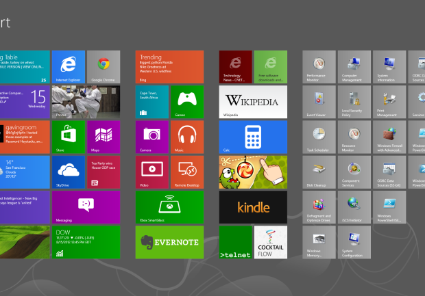
CNET reported today that usability guru Jakob Nielsen is very displeased with the new Windows8 on both PC’s and tablets. He claims that the system has important features hidden, and criticises the start screen.
Let’s think about that for a while. Sure a lot of features (like restart the computer) are more clicks away than ever, but in the era of always on SSD equipped computers is that really a flaw on MS’s part?
The “two desktops” approach may be confusing, but unless Windows 8 fails miserably we won’t see the standard desktop anymore in Windows 9. The biggest flaw at least for me is the fact that you can’t really use more than one window at the time. Sure you can pin a small second window to either the left or right, but that’s not really multitasking. I think Microsoft will address that at some point, because full screen apps are cool and all, but people need to have a choice. Right now it’s as Nielsen stated – the system looks more like a Window than Windows.
But the fact that it’s harder to use for consumers is not a bad thing necessarily. Everything that’s new needs some time to adjust to. Some people used Norton Commander equivalents in Windows for years because they preferred it to the windowed folders approach. Some even still do. But a lot of the users adjusted to the new (and now obsolete) ways of seeing windows.
We can see that by the numbers of people who are downloading the Start8 mod that brings back the start menu. Old habits die hard but without killing them from time to time there won’t be any innovation. And I for one don’t really want to look back in 2050 and still see a start button.
Nielsen may have had some strong points during the years but what would you expect from a person that actually loved the Ribbons in MS office? He also hated Photoshop, which I admit has some flaws, but judging pro software as if it’s made for consumers is a rather big mistake.
Office 2007 is a good improvement over the old, crusty Office UI. Interestingly, Snagit is one of the several other applications to adopt the “ribbon” style UI, which makes that more pleasant to use as well. On the other hand, I continue to find Photoshop unintuitive, though it has made me more productive to downgrade from the full edition to the more limited Elements edition.
J. Nielsen in 2007