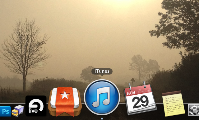
For a long time now Apple has made those ugly music apps icons – the iTunes icon (mac) and iPod / Music (iOS). What was wrong with them? Well for starters they used dark “note” element on a bright gradient background. That of course is not the case with most other iOS apps (namely Phone and Messages). The first iPod icon was also white and it was a bit less “obtrusive” to my taste. The current “dark” icon simply doesn’t fit the rest of the “simple gradient background icons” out there like the App Store, iTunes Store, Phone and Messages.
A while ago the same thing happened to the Mac version of iTunes, but now, with iTunes 11 the white icon is back. Hopefully that will inspire Apple to have the white icon on the iPhone as well. Seriously guys, that thing was SOOO much better in iOS 3.1.3, than it is now…
Not saying that that glossy, gradient filled new white icon is great, but it is an improvement.