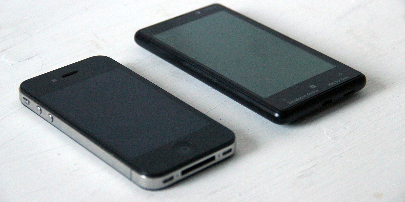
I’ve been what some people call “an Apple Fanboy” since 2005. That year I bought my first iPod and then the addiction started. I had the first iPhone in 2007, went through 4 Macbooks and 2 iMacs, 3 iPads and countless iPhones. I tried using an Android Phone (Samsung Galaxy S) for a few weeks but it failed to meet my expectations (and was ugly). Android might’ve changed since then (I am aware it did) but recently something else has swayed me in yet another direction. Yes – for the last 10 days I’m a Nokia Lumia 820 user and I really like it.
Why switching now? Well – iOS 7 is the main reason. I know it’s a beta, I know it will change a bit. But the main reason that I don’t like it is that it lacks contrast and it’s really dishonest. It pretends to scream simplicity, but it’s lost between the blurs and gimmicks and from afar most apps are hard to tell from one another. I don’t think it’s a good design (and I’m a designer for over 10 years now). That’s why I wanted to try a truly flat, modern and innovative UI. The choice was obvious.
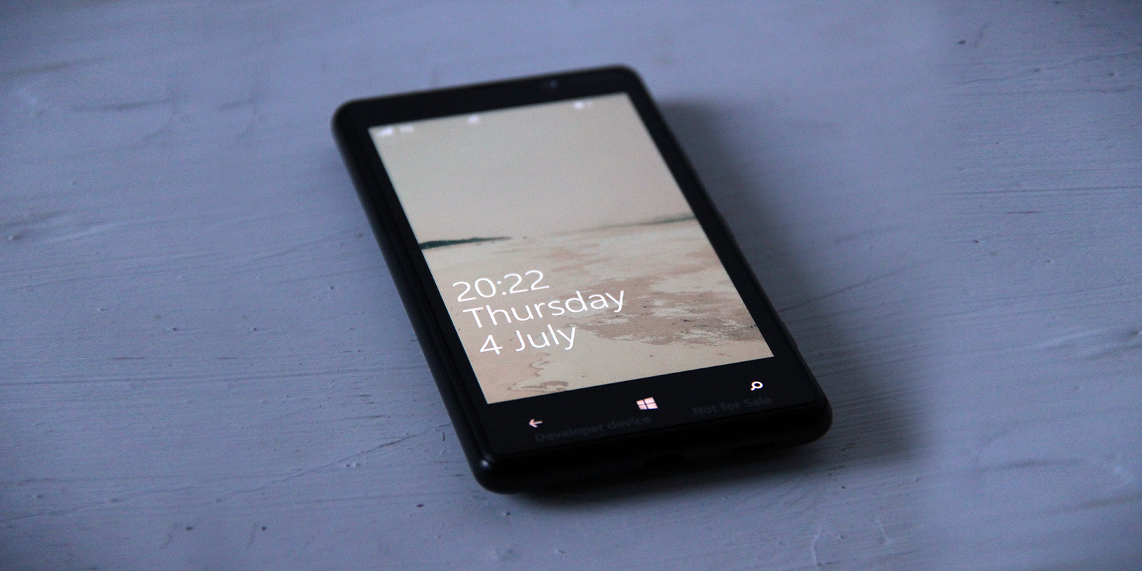
There’s a lot of praise for great typography in Windows Phone and in most cases it’s completely true (unlike iOS 7 and that super thin Helvetica Neue). Just take a look at the lock screen. It doesn’t need animated backgrounds – it’s beautiful with just the text, and the fonts are super crisp. Sure – in some places the typography could still be improved, but Windows Phone is currently the most modern and visually clean mobile OS.
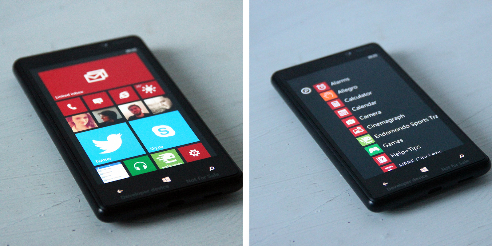
Tiles are a great idea and I found out that I don’t need an array of homescreens to get things done. One is enough if the tiles update – which they do. I can just look at the weather tile to know how hot (or cold) it is, when iPhone convinced me it’s always 24 degrees and sunny, no matter where i went.
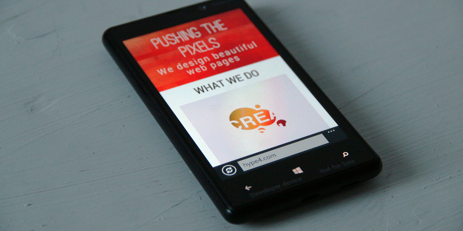
Working in Web Design I remember all the jokes about Internet Explorer, but the new version is actually a very good browser. It’s fast, smooth and renders all recent websites correctly without any problems. I tested some of my responsive designs on it and it worked like a charm.
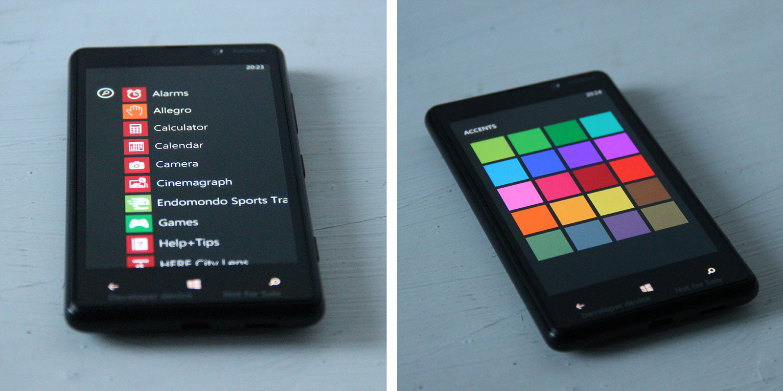
You can “customise” the OS by choosing a background and foreground colour, but while not bad, the choices are limited to only the ones Microsoft decided are good enough. Too bad as I’d really love a white on black tiles (or the opposite) as an option. Well maybe it’ll come soon.
The biggest problem of the platform is the lack of quality apps. There’s no real dropbox app, no instagram (although I don’t use it after it got acquired) and no Wunderlist (which I rely on completely). But you know what – I realised (which may sound weird from an app designer) that I don’t really need to use a lot of apps. If Wunderlist was there I could probably stop complaining just then. Besides, it’s fast and easy to access the web version of some things (if done correctly) which saves the hassle of all those “one time use” apps.
This is NOT the Lumia 920, so I won’t say anything about the camera, aside from the fact that it’s not bad.
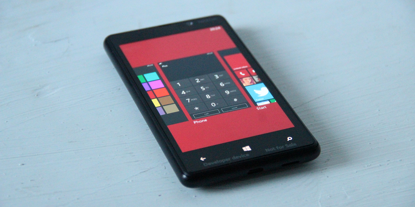
Final words? Well I didn’t expect to fall in love with a product made by either Nokia or Microsoft, but this is essentially what has happened. I REALLY like the OS and the build quality (and crazy colours) of Nokia Smartphones. The lack of apps can be a pain, but web versions are there, and in my case I mostly use the built in stuff anyway (on any platform) and as a Phone + Email + Internet + Maps + Music combo it works perfectly and effortlessly.
So yeah, I love Windows Phone. There. I said it. (still using a Mac though and unless they add that ultralight Helvetica Neue there I don’t plan on switching ;)