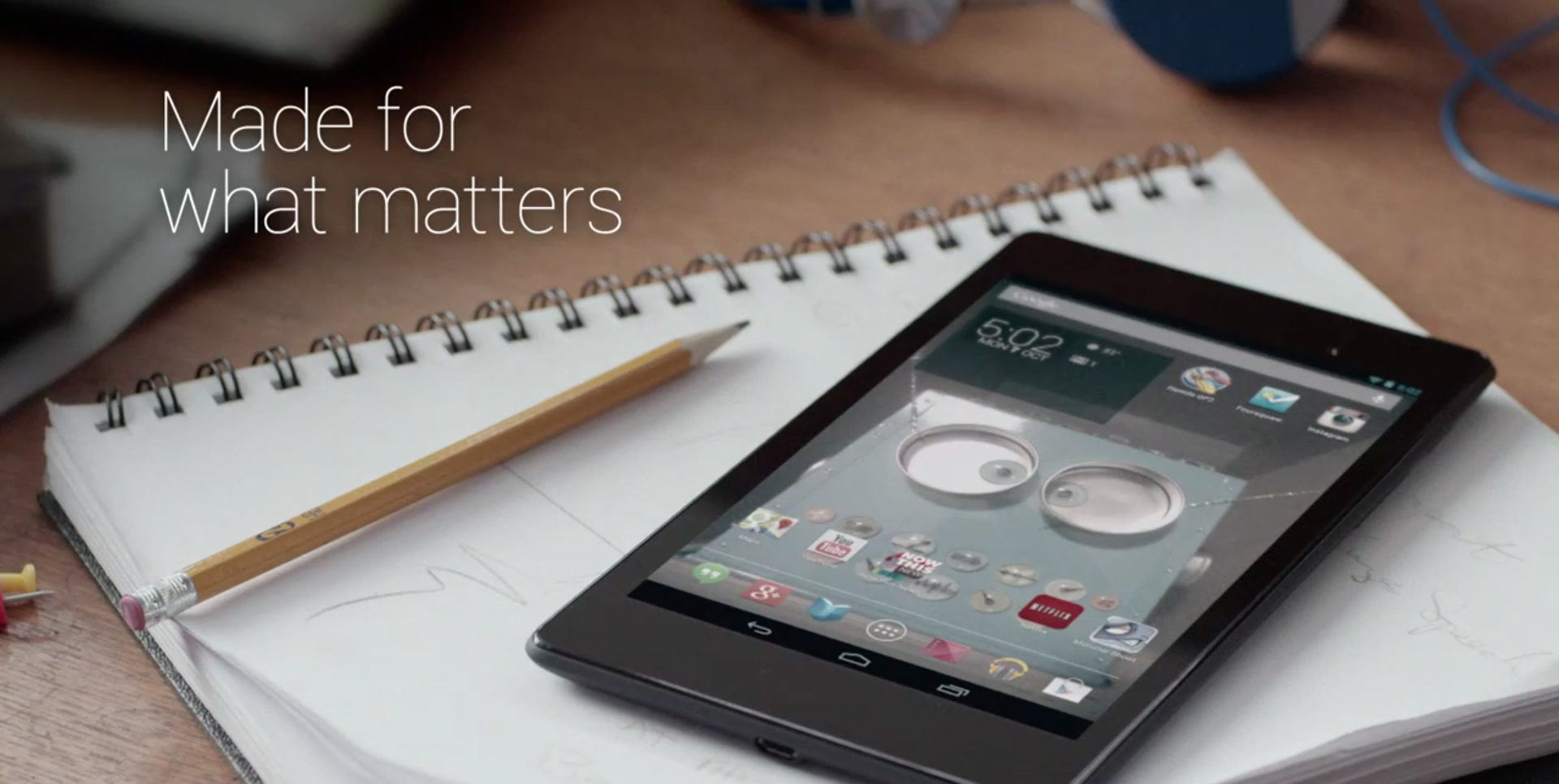
I used to hate all those Android product ads that put Megapixels, megahertz and gigs of ram front and centre, but didn’t really create an experience. Now it seems like Google is catching up to what Apple has been doing for a while – making nice, emotional and full of real-life use ads. The Nexus 7 ad is made in the “Apple style”, but at the same time looking at that clean, bold and pretty-fied OS makes me wonder why Apple is putting out that iOS 7 atrocity. I’m currently a happy Windows Phone user, but seeing that Android ad made me hate it less than I used to. And in comparison Apple I currently see Apple as the one lagging behind and the least innovative of the big three. Too bad… Too bad… And yes, I know the device is still plasticky, despite it’s awesome new screen. And it will probably still feel cheap and low-quality. But maybe just a little bit less with each iteration. iPad beware.
Well… go Google! As long as there’s good design (and Android is getting more of it with each version) and a passion for innovation, I’m for it!