After 2010 we witnessed “minimal” or “flat” design becoming the cool and hip trend all around. We’ve seen flattened brands and products (like below), flat websites, flat apps and more. The world has suddenly stopped being round and became flat, just as some suspected it is a long time ago.
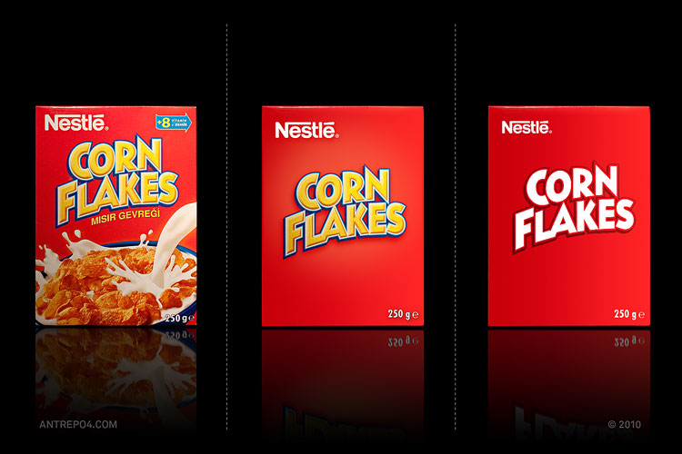
Minimal became the new hip. At first Microsoft pushed the idea with their redesigned Windows interface of flat, colourful tiles and clear typography. Google created their own “minimal” style with a small touch of shadows and transparencies here and there, and Apple followed suit with iOS 7 redesign. That way minimal and flat took over the world.
It also managed to create a false perception in the heads of non-designers (mostly clients) about what their product should be (flat and minimal, right?). The main thing being overlooked here is of course the fact that everything has a purpose and for some companies a wooden background with skeumorphic shadows will work better than a forced flat design. Both have their advantages and disadvantages, but apparently there’s not even a discussion about it anymore. Everyone wants to go flat and that’s final.
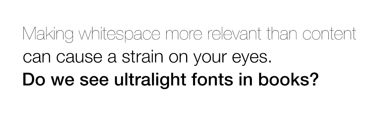
So what exactly is “flat”? Is it super-ultra-light fonts on a white background? Sure, it can be that and that’s what “sticks” to the clients perception when they think about flat. The problem with those ultra-light fonts is they are hard to read. Thin lines, even on modern, super crisp displays are still thin and thus take longer for our brains to process them. Making a font ultra light doesn’t “create” whitespace out of nothing. It creates whitespace at the cost of taking away part of the content. You know – the one that makes it readable.
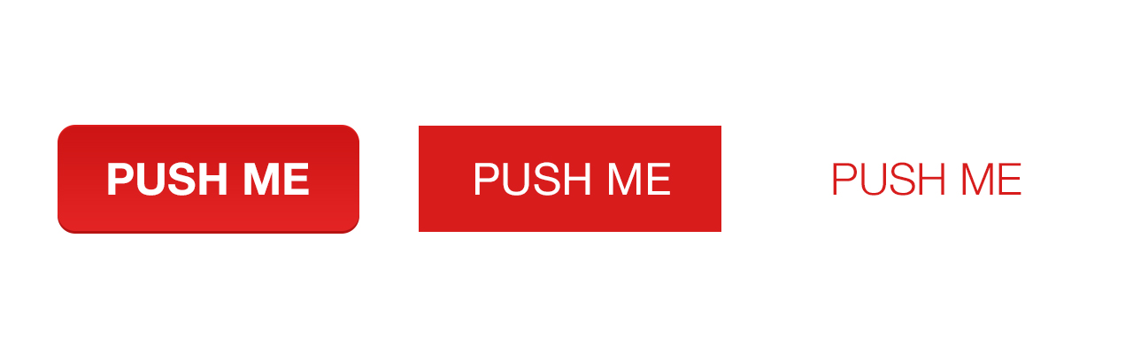
Buttons are another fun example of the trend. Apple decided to completely remove the buttons and just have text. While it’s not entirely bad, try looking at the above image and pointing at what a button is. We all know it’s an analogy (skeumorphic one at that) and in the modern age we don’t need those analogies, as we’re used to technology on a daily basis. But still… If you count reaction times of people tapping on the above buttons you’ll see the time (in miliseconds of course) is longer for each button to the right. Is that bad? Not necessarily, but let’s keep that in mind because this is user experience as much as a wireframe is.
Plain text buttons are ok if they’re used in the right context, like on a navbar. But if you need a call to action, they won’t work so well.
Now let’s step back a bit and welcome the newest additions to the “minimal” and “flat” family – effects. We’re not talking about the old-fashioned effects of yesteryear called gradients and shadows of course. We’re talking about truly modern effects like transparency and blur that give flat designs “depth”. Here’s a million dollar question – what adding depth does to a flat design? If your answer was “it’s not flat anymore” then I’ll mail you your cash in monopoly money (just kidding;). So we strive towards flat, based on research showing that the less elements we have to process the faster and more efficient the experience, but we need to add depth. We used to do it with shadows and gradients (and even before that with textures from the real world) but right now blur and transparency are in.
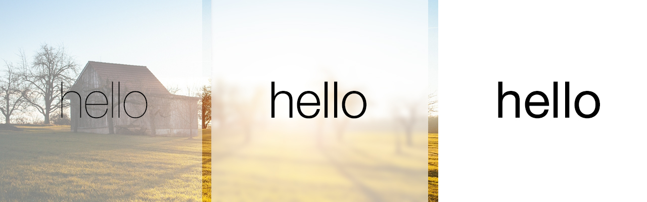
So what are the benefits of those two? The main one is a breath of fresh air in designs because they’re relatively new. They will feel old and dated in a few months – don’t worry ;) Have a nice overlay on a photo with a blur and transparency and you have yourself a modern looking app. Don’t be fooled though, this has nothing to do with “flat” or “minimal”. It’s just changing wood and marble into fake-glass and pretending it’s not skeumorphic anymore. I can’t say I hate the effect as it can make the design feel more alive if used right, and what’s most important if used on the right kind of picture.
If a photo is relatively simple, the effect can look stunning. If the photo is visually “busy” then we add even more mess by bluring it and covering with transparent layers because we now have a busy photo + a version of a busy photo on the same screen. The main idea is of course to put text on those overlays, preferably in an ultra-light font. That is a deadly combination – putting a text with low legibility onto a background that amplifies the visual mess and makes it even harder to read. That in turn ends up affecting your users perception and making the looking at your product longer and harder. That’s never good, right?
What we believe good design is has nothing to do with it being flat or not. Design has to be honest, true to itself and as invisible as possible. Easy to read also won’t hurt. Clearly divided into sections if there are sections? Sure! If the form is more visible then the function it conveys, a design can’t be good. It can be as flat and modern as possible, but it still will be a bad design. Just as bad as parchment background with wooden bindings. Or worse.