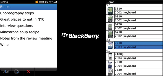
With the quickly coming BlackBerry 10 (the final stand) I looked back at what their apps and OS looks like to designers and actually went through the design guidelines. Most of it is typical gibberish, but the screen above speaks volumes – how could ANYONE create text that’s basically touching the screen border? I know the screens are low res, but having just 5 pixels from the side would create an EXTREMELY big difference. 10/15 would be perfect. The sad truth is that they lost on both functionality (modern touch phones can do a lot more) AND design. And by the looks of the BlackBerry 10 OS some things are fixed, but I think that without a complete overhaul it’s going to be one ugly OS with ugly apps (if any). And that’s a pity because the more OS’es the more different designs I can do. Well, let’s hope Windows 8 catches on…