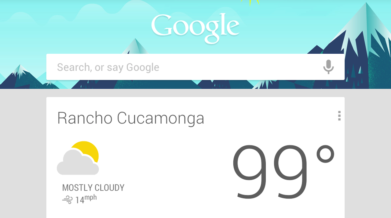
“The Verge” did a great article about how Google finally invested time and effort into design – with a stunningly beautiful result. I couldn’t agree more – the new designs for Maps, YouTube and Gmail apps are very good and in most cases prettier than Apple’s offerings.
There was also this life-long problem of Android being associated with bad quality apps, made just with developers and without any designers. Sounds familiar? Because apparently that’s how Google was operating (sort of) until that change a few years ago. It is true that most Android apps were never touched by a designer, and they are mocked for that by iOS and Windows Phone Users.

Maybe this is all a clever ploy to improve overall designs for the Android Platform? Because if Google defines how to nicely put text data on a white background, many developers will copy the style. That might help boost Android a little bit design-wise which is something the platform really needs for it not to feel like that limpy cousin who always gets his presents a week later.
I personally think that Google has done an amazing job in design. Outpacing Apple and getting real-close to Microsoft. Now it’s Apple’s turn to show us something remarkable with iOS7.