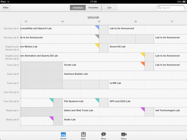
There has been a lot of speculation about how iOS7 will look like this year and apparently Apple gave us a hint releasing the updated WWDC calendar app. It’s going to be white – everyone said. The whole iOS 7 will be white as snow! Yeah, well, maybe. But judging it just by the WWDC app is not really the right option, because it had a different, white design since last year. And when it was announced last year ahead of WWDC everyone sang the same song – the new iOS 6 will be whiter and flatter and prettier because of the WWDC app!
And guess what? It didn’t change at all then. This year we’re almost sure it will, but let’s wait and see, because the WWDC app is at some points pretty nice looking, but it has it’s flaws that can be forgiven for a one-time event app, but not for the whole OS that everyone will use at least for a year. Take a look at those oversized fonts in the sections (they almost don’t fit). There’s very little whitespace in many screen sections too. Also the font stayed the same.
So what I think is that this whole “whitening” might actually happen inside iOS 7 because most OS’es are actually dark, but it will probably not look this way. This is a slightly different app from the rest of the OS for at least a year and even though parts of it look promising, as a whole it’s a typical iOS 6 app.