I am currently a happy user of a Lumia Phone. The idea for the switch from my trusty old iPhone 4S was simple – I wanted to learn & feel the platform since I need to design for it as well. After a few days of playing with the OS I can honestly say I like A LOT. The lack of quality third-party apps is the biggest drawback, but all-in-all it’s a very well designed OS both visually and in the UX (those animations are just lovely)
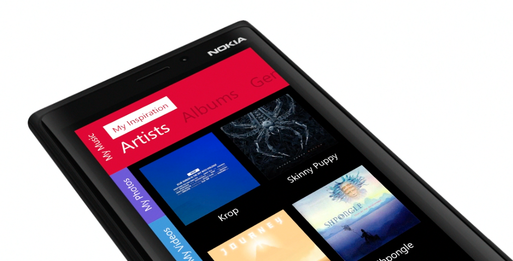
But while playing with the OS an idea formed in my head about a tabbed-not-really-tabbed interface that would both fit the platform and be unique to it. Putting thoughts into pixels was the easy part after that and hence my tabbed-UI for Windows phone mockup was born.
My reasoning behind taking away a bit of horizontal screen real-estate is the fact that most Windows Phones have pretty wide screen sizes compared to both iOS and Android, so the users (especially the switching ones) wouldn’t really notice the difference in viewing area. Also it’s such a small portion of the screen that I believe it can actually aid readability by providing a starting point for our eyes on the left side of the screen.
To avoid accidental usage the tabs would probably have to be dragged 1/3 across to be accessed but that should probably be user-tested as it can prove to be a non-issue.
Also, to avoid turning the head to read the rotated captions we can use small icons there instead.
This is the first of my series of ideas for Windows Phone Navigation so stay tuned for more as I have two more ideas I’d like to explore in more detail.
And here’s the video: