The last few months had been quite busy and extremely exciting here at HYPE4. We are almost done with two new iOS gaming projects that will come after Hungry Squid, which incidentaly just topped 400,000 downloads.
We will announce our new productions very soon, so stay tuned :)
Author Archives: IdeaMonster
iOS 7 visual errors, mistakes and bugs
I was very skeptical about Apple’s new mobile OS a while ago, but it actually grew on me. I still think the home screen icons are ugly, but more and more of the OS is actually quite cool. There are glitches though and small visual errors that look very weird coming from Apple. Steve Jobs had famously called some designers at 4am to change an orange hue on the Google Maps icon, and now things like that end up in the final OS? Odd. Let’s hope they fix it soon. I’ll be adding more images as I’m finding them.
The calendar bug is pretty weird. It says it’s September of 201, and I’m pretty sure that if it was I wouldn’t be writing this blog ;)
Yes, we know that the “3” is under the segmented control, but that is just a plain bad solution. Especially in portrait on the iPad, when we have so much vertical space, we can make the actual days smaller vertically and add another line with just the date. It would be clean and precise + visible too.
Apple’s website is starting to match iOS 7 style and with even better result!
Apple did not only announce some new hardware today, but it also revamped some of it’s web presence, that was considerably lacking the (controversial) flair of iOS 7. Apparently it’s slowly progressing towards unification and we can see the start of it on the iPhone 5C page. First of all it hides the glossy, gradient’y Apple menu background right after you scroll down and the translucent (hello iOS 7) menu bar slides down and stays on the top of the site.
The website also uses nice scroll-animations that are becoming a new web design trend, but fit the mobile OS as well. After all there’s plenty of things moving in iOS 7. It’s becoming more and more consistent and we might as well see a totally revamped Apple website on the day iOS 7 ships.
Let’s just hope they won’t go too minimal with the next desktop OS (the one after mavericks as this one has the classic MAC OS look left intact) because that will be a lot harder to get used to.
Get Things Done vs Make It Cheap
There’s a saying in the design industry, that price alone is far less important than the ability to deliver. That is especially true if price is the only factor by which a design is chosen, and we all got our fair share of “we think the CEO’s nephew will make a great website. Why he did two already!” which almost always results in projects that are not done. Ever. Or at least in any near future. Having a web presence is important just as it always was, but now with responsive web it’s even more important that people can find you via mobile devices. In that case GTD or Get Things Done usually beats the “Make it Cheap” motto, because the latter cases rarely become anything at all. The infamous nephew or that “close friend who has web-something company” usually end up either not doing the job well, or not doing it at all.
When you have a mix of quality and the ability to actually deliver something at the end of the day, you have a successful company that’s hard to beat. If all you look at is price or “personal relation” you might end up with that cute “under construction” graphic BEING your website for a year or two. That’s why it’s always important to price your projects right, so you have the motivation to deliver. After all big companies pay big agencies hundreds times more for the exact same things small design studios do.
Why?
Because those big clients are SURE that the job will be delivered and having that peace of mind is important.
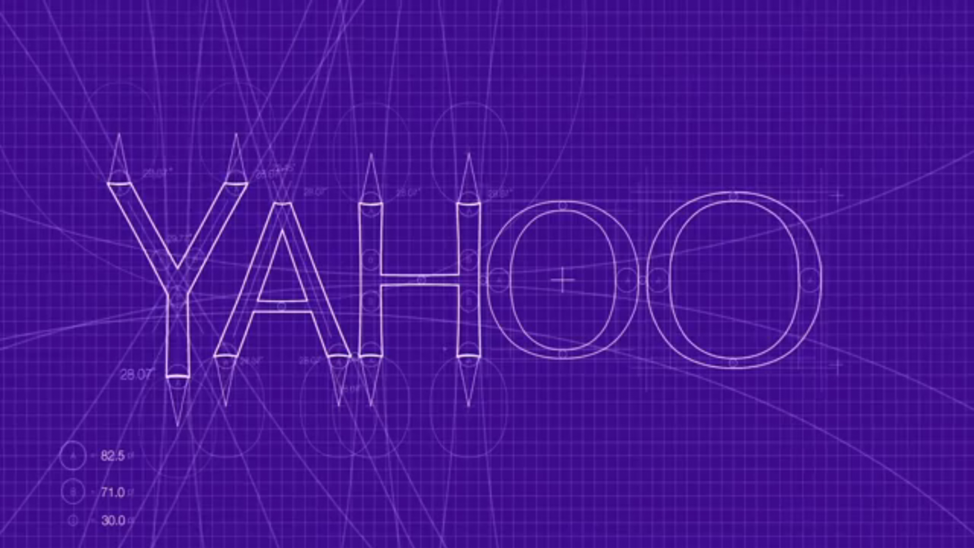
Yahoo’s new logo is … meh.
After a very interesting move to show 30 logo iterations throughout the month, Yahoo finally showed us “the real thing” and unfortunately at least for me, it’s not too impressive. There were definitely better logos in the 30 they showed. What do you think?
Yahoo’s interesting way to rebrand
Most companies considering rebranding (especially the larger ones) try to keep it as much of a secret as possible. Yahoo has decided to go in an opposite direction and will show us 30 of the logo designs they worked on, with a final unveiling of the “real” one on September 5th. That’s a pretty cool idea, to see all the iterations and concepts. The logo itself will still be consistent with the current one as the “!” and the colors will most likely stay exactly the same. The first logo can be seen above, the rest will be shown here
iOS 7 Beta 5 brings elements that are color coded to the iPhone color
We did a couple of mockups a year ago of what it would be like, if iOS matched the color of the phone it’s running on. You can see the whole project here, but what’s interesting is that Apple actually started going in that direction itself. The first thing you see after you turn your iOS device on, used to be a black screen with a white Apple logo in the middle. Well it still is, but only for Black iPhones. For the white ones the screen is inverted, so there’s a black apple logo on a white background. It seems that our idea wasn’t really that farfetched.
I heard you wanna be a web developer
Some of us still remember the crazy times of doing websites that are compatible with IE6 AND all the other browsers. IE6 was so bad, that sometimes almost all the code had to be rewritten specifically for it. Programmers made two versions of the site – for all the browsers and IE6, and there were online petitions to ban IE6 in corporations, because it was mostly their fault people still had to code for IE6 in the first place. Their upgrade process was so slow, that some are still using IE6, even now, but thankfully less and less each year.
Testing a web project is still important though, mostly because doing a website for browsers and IE6 had been replaced by doing the website for all possible devices, including both mobile and big screen TV’s sometimes. But the cool thing I as a designer noticed, is that it’s become very easy to make it work across a range of devices. We test all our websites on Chrome, Firefox, Safari, IE9, iOS Safari, Android browser and Windows Phone IE and we notice that there are barely any differences between them.
Long live HTML5! This definitely is the future of web design and saves us (and our users) tons of time and frustration!
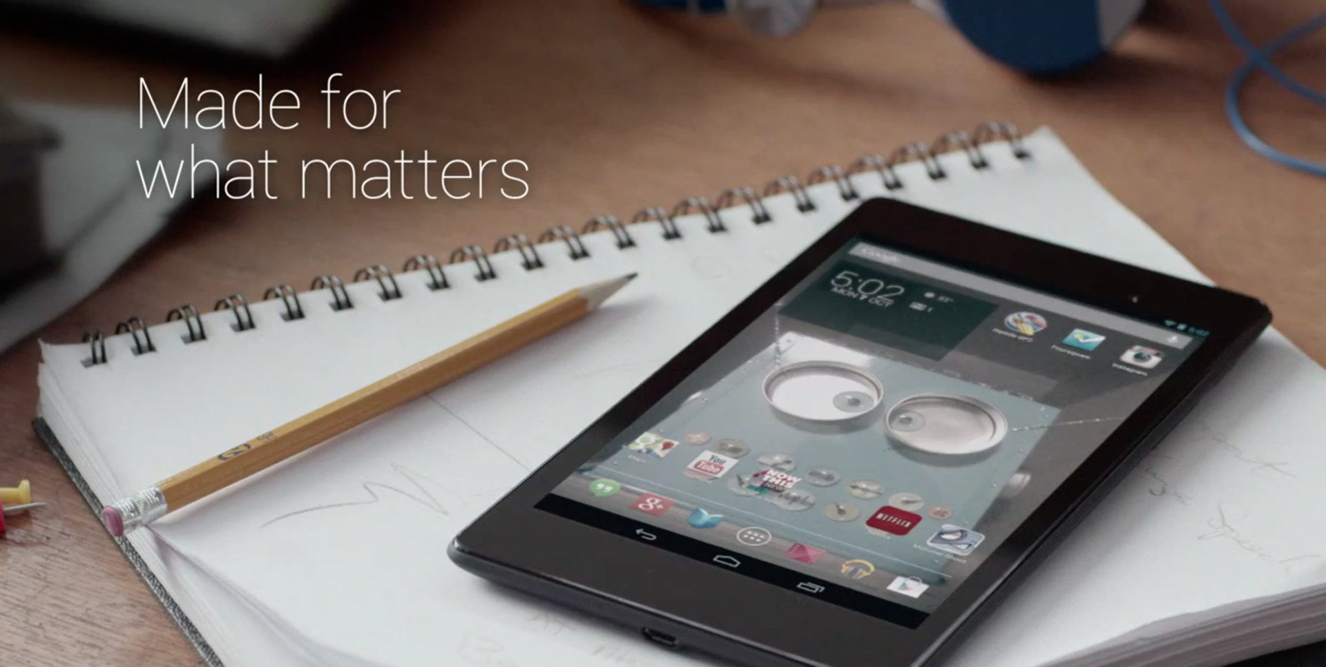
Google is catching up to Apple and fast! Nexus 7 ads are very well made!
I used to hate all those Android product ads that put Megapixels, megahertz and gigs of ram front and centre, but didn’t really create an experience. Now it seems like Google is catching up to what Apple has been doing for a while – making nice, emotional and full of real-life use ads. The Nexus 7 ad is made in the “Apple style”, but at the same time looking at that clean, bold and pretty-fied OS makes me wonder why Apple is putting out that iOS 7 atrocity. I’m currently a happy Windows Phone user, but seeing that Android ad made me hate it less than I used to. And in comparison Apple I currently see Apple as the one lagging behind and the least innovative of the big three. Too bad… Too bad… And yes, I know the device is still plasticky, despite it’s awesome new screen. And it will probably still feel cheap and low-quality. But maybe just a little bit less with each iteration. iPad beware.
Well… go Google! As long as there’s good design (and Android is getting more of it with each version) and a passion for innovation, I’m for it!
All Photoshop filters in one video
Words will not do any justice to this masterpiece. Watch and enjoy! :)
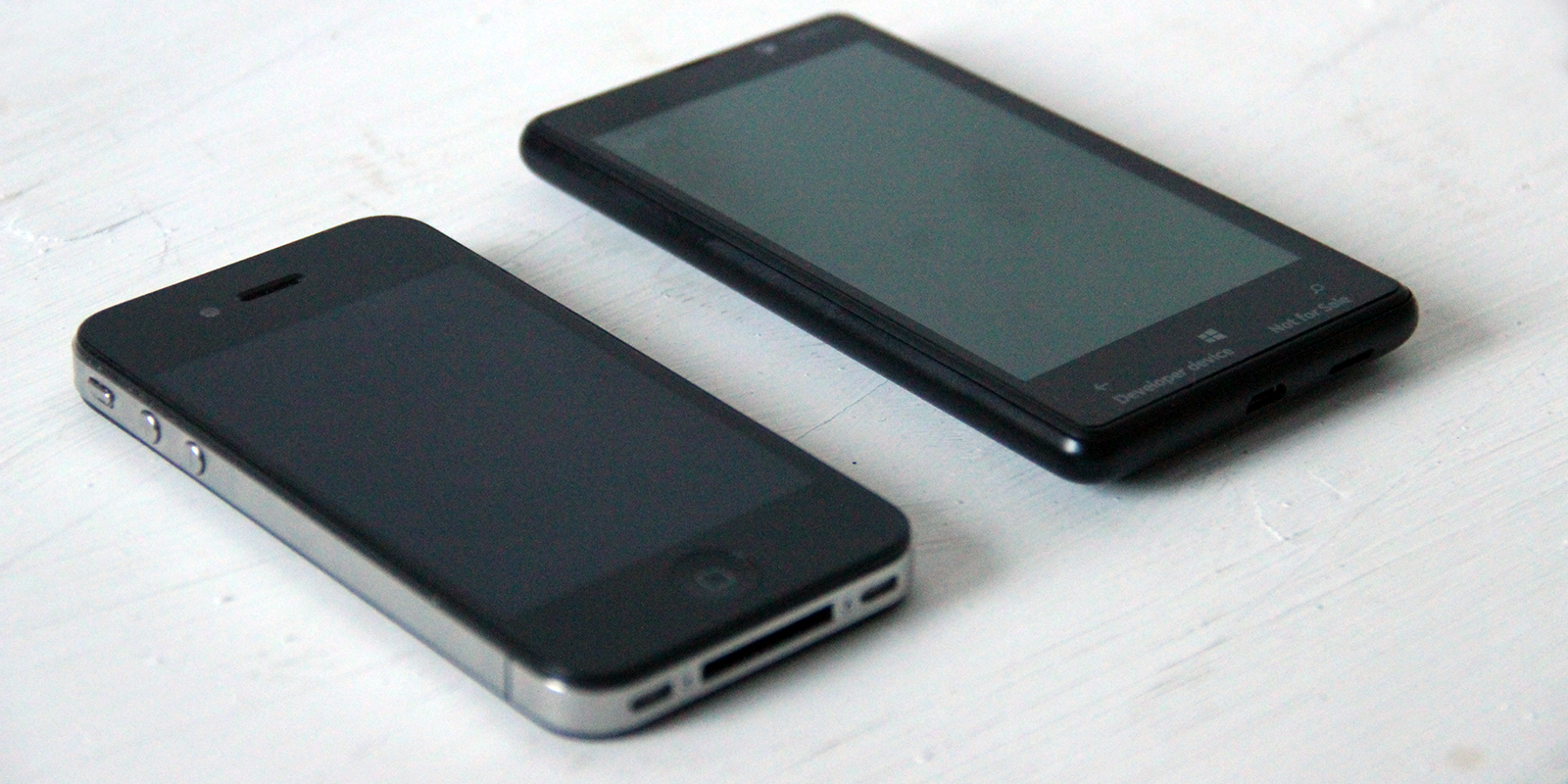
Lumia 920 rocks!
Thanks to some nice people (you know who you are :)) I now have a Lumia 920 and all the praise I gave the 820 applies here too. But in many respects this phone is even more awesome. I’m seriously in love! Finland might be cold and far away, but they do have some top-notch designers over there. This phone is beautiful in every aspect. The plastic shell doesn’t feel cheep like on Samsung devices, and it doesn’t feel cold and machined like the iPhone.
The OS is fantastic but that part didn’t change much from the 820. The only two things that did change are the camera (take a look at that low light photo! A little shaky, but far ahead of any smartphone) and the screen resolution which is now above 320 ppi.
Both of those things make the 920 the best phone I used so far. It’s really an object that I simply like to hold and use. Let’s just hope it catches more wind as Microsoft and Nokia both deserve praise for the software and hardware respectively.
My thoughts after using Windows Phone 8 for 10 days
I’ve been what some people call “an Apple Fanboy” since 2005. That year I bought my first iPod and then the addiction started. I had the first iPhone in 2007, went through 4 Macbooks and 2 iMacs, 3 iPads and countless iPhones. I tried using an Android Phone (Samsung Galaxy S) for a few weeks but it failed to meet my expectations (and was ugly). Android might’ve changed since then (I am aware it did) but recently something else has swayed me in yet another direction. Yes – for the last 10 days I’m a Nokia Lumia 820 user and I really like it.
Why switching now? Well – iOS 7 is the main reason. I know it’s a beta, I know it will change a bit. But the main reason that I don’t like it is that it lacks contrast and it’s really dishonest. It pretends to scream simplicity, but it’s lost between the blurs and gimmicks and from afar most apps are hard to tell from one another. I don’t think it’s a good design (and I’m a designer for over 10 years now). That’s why I wanted to try a truly flat, modern and innovative UI. The choice was obvious.
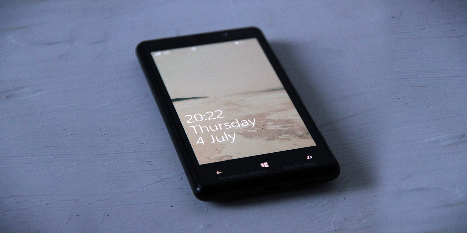
There’s a lot of praise for great typography in Windows Phone and in most cases it’s completely true (unlike iOS 7 and that super thin Helvetica Neue). Just take a look at the lock screen. It doesn’t need animated backgrounds – it’s beautiful with just the text, and the fonts are super crisp. Sure – in some places the typography could still be improved, but Windows Phone is currently the most modern and visually clean mobile OS.
What happened to famous Apple design?
I installed iOS 7 with high hopes that ugly homescreen icons were the only thing bad about it and I will see a familiar, high-quality experience I have associated with Apple. What I saw was inconsistencies (yet they claimed consistency), ugliness and a couple of nice ideas poorly executed. But what strikes me even more is this years Apple Design Award winners.
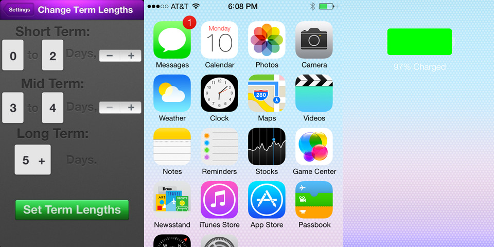
The left side of the image above is an app called “Finish” which is a student-done To-Do list that won this year in the student category.
Now I don’t doubt the app’s usefulness, UX or navigation ideas. But seriously it’s BUTT-UGLY. It’s actually uglier than iOS 7 and that says something on it’s own. I know the rules by which Apps are chosen for the award, but it’s still called Apple DESIGN award, right? And the design here cries for help. And let’s not sugar-coat it with “they’re only students” and crap like that – I know students who design amazing things – they’re all around dribbble and behance. Seriously. WTF is that?
I think that to deserve the design award an app should excel in EVERY aspect. Having a nicely thought out, but ugly app as a design award winner might set bad standards for the future. Or maybe design just doesn’t matter anymore at Apple?
It’s never cool or easy to mock a company that defined me as a designer, a smartphone user and a Mac addict for years. I was a total Apple fanboy, buying most of their products right at launch, and praising them for the best design on the planet. And why it still stands for their physical products (although I love the design of recent Nokia Phones just as much), it went seriously downhill when it comes to their taste in software…
I still remember Design award winners that really contributed to great design – Pixelmator, Flipboard or that Al Gore’s book (Our Choice) that defined a great eBook paradigms that even Apple later copied in their iBooks author. Those were groundbreaking apps with amazing design. This year has proven that design apparently doesn’t matter in Apple Design Awards.
Maybe they should just be called “Apple Awards” ?
Windows Phone Navigation idea mockup (UI + UX)
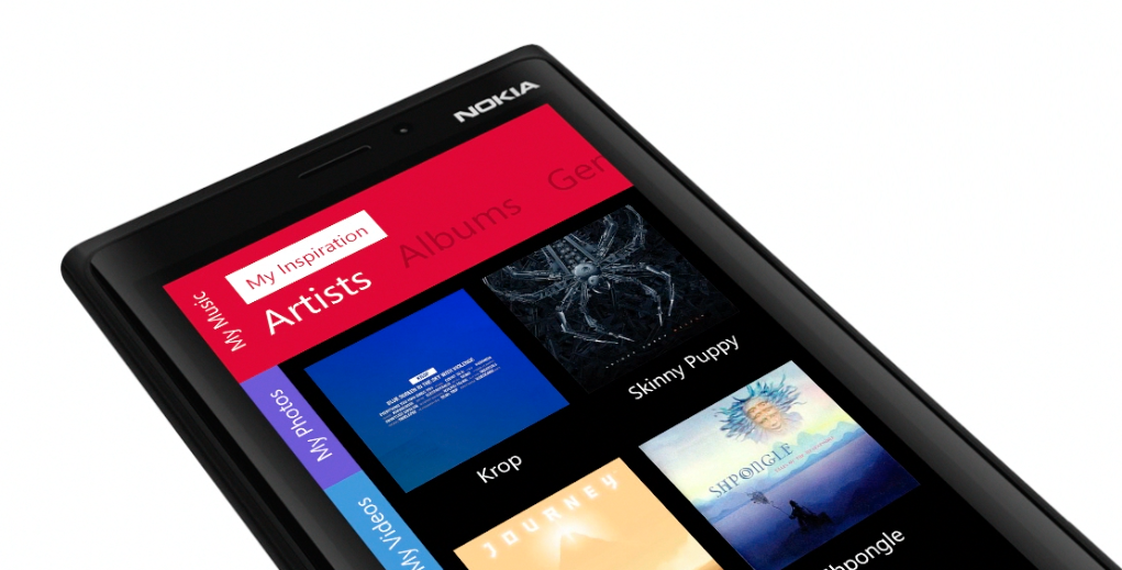
I am currently a happy user of a Lumia Phone. The idea for the switch from my trusty old iPhone 4S was simple – I wanted to learn & feel the platform since I need to design for it as well. After a few days of playing with the OS I can honestly say I like A LOT. The lack of quality third-party apps is the biggest drawback, but all-in-all it’s a very well designed OS both visually and in the UX (those animations are just lovely)
But while playing with the OS an idea formed in my head about a tabbed-not-really-tabbed interface that would both fit the platform and be unique to it. Putting thoughts into pixels was the easy part after that and hence my tabbed-UI for Windows phone mockup was born.
Former Apple designer redesigns iOS 7’s icons
Louie Mantia is a former Apple icon designer, so he actually has even more right to do that thing every designer now does. You know – redesigning iOS 7 icons. And since he has worked on some of the original pre-iOS 7 icons too, he has both the skills and the knowledge on how good icon design works. The fact is that it actually does look much cleaner and nicer, but also a little confusing, because if icons all shared that very consistent style they’d be harder to process by our eyes. So there are compromises everywhere I guess. But still worth a shot, I especially like the safari icon.
You can see his Dribbble post here
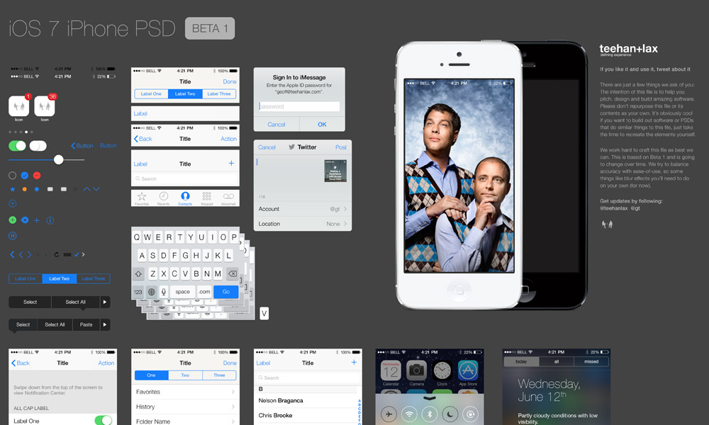
iOS 7 UI in a PSD file now available
Teehan Lax agency has been known for years to deliver each iOS version created from scratch in Photoshop so you can easily export UI elements while working on your own apps. iOS 7 wasn’t yet released, but they decided to do a beta PSD anyway, because summer will be quite busy for some developers – they need to redesign their apps to fit iOS 7 before it’s fall release. You can download the PSDhere