We’re at this year’s travelhack in lovely Stockholm, Sweden competing as CityFix. The photos will be added below during the day.
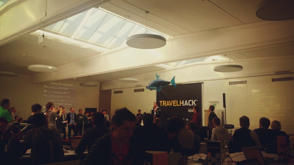
We’re at this year’s travelhack in lovely Stockholm, Sweden competing as CityFix. The photos will be added below during the day.

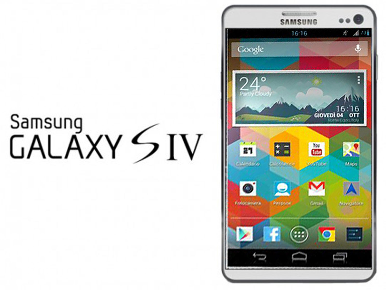
While watching the Galaxy S4 event (aside from the amazing production values and money spent) I realised that right now the megahertz and gigabytes are not as important anymore. Come on – the new Galaxy S4 has the same amount of internal drive (16gb) as an iPhone from 4 years ago. But the most promoted features were some smart ways to use the phone.
Maybe Samsung has finally learned that adding megapixels and megahertz can get you so far. Right now it’s all about software and apps. That’s VERY good :) It’s all about software people, not the plastic hardware ;)
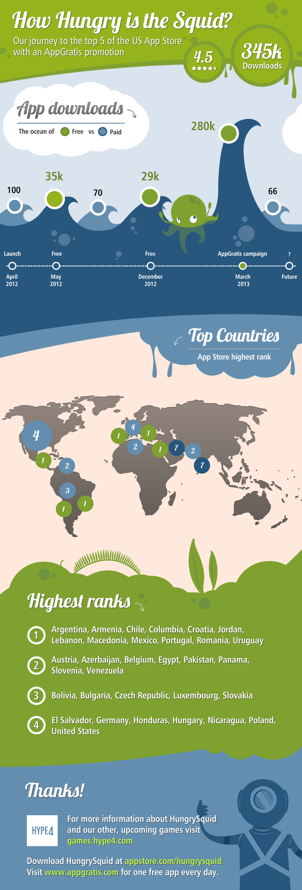
Here’s how HungrySquid did with an AppGratis promotion in late February 2013.
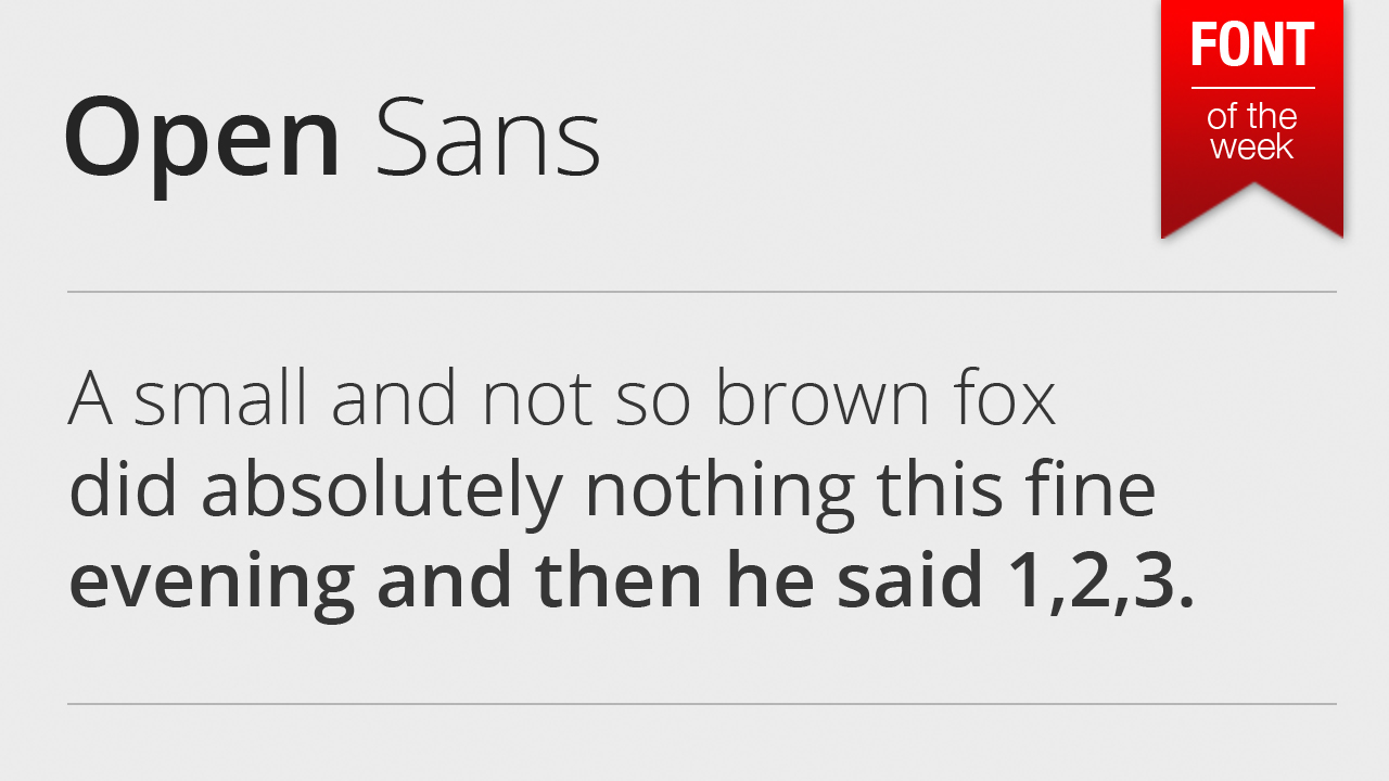
Open Sans is a font that stole my heart and my designs this year. It’s by far one of the most beautiful typefaces I’ve ever seen. And it’s perfectly crafted for both web and mobile. It really shines in the latter. The best part? It’s completely free and a part of google web fonts.
If you haven’t heard about it yet, download it:
http://www.google.com/webfonts/specimen/Open+Sans
This font has the best chance to finally kill off the much overused helvetica (jk;))
I watched a fair share of UX experts working away on their designs, moving rectangles into place and always worrying about the fold (on both the web and mobile). As expert as they all are I think they’re forgetting that typography and layout alignment are also a part of the UX design process.
Since they seem to worry about the fold the most (which is a silly thing of the past really – we do have scroll wheels now – we scroll!) and they try to cram as much content above it as humanely possible. According to those experts good UX is when font sizes are around 10-12 and plenty of links. That creates condensed, hard to read and chaotic layouts that are NOT good UX.
It takes the user much longer to process smaller text, small leading and paddings. That in turns make the whole Information Architecture suffer, as the user is skipping most of the information. And if he is, then why is it even there in the first place?
Creating forms in Axure or Balsamiq is one thing, but the important part of every good UX design is not to focus on just moving boxes around. It’s about what the user experiences. And small type with almost no white-space is simply not a good experience to look at.
Some say sure – but it’s a design thing, not UX. They couldn’t be more wrong. A graphic designer is in most cases a UX designer as well, just with a lot more imagination and sense of visual style. And since typography is mostly graphic designers domain, we can honestly say that all graphic designers (good or bad) are also UX designers (good or bad). Not to say that a lot of simple web / mobile interfaces could be designed without the mockup in the first place and just as fast.
You might have the best flow in your app, but when the text is hard to read the experience will be far from awesome.
And since we’re all UX (and graphics) designers now, it’s important to remember that unless it’s a photo/video app or site, type is STILL the most important part of both the message and the experience.
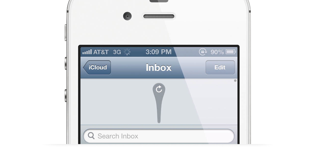
If there’s a way to do things and it has been in use for a long time, the users are more likely to understand that way and have a better experience. Easier too. UX people are usually using this one a lot, almost as a bible-quote. Sure – if something’s not broken why fix it, but that’s only one part of the story. The truth in mobile apps is, that Apple created a certain set of rules in 2007 that hasn’t really changed. Android followed with their ripoff own version a while later and both platforms.
So should we really follow only what users know and expect? Because if we did, we wouldn’t have Twitter’s “Pull to refresh” which is now ubiquitous. We wouldn’t have the twitter / facebook style slide-from-the-left menu panel and many, many more small tidbits.
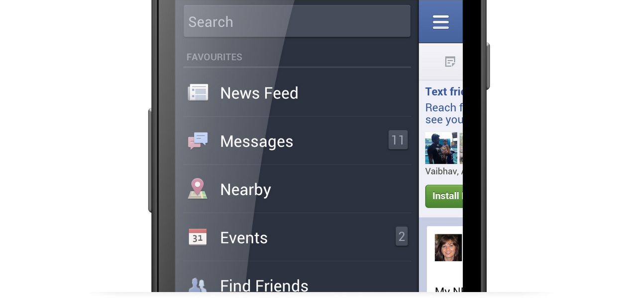
Within reason it’s those who try new things, that are pushing the experience forward. And the only was is to go against the user sometimes. Of course it’s all within reason, but don’t let anybody fool you. If an UX designer is saying your idea is bad, just go and prove him wrong :) Unless you want the world to stand still.
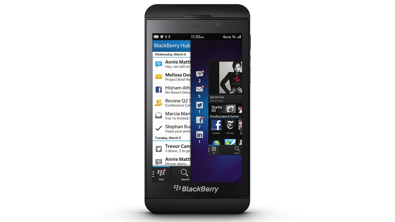
You might say what you want about BlackBerry and it’s OS in the recent years, but pretty will probably not be among them. With the recently launched Blackberry 10 OS it appears that there is finally some good design involved that doesn’t (at least not completely) rip-off from other platforms. The interface is clean, modern and kinda sexy actually. That’s not really BB style, but it’s a nice and refreshing choice.
I really like the typography, spacings and icons. Even the semi-skeumorphic keyboard looks quite nice. Sure, there are some odd things about it and the UI is a bit different from what we’re used to, but that’s not necessarily a bad thing. It’s going to be an interesting battle (especially for the Enterprise market) between Microsoft and Blackberry this year. Being number 3 is always better than being number 4, right?
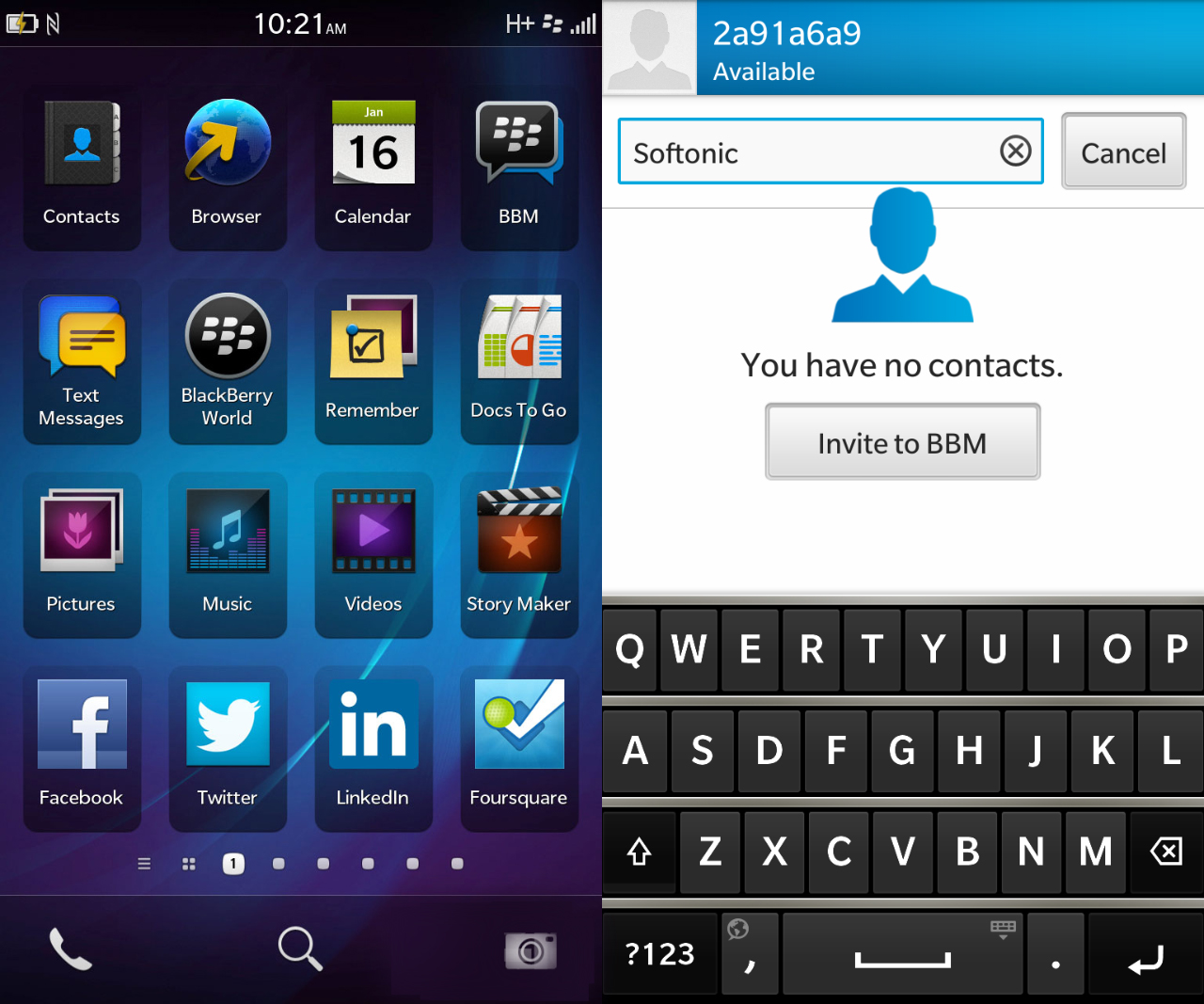
Too bad that right now the most outdated looking OS is the one coming from Apple…
Update:
 This is an interesting idea for a back button, with the skewed line showing which way the user will go. It’s a similar concept to what we have tried to do for an iOS app a few weeks ago, that I’ll try and showcase here soon.
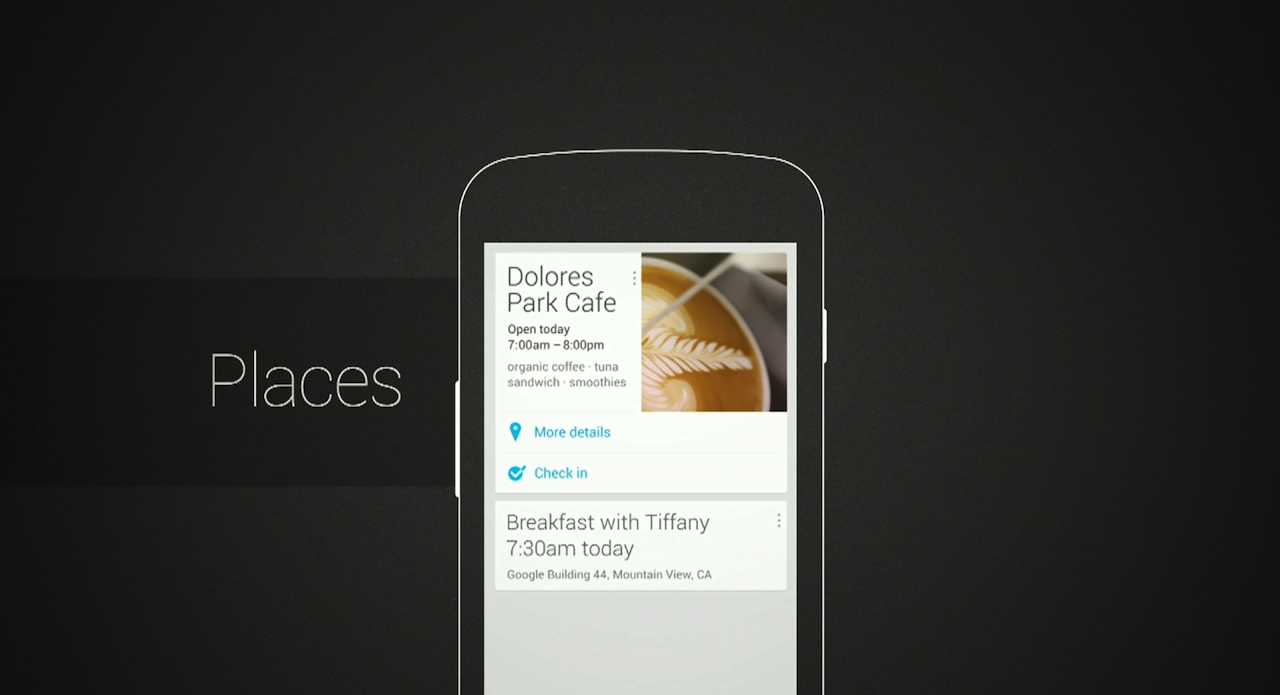
“The Verge” did a great article about how Google finally invested time and effort into design – with a stunningly beautiful result. I couldn’t agree more – the new designs for Maps, YouTube and Gmail apps are very good and in most cases prettier than Apple’s offerings.
There was also this life-long problem of Android being associated with bad quality apps, made just with developers and without any designers. Sounds familiar? Because apparently that’s how Google was operating (sort of) until that change a few years ago. It is true that most Android apps were never touched by a designer, and they are mocked for that by iOS and Windows Phone Users.
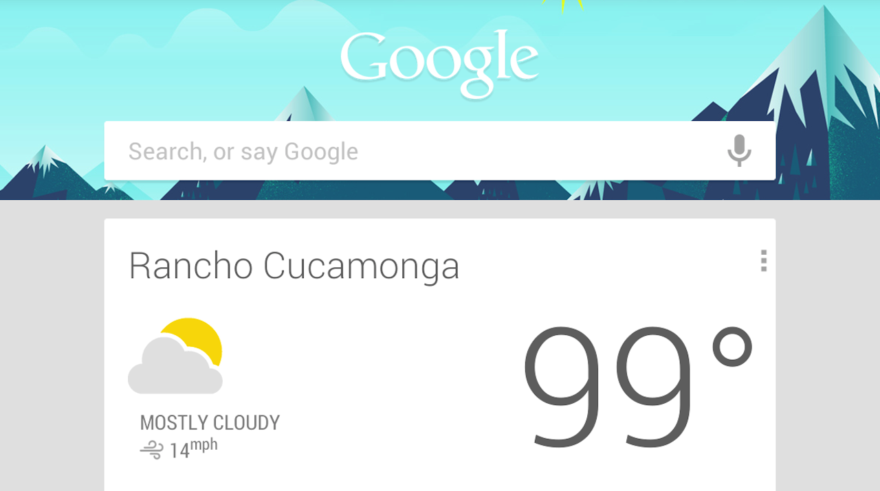
Maybe this is all a clever ploy to improve overall designs for the Android Platform? Because if Google defines how to nicely put text data on a white background, many developers will copy the style. That might help boost Android a little bit design-wise which is something the platform really needs for it not to feel like that limpy cousin who always gets his presents a week later.
I personally think that Google has done an amazing job in design. Outpacing Apple and getting real-close to Microsoft. Now it’s Apple’s turn to show us something remarkable with iOS7.

From now on all the new content on CM will be uploaded in Retina Display quality, so all you rMacbookPro users out there can rejoice. I have had the 13″ rMBP for a few days now and the display quality is simply breathtaking. More on that soon, with a review of the laptop and some shots, but for now let’s all look into the future, because the future is very sharp.
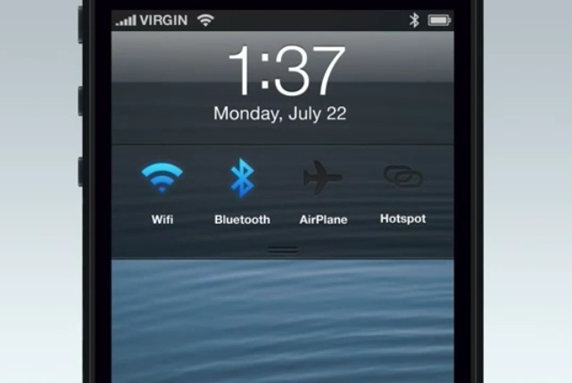
This is an example of how awesome the iOS lockscreen could’ve been by adding a top-down drawer for important OS shortcuts (like airplane mode or bluetooth) working in a similar way (just different direction) as the current camera shortcut works. Watch this vid:
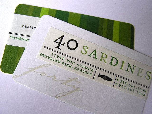
Who said they need to be clean and simple? Well I did. But sometimes going a little bit overboard can yield interesting results and catch attention, which sort of is the sole purpose of a business card.

The battle of the giants is on. With three main competing platforms (iOS, Android and Windows Phone) each company tries as much as possible to have an upper hand. Apple doesn’t really do cross platform apps for mobile, but MS and Google have some on nearly every platform and they are popular.
It started with Apple removing Google Maps and YouTube from iOS in the 6th version of the OS. Soon after that Google has published their own apps to replace the stock ones on iOS, and they are great. At the same time Google refuses to make their maps app for Windows Phone and even tried blocking web versions from mobile IE.

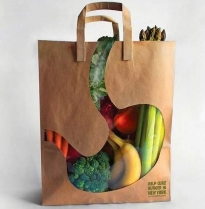
Here are some very cool and innovative ideas for package designs. Product packaging doesn’t have to be boring and these will catch attention on every store shelf.
![]()
Pixelmator, the cheap ($25) image editing app has been a big hit on the App store. First of all – it can read PSD files and save them. It also provides a lot of the basic editing tools and filters that most web/mobile designers use every day. Also it uses 99% of the same keyboard shortcuts as Photoshop, so it’s very easy and natural for a PS user. Sure it’s not as good as the newest PS for large print and photo editing, but for a web / app designer only a few things were missing. Mostly layer styles and vector shape support. Well guess what – they’re all coming to the app as a free update in the very near future.
I have tested Pixelmator for quite a while now and if it had layer styles and shapes I think it could replace Photoshop in my daily workflow completely. After those functions are added I will try and do my day-to-day work in Pixelmator for two weeks and will submit my views every other day. This is VERY good news for all designers out there.
Let’s just hope the company will expand and make a vector editing app as well, because frankly most cheap alternatives to illustrator are not really good.
You can read more about the app and it’s features at pixelmator.com
Apparently the whole “Free download” has made quite a stir on the internet. People were happy to finally go “legal” in some cases, even with old software. Sure, the Mac version wouldn’t work on any new Mac (post 2006) anyway, but FREE is free right? Well, no. No it’s not.
You have heard wrong! Adobe is absolutely not providing free copies of CS2!
What is true is that Adobe is terminating the activation servers for CS2 and that for existing licensed users of CS2 who need to reinstall their software, copies of CS2 that don’t require activation but do require valid serial numbers are available.
So there you have it. I knew it was too good to be true, especially for a company like Adobe ;)