Apple iPhone screen fragmentation and the missing 3 pixels

iphone screen size fragmentation

When apple switched from the 4:3 aspect ratio on the iPhone 4S, to the 16:9 ratio of the iPhone 5, the world accepted it as a fact.
Now, when we have two new resolutions we can start thinking about iOS fragmentation. Apparently both the iPhone 5, 6 and 6 plus have a 16:9 aspect ratio. With the respective resolutions of 1136 x 640, 1334 x 750 and 1080 x 1920, we would expect we can scale the top resolution down and get the middle and lowest one. No suck luck.

iphone screen size fragmentation 3px

When we scale 1080p down to 750 pixels, we get 750 x 1333. We are missing one pixel.
It get’s even weirder when we scale it down from 750 x 1334 to 640, because the height appears to be 1138. Now we are gaining two pixels.
Scaling up from 640 to 750 yields 750 x 1331 pixels – so loosing two.

Of course it’s all roughly 16:9 every time, but the problem is that even when you created your app fully on vectors, you can’t simply resize the canvas because you’re missing pixels on every resolution.

Bad move apple :(

Apple posts design tips for developers

apple design tips

We recently raised the subject of how most apps don’t really look like the design when they are developed, and here comes Apple to the rescue! ;) The developers are generally lazy when it comes to implementation and believe that if it displays (in any way) then their job is done. They don’t care about margins, spacing, platform rules and ui paradigms. No, they are the mighty app developers, a rather small elite among other devs, so they don’t lower themselves down to implement things perfectly or to worry about how the information is presented.

Apple has published a set of rules and guidelines (a short one still, but always something) to educate developers about some basic mistakes they do. Let’s just hope they’ll start rejecting crap-design apps from now on, because a warning is only meaningful when it’s a threat.

Our own “Natural environment” device library

mockup-iphone5c-yellow mockup-android-phone-1
mockup-tablet-1
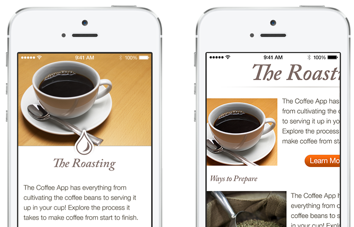
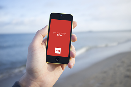
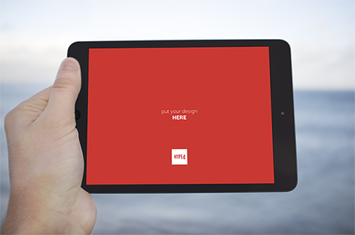
We are starting our own little photo library (avoiding the term stock on purpose, as our photos will be natural, human and real, instead of “plastic”). We are creating mockup-ready, natural environment device photos (in PSD format) that you’ll be able to paste your design into (a PSD smart object) so it’ll appear natural on the screen. The decision came to us because we always like to show our designs in the context of the device it was made for, but most stock photos of “iPhones in hand” are plain terrible. The photos will be taken in all possible settings (beach, mountains, cafe, home etc) and added over time. We will be selling them, but the prices will be VERY low.

Photoshop CS6 first impressions, bugs and awesome new features

photoshop cs6 new features

Photoshop CS6 was released quite a while ago, but as usual, the first versions are ridden with bugs and generally slow, so I finally bought the update yesterday and wanted to share my impressions about it. There was one annoying (very annoying) bug with Middle-Eastern typography setting (instead of East Asian) that I resolved, but more on that later. Now let’s get to what’s cool:

Continue reading

Bad typography = Bad User Experience (UX)

bad typography equals bad user experience

I watched a fair share of UX experts working away on their designs, moving rectangles into place and always worrying about the fold (on both the web and mobile). As expert as they all are I think they’re forgetting that typography and layout alignment are also a part of the UX design process.

Since they seem to worry about the fold the most (which is a silly thing of the past really – we do have scroll wheels now – we scroll!) and they try to cram as much content above it as humanely possible. According to those experts good UX is when font sizes are around 10-12 and plenty of links. That creates condensed, hard to read and chaotic layouts that are NOT good UX.

It takes the user much longer to process smaller text, small leading and paddings. That in turns make the whole Information Architecture suffer, as the user is skipping most of the information. And if he is, then why is it even there in the first place?

Creating forms in Axure or Balsamiq is one thing, but the important part of every good UX design is not to focus on just moving boxes around. It’s about what the user experiences. And small type with almost no white-space is simply not a good experience to look at.

Some say sure – but it’s a design thing, not UX. They couldn’t be more wrong. A graphic designer is in most cases a UX designer as well, just with a lot more imagination and sense of visual style. And since typography is mostly graphic designers domain, we can honestly say that all graphic designers (good or bad) are also UX designers (good or bad). Not to say that a lot of simple web / mobile interfaces could be designed without the mockup in the first place and just as fast.

You might have the best flow in your app, but when the text is hard to read the experience will be far from awesome.

And since we’re all UX (and graphics) designers now, it’s important to remember that unless it’s a photo/video app or site, type is STILL the most important part of both the message and the experience.

Why sticking to what user already knows in UX design is a wrong approach

pull to refresh UX

If there’s a way to do things and it has been in use for a long time, the users are more likely to understand that way and have a better experience. Easier too. UX people are usually using this one a lot, almost as a bible-quote. Sure – if something’s not broken why fix it, but that’s only one part of the story. The truth in mobile apps is, that Apple created a certain set of rules in 2007 that hasn’t really changed. Android followed with their ripoff own version a while later and both platforms.

So should we really follow only what users know and expect? Because if we did, we wouldn’t have Twitter’s “Pull to refresh” which is now ubiquitous. We wouldn’t have the twitter / facebook style slide-from-the-left menu panel and many, many more small tidbits.

facebook pull the side menu

Within reason it’s those who try new things, that are pushing the experience forward. And the only was is to go against the user sometimes. Of course it’s all within reason, but don’t let anybody fool you. If an UX designer is saying your idea is bad, just go and prove him wrong :) Unless you want the world to stand still.

CreationMachine is now Retina Laptop ready with Hi-Res artwork!

Retina display optimized blog

From now on all the new content on CM will be uploaded in Retina Display quality, so all you rMacbookPro users out there can rejoice. I have had the 13″ rMBP for a few days now and the display quality is simply breathtaking. More on that soon, with a review of the laptop and some shots, but for now let’s all look into the future, because the future is very sharp.

Android Apps can look good too! Community redesigns popular apps.

Android is not really famous for good designs of their Apps. In fact Apple mocks them all the time in their keynotes (especially the tablet scaled-up phone apps). There were some good ideas introduced to Android design with Holo, but still it feels as if most apps don’t really take it into account and are made by programmers without designers. WindowsPhone and iOS are way ahead of Android in terms of app design and that’s a fact. But that can still change! A google plus Android design community has put together some nice user redesigns of popular Android apps and the results are WAY better than the original apps. That means that there are skilled designers who understand the Android UI guidelines and can use them to create something that’s not appalling at first glance. Some of those apps look REALLY good. Let’s hope it spawns even more Android redesigns and the platform will finally get quality apps and not only cheaper, plastic phones from millions of manufacturers. Last.fm app redesign is up top, and here’s the original version below:

The new one looks much better doesn’t it?
You can see all the other works at
https://plus.google.com/u/0/s/%23ADiA%20%23Androiddesign

Font of the week – Signika Light / Signika font family

Font of the week signika

The Signika family is a beautiful set of typefaces made by Anna Giedryƛ. Signika is a sans-serif, gentle gentle font, developed for wayfinding, signage, and other media where clarity of information is required. And it sure does deliver, looking great especially on white backgrounds. It has a low contrast and tall x-height to improve readability of texts in small sizes as well as in large distances from the reader. It can also be used via Google Web Fonts and looks great online. In fact we’re using it for the body copy at Hype4 websites (blogs not included). Get it now at Google Web Fonts

Adobe Illustrator sucks! We want FreeHand back! Well sort of.

A while ago a group of dedicated Macromedia Freehand users created a petition to bring back the beloved vector image editor from the dead (or Adobe’s closet if you wish). Of course there’s no way in hell Adobe will admit that illustrator is not good enough, so they didn’t really go well with the idea of bringing a streamlined, easier to use and more intuitive vector tool back to the world. But fret not. Apparently FreeHand’s fans are really a dedicated bunch, because they’re making a “clone” of FreeHand, with modern features that would probably be added anyway if the software was still alive. The project is in development and there’s not much info available yet, but you can give the guys 25EUR to keep them both motivated and moving forward.

We think it’s a very cool idea, because let’s face it – the interface for Ai is dreadful. And since the Pixelmator Team didn’t start a vector app (yet?) we have to stick to what we hope will be the next best thing.

Check them out at : www.stagestack.com

Why are designers afraid of big fonts? Web readability practices

Back in the days when we had to design for 800×600 screen sizes, “The Fold” was somewhat as much feared as IE6’s ability to destroy layouts. Now it’s 2012 and we have 800×600 pixels and more in some mobile phones, and the web has settled for 960 pixel width layouts. But the Fold is still pretty strong in a lot of the designs.

On most websites a nice body copy font is considered to be somewhere close to 10-12 pixels, with the default leading. And usually to cover the fact that most web copy is just plain horrible, there’s a lot of graphics around the text, almost as if the main function (information) is loosing with the form (the graphics). It’s not readable. And I’m not talking about pink fonts on yellow backgrounds. I’m talking about most of the web.

It’s almost as if designers are afraid of making the content look legible. Maybe they’re thinking that if there’s more text than anything else in a design, they’re not really needed anymore? Who knows. The fact is that most of the web is terribly unreadable and actually painful to use.

And then came Flipboard with it’s pre formatting and changed some perspectives. Bigger fonts (between 16 and 24 pixels) came into play, and a leading of 1.4 em. Content consumption has become pleasant again. Apple added the “Reader” feature to Safari, and suddenly most websites are just a click away from being enjoyable!

Maybe it’s time to switch some perspectives and bring the web to it’s basic function (except porn) – reading stuff on the screen. And yes it can be a nice experience!

#000000 black doesn’t exist in nature, so it shouldn’t exist in design

Pure black is only pure when you close your eyes. In the dark

We have covered minimal design before, and every time we did the idea was to have black text on white background. Well, that minimalist approach was of course oversimplified, but a couple readers asked me about that, so here we go:

I stumbled upon a couple of blog posts recently about the issue and that made me think about it as well. The fact is that pure (#000000) black doesn’t exist anywhere in nature. Even if a surface is black, light hitting it makes it dark-grayish with a warm or cool tone. So it’s never really black, but we call it that.

Same with text. Black text on a white background creates A LOT of contrast (as high as it gets really) and that’s not very good on the eyes. The idea is to modify the extremes a little bit (both black and white) into some nice looking dark/light greys. If the general website palette is warm, we should have our “blacks” warm with a bit more red, than blue in them. If it’s rather cool, we’d add more blue to our black and have a black and blue design. Yay.

Pure black is also not good with other colours because it immediately catches the eye and distracts us from the rest of the content. I personally prefer even brighter blacks, than most designers, ranging from #2x2x2x up to #4x4x4x, with my “white” backgrounds being somewhere around #fdfdfd with a slight addition of either blue or red.

All in all toned down text is both readable and beautiful and it’s the first step to better typography. Let’s leave pure blacks to print, because after it’s printed it’s not pure black anymore (light is hitting the black making it grey too)

Is minimal design the best thing that happened to the web in years?

Corporations AND designers all over the world are switching to minimalistic, simple design

The web sure has gone a long way from it’s humble beginnings of blue, underlined links, serif fonts, animated GIFs (they now exist as something completely different) and patterned backgrounds. Well now we are seeing a rapid increase of so-called ‘minimal design’. The idea is to have a simple, once color background (preferably white). Gradients and textures are generally frowned upon. The site’s palette should consist of only a couple colours, and using more than two (or three) fonts is prohibited.

Everything is super readable, clear and well … minimalistic. That in turn gives the main purpose of the web a boost – to consume content, both video, text and imagery. Everything is easier to access and these sites generally load faster too.

Continue reading

Pixelmator 2.1 is here – alignment guides look awesome!

Another step closer to ending Photoshop rule

Sure it still has a long way to go, but at $15 Pixelmator is what their slogan says – an image editor for the rest of us. The amount of pro and semi-pro features though, put it a little above that line. And yes – it can open and edit PSD files. The new version added a couple of nice features, and one that is simply groundbreaking. But more on that later. First we get some vintage and depth of field effects that are a bit Instagram’esque, but higher quality. That’s the “for the rest of us part” – easily applying filters to our photos for them to get that “hipster look”. But what’s truly awesome about this release are the alignment guides – sure they’re sort of present in Photoshop, but not as precise and user friendly as here. This is the way to do guides, no questions asked. You can even align objects to the same spacing, as other on-screen objects have, along with precise pixel info right there on the image. This is awesome and hopefully PXM will get the much needed layer styles to become the image editor of choice for even more designers.

The App is available as a free update on the Mac App Store. Visit their site at www.pixelmator.com for some nice preview videos.

Buy/Sell your design elements and/or icons on Fol.io

There are many "virtual goods markets for designers" but here's another one with a twist!

We probably all have a “resources” folder somewhere at hand, with hundreds of icons, prefab panels, fonts and other design elements. It took years to collect them and we’re pretty proud, but it’d be cool to have an easy way of finding stuff we need right now. And here comes fol.io – it integrates with your mac and lets you find resources right from the topbar in a spotlight kinda way.

So far there aren’t many files there and not many are actually bought (it’s just started, let’s see how it develops), but with prices like $1 for a cartoonish drawing they’re quite in-reach for most designers. I just registered there and we’ll see what it has to offer to the sellers.

Check it out at fol.io

UPDATE
We have just posted our design pack there for $15 at http://app.fol.io/#/user/hype4

Attention! Details!

Apps are looking better and better!

I’m currently in the middle of putting the final touches on my first BIG mobile app. By BIG I mean it’s for a big, recognizable company, not a personal project. The sheer amount of brainstorming that went into that, along with ever-changing mockups and UX drafts led me to a conclusion that live app testing is crucial to have something stable and production-ready without too much hassle with updates. From platform UI paradigms to general aestethics mobile app design is no easy task. Sure the canvas is smaller and supposedly easier to do than say a web page, but there’s a lot more that can go wrong.

Maybe that’s because we’re a little used to things going wrong on the web and can look the other way, but we tend to criticize apps that don’t work as advertised. Exciting times ahead, since the mobile space has evolved with apps being able to do more and look better, even using platform specific components (if used creatively and with some twist).

If you want examples try Path and Foursquare for iOS – each uses the basic styles and elements, but with a twist that makes it both original and pretty.