Etsy – One of the not many good looking Android apps

Good design Android app - Etsy

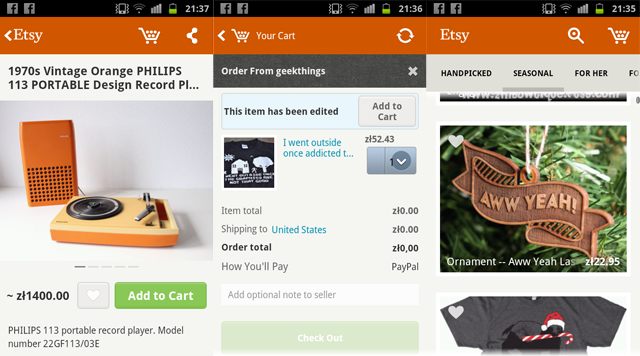
Etsy has released an Android app recently and I was pretty shocked, because it actually looks nice. Most of the Android apps I’ve seen are terribly ugly. That’s not really because of the UI difference from other platforms, but rather because developers for Android don’t really care about quality. They want to release many apps as fast as possible and cash the checks. Plus Google Play store is not as strict as iOS App Store when it comes to quality.

A lot of apps have fonts that are mis-aligned, weird spacings or lack of spacing, pixelated graphics or banding on gradients (that is a problem but can be fixed). So the main reason for Android apps looking relatively worse than iOS and Windows Apps is that the developers are lazy or they do the designs themselves without hiring an experienced designer.

That is a problem for the platform, even if people got used to apps looking ugly. By the way, I’m not saying that iOS has better UI than Android. Don’t really like gradients and gloss in iOS as well. That’s not the point. The point is that within those guidelines (or sometimes outside of them – completely unique apps like Flipboard) most iOS apps tend to look more refined than Android apps. You don’t see many apps on iOS that have their fonts glued to the left side of the screen without any padding. Or fonts that are not vertically/horizontally centred when they should be.

Good that Etsy (among some other apps that I’m hoping to find soon) is showing the world how Android apps should be done. Nearly everything here is perfect. Good fonts, good whitespace, right size icons and the right relativity of elements make it a very well designed and very refined Android experience. Hope to see more of that on the platform!

Do you know any good looking Android apps? Let us know!

You can download the app for free at: https://play.google.com/store/apps/details?id=com.etsy.android

Android Apps can look good too! Community redesigns popular apps.

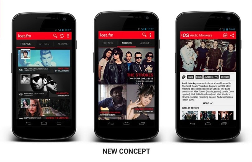
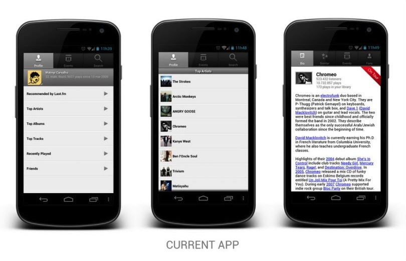
Android is not really famous for good designs of their Apps. In fact Apple mocks them all the time in their keynotes (especially the tablet scaled-up phone apps). There were some good ideas introduced to Android design with Holo, but still it feels as if most apps don’t really take it into account and are made by programmers without designers. WindowsPhone and iOS are way ahead of Android in terms of app design and that’s a fact. But that can still change! A google plus Android design community has put together some nice user redesigns of popular Android apps and the results are WAY better than the original apps. That means that there are skilled designers who understand the Android UI guidelines and can use them to create something that’s not appalling at first glance. Some of those apps look REALLY good. Let’s hope it spawns even more Android redesigns and the platform will finally get quality apps and not only cheaper, plastic phones from millions of manufacturers. Last.fm app redesign is up top, and here’s the original version below:

The new one looks much better doesn’t it?
You can see all the other works at
https://plus.google.com/u/0/s/%23ADiA%20%23Androiddesign

What if iOS design matched the iPhone design? (and it’s colours!)

iOS redesign

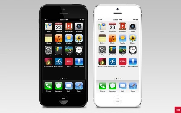
A few days ago Yves Behar had said, that Apple products don’t really fit the software, as if they were made by two completely different teams. The industrial design is clean, simple and futuristic, while the OS has skeumorphism with stitched leather and all that ‘fun’ stuff. He inspired me to see what would happen, if the software design matched the industrial design, with color-coded OS for each device. Apple has been under a lot of critique lately, due to keeping it safe and not introducing many visual innovations to their software. I’m not saying my design is better. I just wanted to see how it’d look like if the design matched the phone quite literally. So I created the Black and Grey + White and Silver versions of the OS for the iPhone 5.

You can see the whole project at: http://hype4.com/whatif

New Myspace Redesign is amazing!

New myspace

Remember MySpace? No? Well before Facebook (and yes there was a BEFORE Facebook) the most popular social network in the world was MySpace. It allowed people to customize their profiles with images and CSS, so each and every one was different. It was many things (music player, social media, bands promotion platform) but clean it wasn’t.

I still remember the horrible glitter backgrounds and green type on pink backgrounds. Yuck! Since Facebook came to life with it’s “clean&boring” design, MySpace was slowly dying, even with one of the biggest indie music collections in the world onboard. Well now they’re redesigning it (again) to be a mix of a music service, pinterest-que type photo viewer and in general a social network for the creatives – photographers, musicians, designers. And of course “fans”. Take a look at the screenshots after the break – it looks impressive and really clean + modern. Good job MySpace!

Continue reading

iPhone 5 it’s almost … retro?

A while ago we talked about the fact that some recent UI design changes Apple made weren’t really that fortunate. When they replaced the iPod app with the “Music app” (which is actually a better name) they also went with an extremely UGLY icon that didn’t really match the rest. I mean come on, a dark and suspiciously thin note on an orange background just doesn’t do it for me. The Phone app, the messsages, the App store – they all have white icons on colorful backgrounds. This Music icon just doesn’t fit. At all. We’re not sure yet if it’ll be changed (but we seriously hope so) in iOS6, but it’s only a few more days to find out.

Right now take a look at that awesome retro-Mac icon set for the iPhone. Maybe Apple should go for that look? And we’d see Black&White pixel icons on Galaxy S4 ;)

A 3d racing wipeout clone made with HTML5 + WebGL

HTML5 is showing it's middle finger to Flash

It’s been a steady decline for Adobe Flash technology over the last few years. But in some scenarios it still stood pretty strong – one of them being games. Flash games exploded on the internet with many great titles (canabalt for example) and many not-so-great ones. When HTML5 took over web video as a better and more efficient player, games were still mostly a flash domain. Apparently that’s changing too, with Microsoft making HTML5 version of some Atari Classics and this WebGL wipeout clone that works extremely well in-browser on a 2011 11″ MacBook Air.

You’ll need a WebGL enabled browser (Google Chrome or Recent Firefox). Go to http://hexgl.bkcore.com to check it out!

In a few years Flash will probably cease to exist altogether if people can pull off things like that in HTML5 and WebGL. Good riddance!

Microsoft goes for a (semi) radical logo redesign

Microsoft logo evolution 25 years
We might've been expecting that to happen, so meh...

It’s been long since MS redesigned their brand, but we’ve all seen it coming. Introducing the metro windows 8 interface with colorful tiles and nice typography, MS went ahead to further afirm the choice by changing it’s main brand logo to reflect that. Now it’s just 4 colorful tiles with Microsoft written in Segoe font next to them. While it might not be the most creative thing out there, it fits with the brand and the future chosen by the Redmond company. They kept the F and T connection in this one, which probably is supposed to suggest the evolution. Redesigns of big brands do happen quite often, as seen below.

And here’s a 4-step revolution from Apple:
Apple Logo Evolution

And one by Google:
Google logo evolution

New Outlook.com email is stunning!

Finally a worthy competitor to Gmail!

Microsoft is really pushing the metro interface (it’s not supposed to be called metro anymore – they’re thinking of a new name) with tiles, colors and beautiful typography. That purely digital, modern approach is finding it’s way in other places, and right now it came to the fully redesigned hotmail little brother – Outlook.com.

The site features skype video calling, facebook integration and a super-clean email experience with no ugly MS ribbons and cluttered menus. This looks so good, that it’s possibly the very best design in web email clients anywhere.

That clean, uncluttered interface IS the future and I seriously hope that Apple will tune down those skeumorphic designs at least a little bit. Since it’s all digital anyway, maybe it’d be best to accept it and become digital design-wise.

Besides it works well from the usability standpoint since it’s all clear, visible and easily accessible. The only thing I don’t quite like is the choice of colors. Maybe MS could tune down those hard colors a bit, or give the users a choice to just type in a hex color themselves. That’d be awesome. Well anyway – since it’s just launched maybe it’s a good time to go and “reserve” your name on there? www.outlook.com

Mac OS X Lion made in pure CSS3!

This is a stunning example of how the web can look in a few years

Some people seem to have a bit too much time on their hands, but let’s not complain because their work is astonishing. A while ago we’ve seen iPad running inside the browser, that was made with CSS3, and now here’s Mac OS X Lion, with even the login screen included. It’s a work in progress by a designer by the name Alessi Atzeni, and you can see it for yourself at:
http://www.alessioatzeni.com/mac-osx-lion-css3/