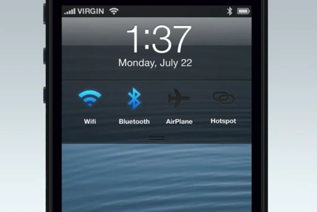
With project “Innsbruck” – the apparent Jony Ive led iOS redesign – just a few months away, the web is speculating extensively what will the changes bring. People are speaking of flatter designs, less gradients, shadows, leather, wood and all the other Skeumorphic stuff and that is all good. Purely digital, flat designs are all the rage right now thanks to Microsoft’s innovative approach to Windows. Soon after that, Android and google iOS apps got some nice “flattening” treatments (coincidence? ;)).
The funny thing is that Microsoft is praised so much for the design of it’s system, yet most users choose either iPhone or Android anyway. There’s also one more problem with radical change – unless it’s something really new and great, it will simply be compared to being a Win8 ripoff. And does Apple really want to be the company that copies others?
There’s also the problem of the app-stores – I don’t expect all the developers changing both their apps and their icons to be more “minimal” in any way. And that will bring great inconsistency.
But all that aside I’d be happy to see Skeumorphism go, but it doesn’t necessarily need to be towards superminimal-flat design. It can be something in between that compliments the hardware well. You know, kinda like we tried with that color-coding the OS to the Phone’s color thing back a few months.