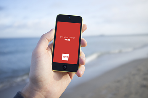

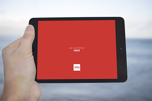
 We are starting our own little photo library (avoiding the term stock on purpose, as our photos will be natural, human and real, instead of “plastic”). We are creating mockup-ready, natural environment device photos (in PSD format) that you’ll be able to paste your design into (a PSD smart object) so it’ll appear natural on the screen. The decision came to us because we always like to show our designs in the context of the device it was made for, but most stock photos of “iPhones in hand” are plain terrible. The photos will be taken in all possible settings (beach, mountains, cafe, home etc) and added over time. We will be selling them, but the prices will be VERY low.
Category Archives: Inspiration
Bob Dylan comes back to the techno-reality with “Like a rolling stone” interactive music video
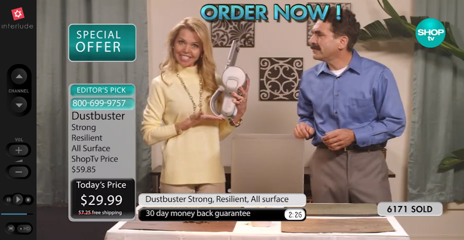
I never considered Bob Dylan to be Tech Savvy, aside from doing ads for Apple a while ago, but apparently the man has still some cool ideas. Sure it took quite a few years for Like a Rolling Stone to get a music video, but it was well worth the wait. The video is interactive and actually fun to use + no two people will get the same experience the creators claim. Check it out at:
Windows Phone Navigation idea mockup (UI + UX)
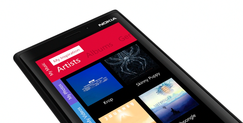
I am currently a happy user of a Lumia Phone. The idea for the switch from my trusty old iPhone 4S was simple – I wanted to learn & feel the platform since I need to design for it as well. After a few days of playing with the OS I can honestly say I like A LOT. The lack of quality third-party apps is the biggest drawback, but all-in-all it’s a very well designed OS both visually and in the UX (those animations are just lovely)
But while playing with the OS an idea formed in my head about a tabbed-not-really-tabbed interface that would both fit the platform and be unique to it. Putting thoughts into pixels was the easy part after that and hence my tabbed-UI for Windows phone mockup was born.
How iOS 7 icons SHOULD look like

The biggest controversy with iOS 7 is probably the super-ugly set of homescreen icons (especially safari, but also the fact that most icons simply are too big within the rounded-square boundaries). One designer decided to take a stab at it and redesigned the icons (on the left) vs their original ones. We think this looks MUCH better! What do you think?
Check out the full size image and give props to the designer (Leo Drapeau) at His dribbble profile
Inspiration: Cool advertisements (ads)
Why sticking to what user already knows in UX design is a wrong approach
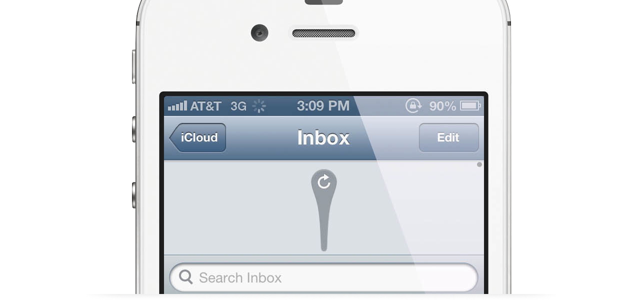
If there’s a way to do things and it has been in use for a long time, the users are more likely to understand that way and have a better experience. Easier too. UX people are usually using this one a lot, almost as a bible-quote. Sure – if something’s not broken why fix it, but that’s only one part of the story. The truth in mobile apps is, that Apple created a certain set of rules in 2007 that hasn’t really changed. Android followed with their ripoff own version a while later and both platforms.
So should we really follow only what users know and expect? Because if we did, we wouldn’t have Twitter’s “Pull to refresh” which is now ubiquitous. We wouldn’t have the twitter / facebook style slide-from-the-left menu panel and many, many more small tidbits.
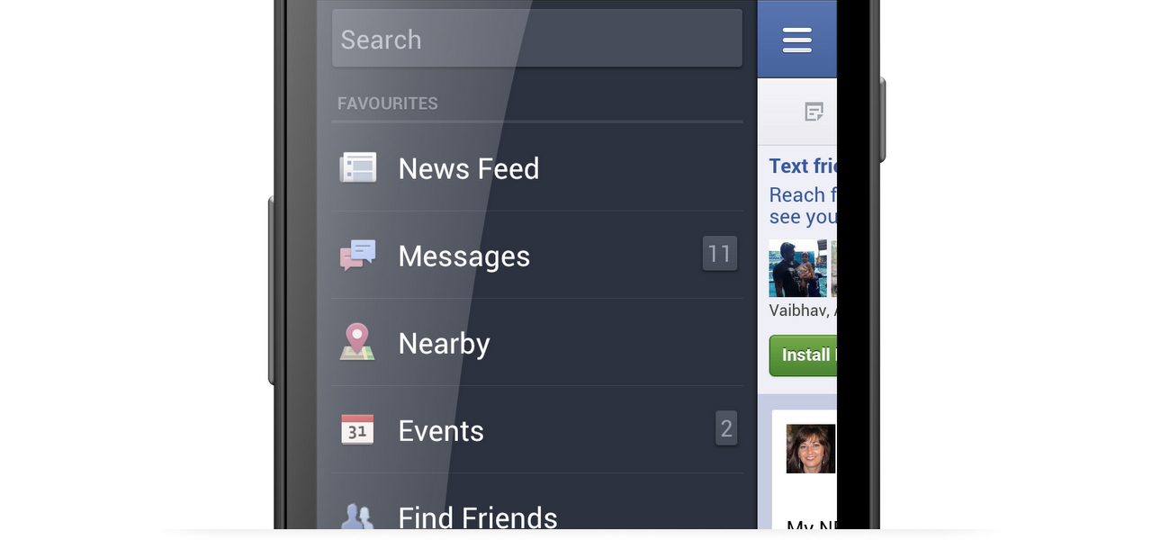
Within reason it’s those who try new things, that are pushing the experience forward. And the only was is to go against the user sometimes. Of course it’s all within reason, but don’t let anybody fool you. If an UX designer is saying your idea is bad, just go and prove him wrong :) Unless you want the world to stand still.
Inspiration – A set of Non-minimal business cards
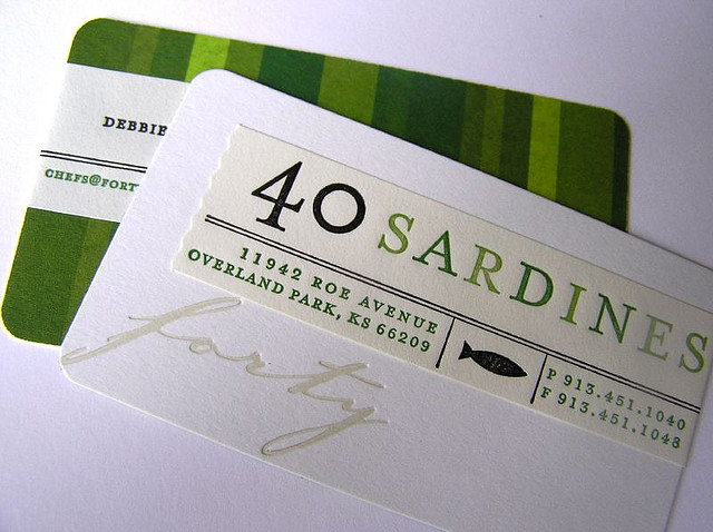
Who said they need to be clean and simple? Well I did. But sometimes going a little bit overboard can yield interesting results and catch attention, which sort of is the sole purpose of a business card.
Clever and beautiful package designs
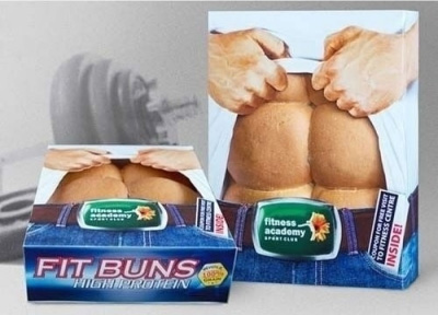
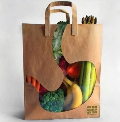
Here are some very cool and innovative ideas for package designs. Product packaging doesn’t have to be boring and these will catch attention on every store shelf.
The 4 best designed Android Apps (Top list)
I’ll be honest, etsy shook my world a little bit because it looked far better than any Android app I’ve seen so far. And if there’s one there might be more, right? So I went out and searched for best designed Android Apps and while the list is not long (yet) at least there’s more than one non-stock beautifully designed App for the green robot. So let’s start, shall we?
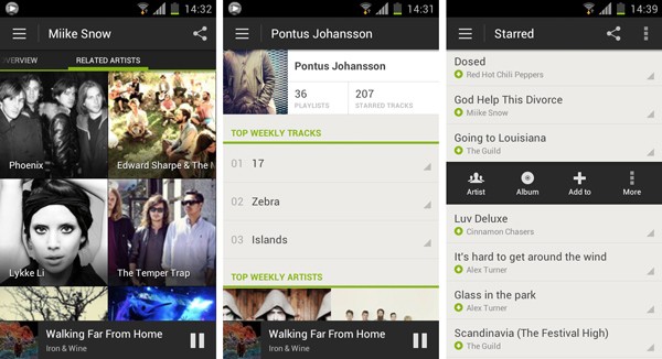
1. Spotify
Spotify takes the first place and leaves the competition far away (have you seen that terrible Android Last.fm app? Exactly!). Here we have Android style UI with a lot of attention to detail, great font alignments, spacings and an overall refined look & feel. Too bad that’s just one app and not the entire Google Play offering…
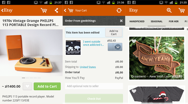
2. Etsy
We covered Etsy last week and we believe it still deserves a place among the best designed Android apps, so here it is.
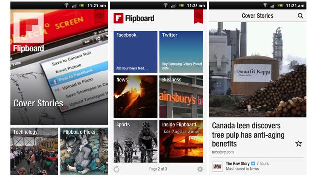
3. FlipBoard is another example that has been transferred from iOS with high precision. It looks almost exactly the same and it’s a good thing because it didn’t use the standard iOS guidelines anyway, so it translates well for any touch platform.
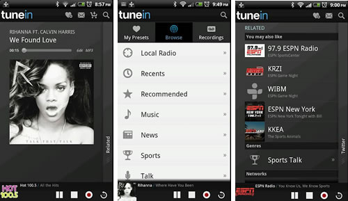
4. TuneIn Radio
A simple and clean app can be free of annoying design flaws like fonts touching the edge of the screen with no padding. Whoa! That is actually something on Android!
Do you know any other beautiful Android Apps?
Hype4 iOS redesign project on Behance
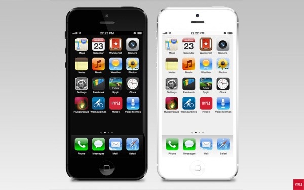
A while ago we created an iOS redesign project, to see what would the OS look like if the colours matched the iphone chassis colour. The results can now be viewed on Behance. Dont forget to Appreciate it ;)
What if Zombies took over the logo design?
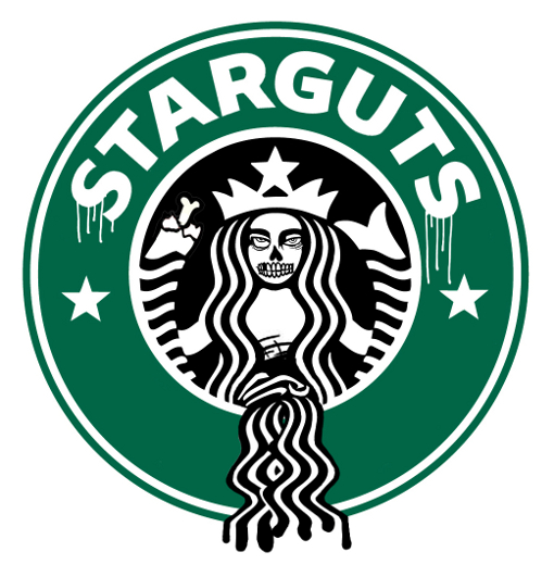
Designer Ben Fellowes created zombie versions of popular brands. Starguts and Fed On are my favourites. Here they are:
Clients do come from hell sometimes – funny Client quotes from SharpSuits!
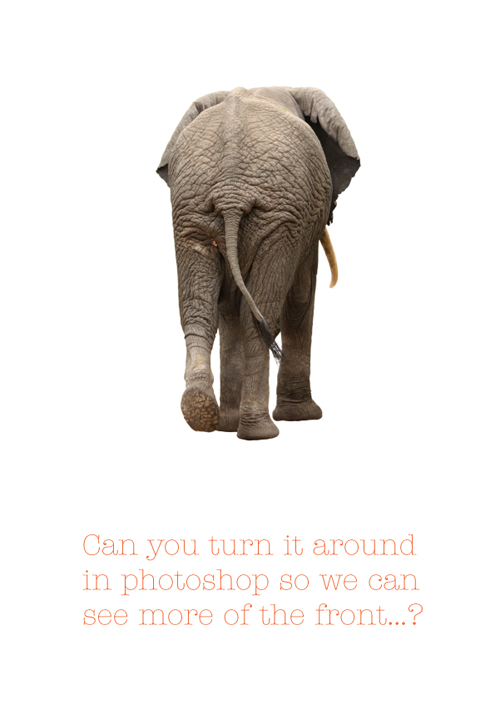
Guys at http://sharpsuits.net/ have put together an amazing gallery of client quotes. How many of these have you encountered yourself? I had almost all of them at some point but the most memorable is the elephant one. It really DID happen! More after the break.
Minimal drink and beverage packaging designs
Today we have some nice minimalist packages (bottles and cans) of drinks and beverages. We think most of the packaging on store shelves is extremely overcomplicated. We prefere these:

