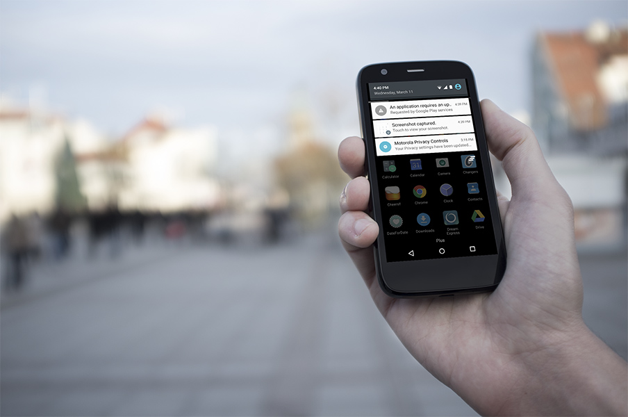
Finally Moto G First Gen users can play with the new Android release. So far it seems quite stable and visually better indeed. Material design was actually present on the Moto G even on 4.4.4 with most Google apps taking cues from it. Now we also have all the nice animations and transitions and the good thing is that they run smoothly even on a budget phone like the Moto G.
Category Archives: Mobile
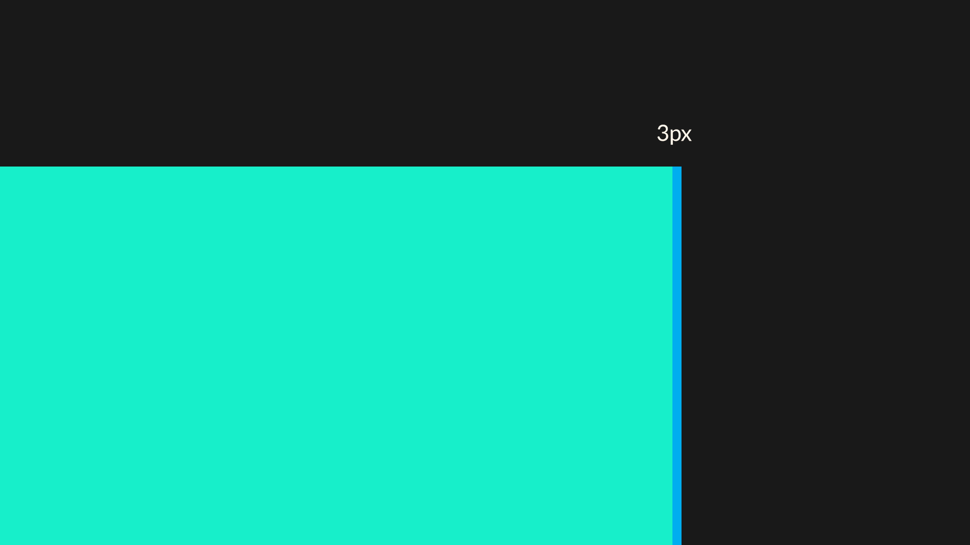
Apple iPhone screen fragmentation and the missing 3 pixels
When apple switched from the 4:3 aspect ratio on the iPhone 4S, to the 16:9 ratio of the iPhone 5, the world accepted it as a fact.
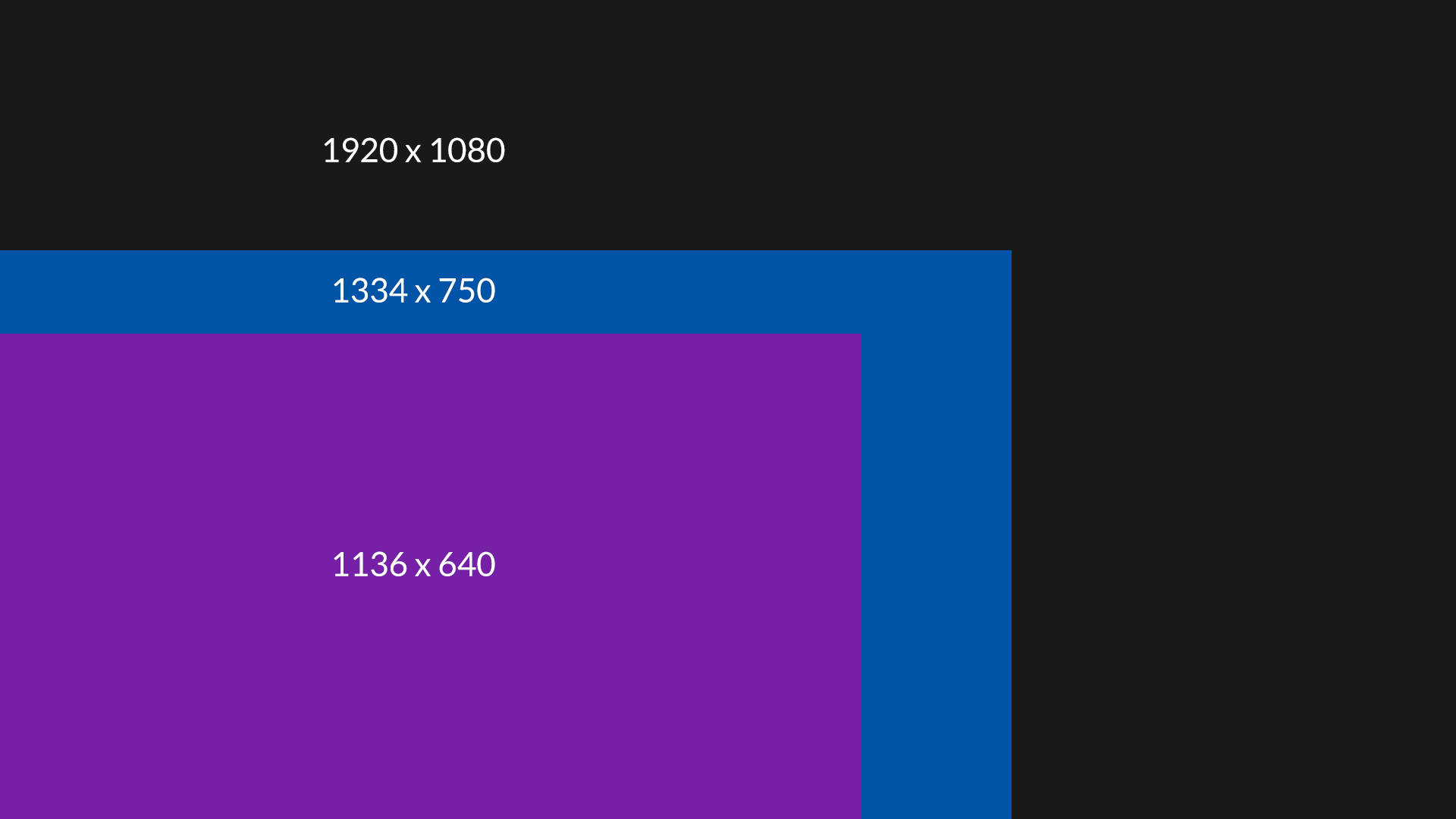
Now, when we have two new resolutions we can start thinking about iOS fragmentation. Apparently both the iPhone 5, 6 and 6 plus have a 16:9 aspect ratio. With the respective resolutions of 1136 x 640, 1334 x 750 and 1080 x 1920, we would expect we can scale the top resolution down and get the middle and lowest one. No suck luck.
When we scale 1080p down to 750 pixels, we get 750 x 1333. We are missing one pixel.
It get’s even weirder when we scale it down from 750 x 1334 to 640, because the height appears to be 1138. Now we are gaining two pixels.
Scaling up from 640 to 750 yields 750 x 1331 pixels – so loosing two.
Of course it’s all roughly 16:9 every time, but the problem is that even when you created your app fully on vectors, you can’t simply resize the canvas because you’re missing pixels on every resolution.
Bad move apple :(
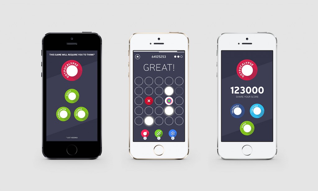
Our next iOS arcade game – “Dotpocalypse” is coming very soon
We are happy to announce our second iOS game – Dotpocalypse. It’s coming VERY soon and will be free with in-app purchases. The second game is very flat and minimal for a difference, while the most important part of it to be as fast and accurate as possible. Without spoiling any more details, we’ll post a link to the game when it’s released this February.
We played around with quite a lot of ideas and concepts, and yes – we are working on a moody, atmospheric and story driven game. We wanted to release something simple and minimal first and now it’s almost there.
iOS 7 Beta 5 brings elements that are color coded to the iPhone color
We did a couple of mockups a year ago of what it would be like, if iOS matched the color of the phone it’s running on. You can see the whole project here, but what’s interesting is that Apple actually started going in that direction itself. The first thing you see after you turn your iOS device on, used to be a black screen with a white Apple logo in the middle. Well it still is, but only for Black iPhones. For the white ones the screen is inverted, so there’s a black apple logo on a white background. It seems that our idea wasn’t really that farfetched.
Lumia 920 rocks!
Thanks to some nice people (you know who you are :)) I now have a Lumia 920 and all the praise I gave the 820 applies here too. But in many respects this phone is even more awesome. I’m seriously in love! Finland might be cold and far away, but they do have some top-notch designers over there. This phone is beautiful in every aspect. The plastic shell doesn’t feel cheep like on Samsung devices, and it doesn’t feel cold and machined like the iPhone.
The OS is fantastic but that part didn’t change much from the 820. The only two things that did change are the camera (take a look at that low light photo! A little shaky, but far ahead of any smartphone) and the screen resolution which is now above 320 ppi.
Both of those things make the 920 the best phone I used so far. It’s really an object that I simply like to hold and use. Let’s just hope it catches more wind as Microsoft and Nokia both deserve praise for the software and hardware respectively.
My thoughts after using Windows Phone 8 for 10 days
I’ve been what some people call “an Apple Fanboy” since 2005. That year I bought my first iPod and then the addiction started. I had the first iPhone in 2007, went through 4 Macbooks and 2 iMacs, 3 iPads and countless iPhones. I tried using an Android Phone (Samsung Galaxy S) for a few weeks but it failed to meet my expectations (and was ugly). Android might’ve changed since then (I am aware it did) but recently something else has swayed me in yet another direction. Yes – for the last 10 days I’m a Nokia Lumia 820 user and I really like it.
Why switching now? Well – iOS 7 is the main reason. I know it’s a beta, I know it will change a bit. But the main reason that I don’t like it is that it lacks contrast and it’s really dishonest. It pretends to scream simplicity, but it’s lost between the blurs and gimmicks and from afar most apps are hard to tell from one another. I don’t think it’s a good design (and I’m a designer for over 10 years now). That’s why I wanted to try a truly flat, modern and innovative UI. The choice was obvious.
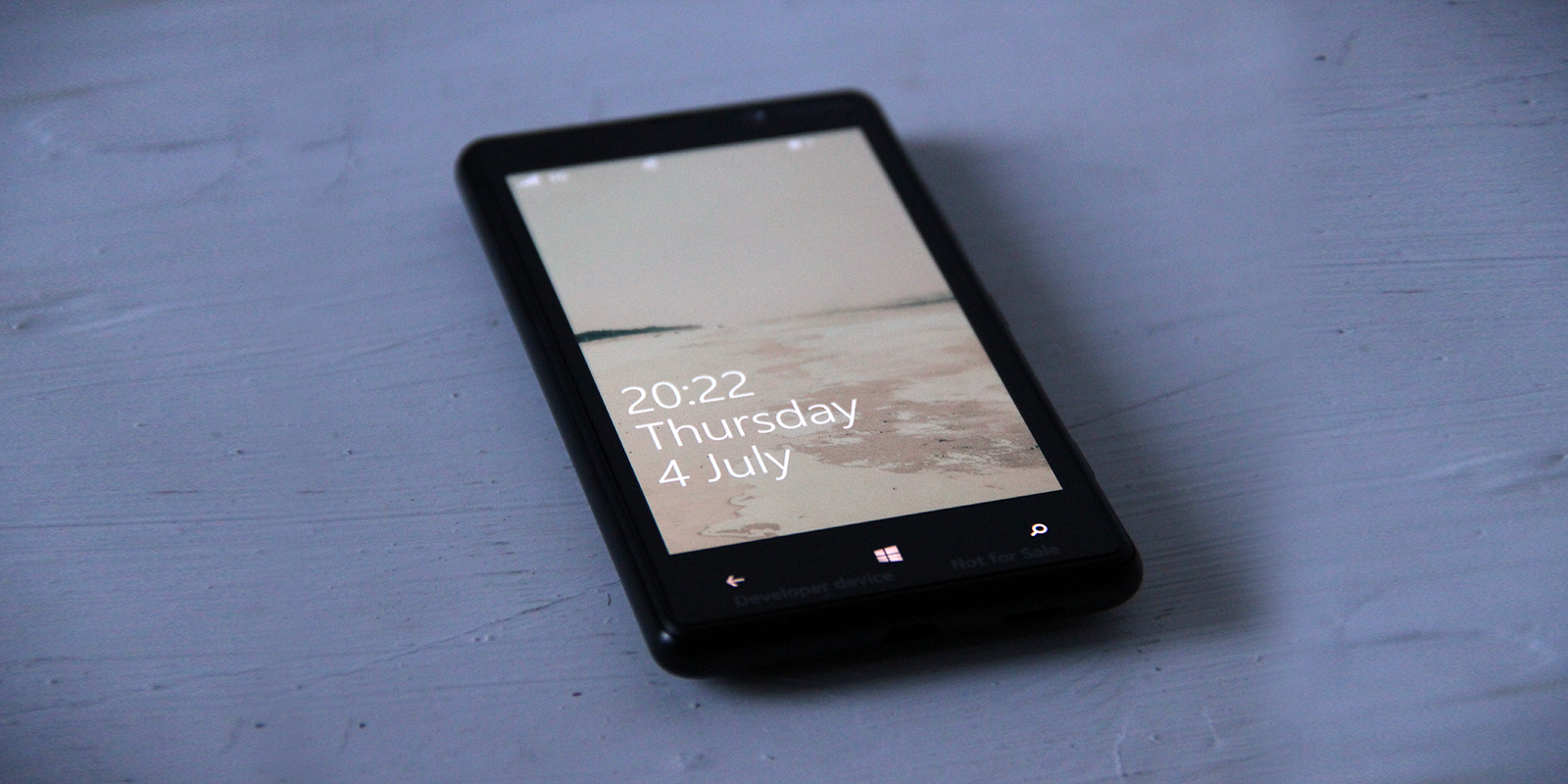
There’s a lot of praise for great typography in Windows Phone and in most cases it’s completely true (unlike iOS 7 and that super thin Helvetica Neue). Just take a look at the lock screen. It doesn’t need animated backgrounds – it’s beautiful with just the text, and the fonts are super crisp. Sure – in some places the typography could still be improved, but Windows Phone is currently the most modern and visually clean mobile OS.
Windows Phone Navigation idea mockup (UI + UX)
I am currently a happy user of a Lumia Phone. The idea for the switch from my trusty old iPhone 4S was simple – I wanted to learn & feel the platform since I need to design for it as well. After a few days of playing with the OS I can honestly say I like A LOT. The lack of quality third-party apps is the biggest drawback, but all-in-all it’s a very well designed OS both visually and in the UX (those animations are just lovely)
But while playing with the OS an idea formed in my head about a tabbed-not-really-tabbed interface that would both fit the platform and be unique to it. Putting thoughts into pixels was the easy part after that and hence my tabbed-UI for Windows phone mockup was born.
Former Apple designer redesigns iOS 7’s icons
Louie Mantia is a former Apple icon designer, so he actually has even more right to do that thing every designer now does. You know – redesigning iOS 7 icons. And since he has worked on some of the original pre-iOS 7 icons too, he has both the skills and the knowledge on how good icon design works. The fact is that it actually does look much cleaner and nicer, but also a little confusing, because if icons all shared that very consistent style they’d be harder to process by our eyes. So there are compromises everywhere I guess. But still worth a shot, I especially like the safari icon.
You can see his Dribbble post here
How iOS 7 icons SHOULD look like
The biggest controversy with iOS 7 is probably the super-ugly set of homescreen icons (especially safari, but also the fact that most icons simply are too big within the rounded-square boundaries). One designer decided to take a stab at it and redesigned the icons (on the left) vs their original ones. We think this looks MUCH better! What do you think?
Check out the full size image and give props to the designer (Leo Drapeau) at His dribbble profile
iOS 7 screenshots and design review
We installed the new iOS 7 right away and we wanted to share both our thoughts and a nice set of screenshots from the release with our readers along with some commentary where we think it’s necessary to say something. Overall we have mixed feelings about the new OS design. Some elements are simply stunning (blurred navbars and tabbars), while some look like they’ve been done in a rush (the safari icon, the Control Center arrows are way too thick and so forth). On a side-note Apple also now allows developers to transfer their apps to another developer account. That can be handy – I hope Rovio transfers Angry Birds to me based on a typo ;)
What we like
The blurred, semi-transparent backgrounds of some elements are just plain stunning. We also like the general white tone of the OS that differentiates it from all the competition (both Windows Phone and Android are much darker). Siri looks simply stunning. The new UX features in Safari (pulling down for an unified search / address bar rocks!). The new keyboard is also pretty sweet looking. The lockscreen and weather (the do share a common aesthetic) are also beautiful. So is the new search bar and folder view. An oh the music icon finally has a white note one it! Just as we hoped it will!
What we don’t like
There’s still A LOT of inconsistency between all the apps. They have different font sizes and spacings, different color schemes (the keyboard sometimes changes the color too) and some of the new icons are plain ugly. There’s also a big inconsistency within the icons – some have very soft gradients while others – like mail, have hard and long gradients on them. Instead of unifying the look it makes it actually just as distracting as before. Apple showed some pretty advanced font alignments (with rulers and measurements and stuff) but all in all in some places the fonts really look out of place. Sometimes it’s better to judge things by the eye than with the numbers apparently. Some elements in the presentations were also pretty off (like the headline above the AirDrop bubbles – it’s not in the center of the screen but more to the left and it shows!). The control center arrow is WAAAAAY too thick and it looks out of place there visually. Also the messages are bulky and too close to each other. The whole messaging app doesn’t have enough breathing room (white space) and they don’t really look refined at all. More like a quick mockup as the internal paddings of the messages are way too big, while the external margins are way too small… Also some tab-bar icons are only blue when active (app store and contacts) while others are all blue (safari and maps).
What we’ve noticed
The icons are more rounded now which also changes the perception of the homescreen a bit. Also the contacts have now been put inside circles. This is actually a bit odd as there are not many circles anywhere inside iOS (the icons, even when more rounded are still rounded squares). But the circles do look nice. Some icons have thicker edges than others, some are very narrow and some are very wide. That all creates a bit of inconsistency.
Our judgement
We think it’s a step in an interesting direction but this is not what we’d expect from Apple. There’s too many little mistakes or weird, mismatched elements and inconsistency for my taste. But since it’s the first version of a developer beta we think a lot of the stuff will be refined in the final version and maybe that’s the idea Apple has – to get some good feedback now and refine iOS 7 for the fall release.
Screenshots
And here are some screenshots we took today:
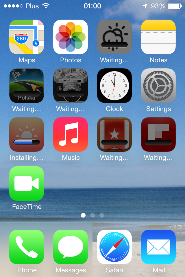
More after the break.
iOS 7 redesign and white icons
We have discussed earlier that Apple has had some poor color choices for it’s icons – namely the desktop iTunes icon and the iOS music app icon. The iOS music icon especially should have the notes in white like it was before, and apparently with all the upcoming iOS 7 visual changes it finally will. We’ll keep you posted on the design updates as soon as they appear.
Fingers crossed for some visual goodness and cool new UX ideas because we don’t want another Android or Windows phone with just going minimal. If it indeed goes minimal we want it to be unique :)
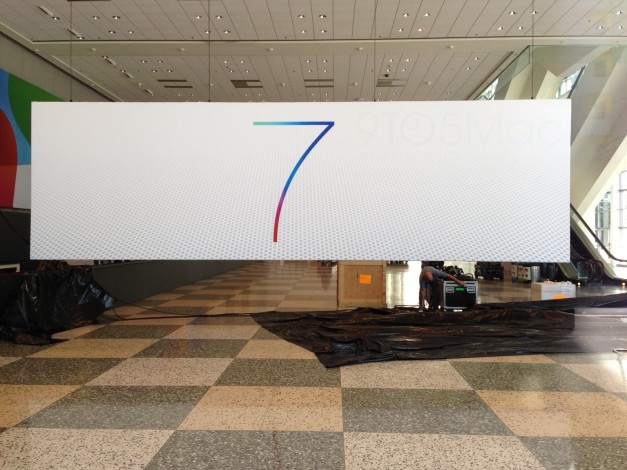
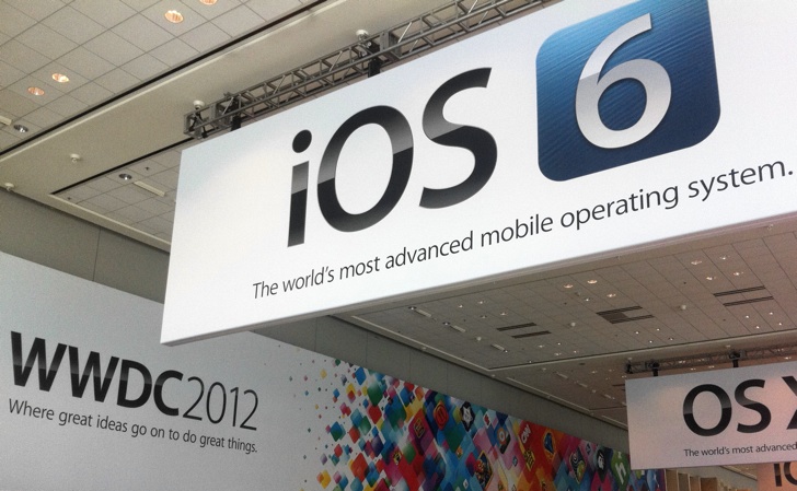
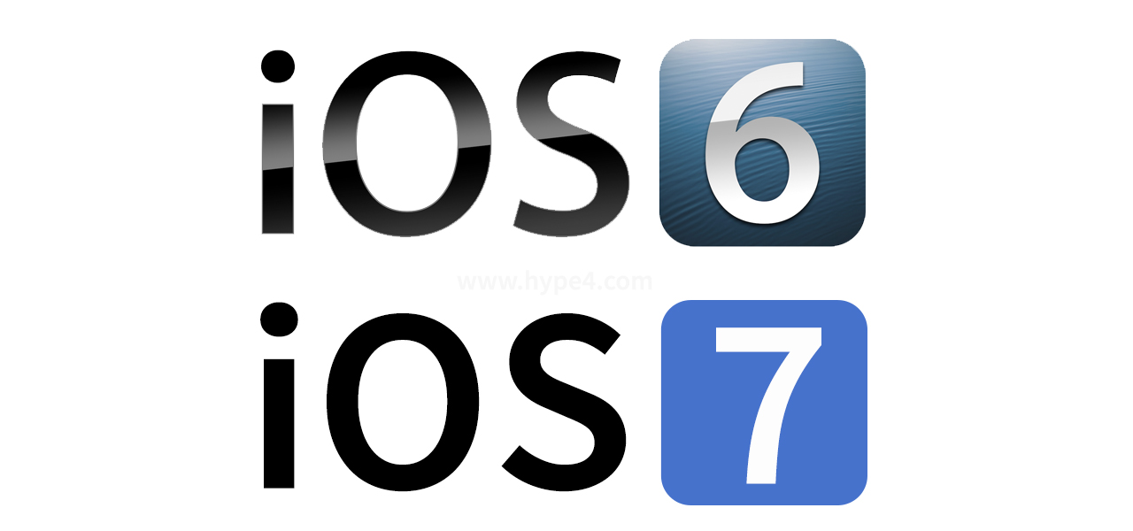
iOS 6 vs iOS 7 banners comparison
The hype is building up before WWDC this year about major redesigns for both iOS and OS X (which is unlikely especially since Apple has pulled engineers from OS X to deliver iOS on schedule, and OS X is by far a more complex OS)
We think it’s a cool direction for both iOS 7 and OS X (what cat comes after Mountain Lion? Anybody knows?)
People say “modern, flat designs are all the rage” which is of course true, but looking back they actually always were. They’re just being refined as people understand the technology, hi-dpi screens and touch inputs more and more.
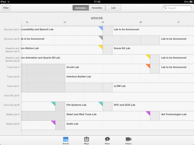
Did Apple show iOS 7 design in the WWDC App?
There has been a lot of speculation about how iOS7 will look like this year and apparently Apple gave us a hint releasing the updated WWDC calendar app. It’s going to be white – everyone said. The whole iOS 7 will be white as snow! Yeah, well, maybe. But judging it just by the WWDC app is not really the right option, because it had a different, white design since last year. And when it was announced last year ahead of WWDC everyone sang the same song – the new iOS 6 will be whiter and flatter and prettier because of the WWDC app!
And guess what? It didn’t change at all then. This year we’re almost sure it will, but let’s wait and see, because the WWDC app is at some points pretty nice looking, but it has it’s flaws that can be forgiven for a one-time event app, but not for the whole OS that everyone will use at least for a year. Take a look at those oversized fonts in the sections (they almost don’t fit). There’s very little whitespace in many screen sections too. Also the font stayed the same.
So what I think is that this whole “whitening” might actually happen inside iOS 7 because most OS’es are actually dark, but it will probably not look this way. This is a slightly different app from the rest of the OS for at least a year and even though parts of it look promising, as a whole it’s a typical iOS 6 app.
iOS 7 will be flat and more modern apparently says Jony Ive
With project “Innsbruck” – the apparent Jony Ive led iOS redesign – just a few months away, the web is speculating extensively what will the changes bring. People are speaking of flatter designs, less gradients, shadows, leather, wood and all the other Skeumorphic stuff and that is all good. Purely digital, flat designs are all the rage right now thanks to Microsoft’s innovative approach to Windows. Soon after that, Android and google iOS apps got some nice “flattening” treatments (coincidence? ;)).
The funny thing is that Microsoft is praised so much for the design of it’s system, yet most users choose either iPhone or Android anyway. There’s also one more problem with radical change – unless it’s something really new and great, it will simply be compared to being a Win8 ripoff. And does Apple really want to be the company that copies others?
There’s also the problem of the app-stores – I don’t expect all the developers changing both their apps and their icons to be more “minimal” in any way. And that will bring great inconsistency.
But all that aside I’d be happy to see Skeumorphism go, but it doesn’t necessarily need to be towards superminimal-flat design. It can be something in between that compliments the hardware well. You know, kinda like we tried with that color-coding the OS to the Phone’s color thing back a few months.
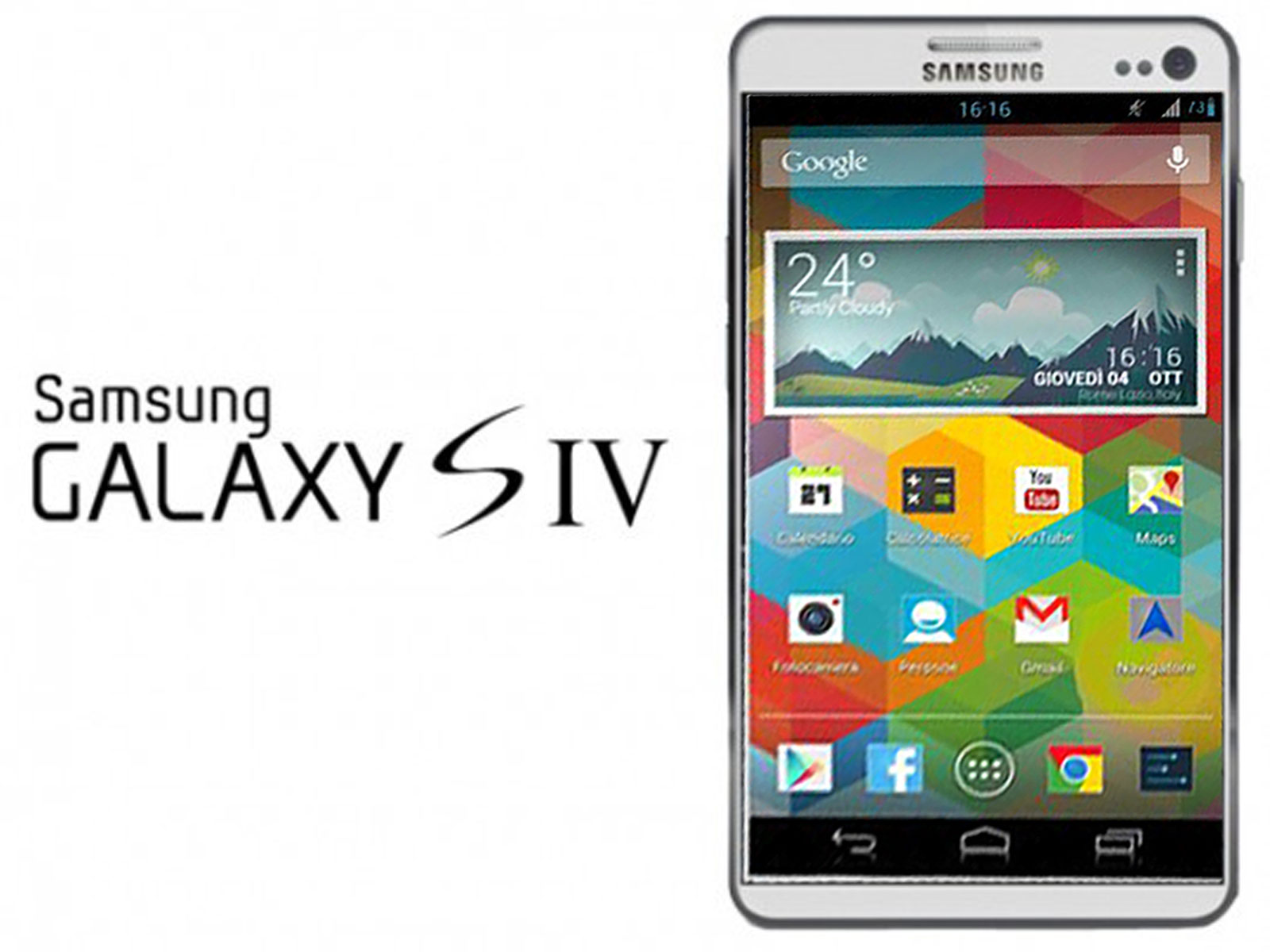
Samsung Unpacked Galaxy S4 event – it’s all about software
While watching the Galaxy S4 event (aside from the amazing production values and money spent) I realised that right now the megahertz and gigabytes are not as important anymore. Come on – the new Galaxy S4 has the same amount of internal drive (16gb) as an iPhone from 4 years ago. But the most promoted features were some smart ways to use the phone.
Maybe Samsung has finally learned that adding megapixels and megahertz can get you so far. Right now it’s all about software and apps. That’s VERY good :) It’s all about software people, not the plastic hardware ;)
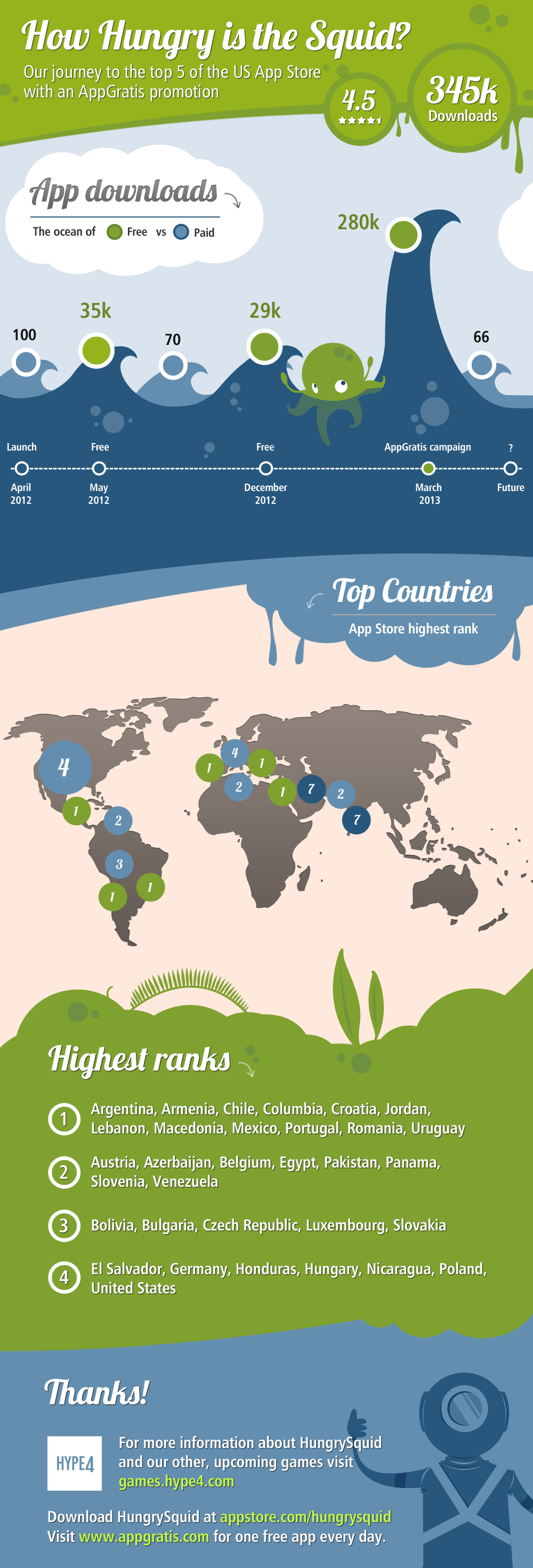
App store promotion infographic
Here’s how HungrySquid did with an AppGratis promotion in late February 2013.