Bad typography = Bad User Experience (UX)

bad typography equals bad user experience

I watched a fair share of UX experts working away on their designs, moving rectangles into place and always worrying about the fold (on both the web and mobile). As expert as they all are I think they’re forgetting that typography and layout alignment are also a part of the UX design process.

Since they seem to worry about the fold the most (which is a silly thing of the past really – we do have scroll wheels now – we scroll!) and they try to cram as much content above it as humanely possible. According to those experts good UX is when font sizes are around 10-12 and plenty of links. That creates condensed, hard to read and chaotic layouts that are NOT good UX.

It takes the user much longer to process smaller text, small leading and paddings. That in turns make the whole Information Architecture suffer, as the user is skipping most of the information. And if he is, then why is it even there in the first place?

Creating forms in Axure or Balsamiq is one thing, but the important part of every good UX design is not to focus on just moving boxes around. It’s about what the user experiences. And small type with almost no white-space is simply not a good experience to look at.

Some say sure – but it’s a design thing, not UX. They couldn’t be more wrong. A graphic designer is in most cases a UX designer as well, just with a lot more imagination and sense of visual style. And since typography is mostly graphic designers domain, we can honestly say that all graphic designers (good or bad) are also UX designers (good or bad). Not to say that a lot of simple web / mobile interfaces could be designed without the mockup in the first place and just as fast.

You might have the best flow in your app, but when the text is hard to read the experience will be far from awesome.

And since we’re all UX (and graphics) designers now, it’s important to remember that unless it’s a photo/video app or site, type is STILL the most important part of both the message and the experience.
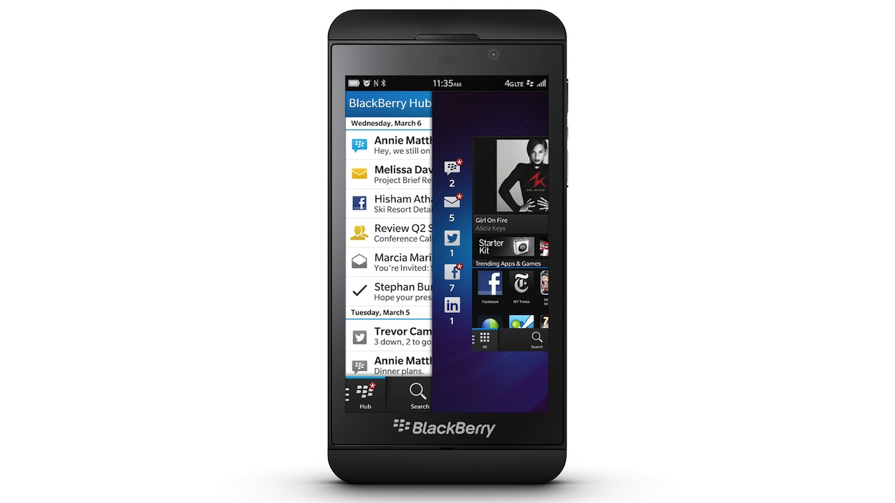
Blackberry OS 10 finally has a design voice, isn’t it too late though?

BlackBerry 10 OS design language

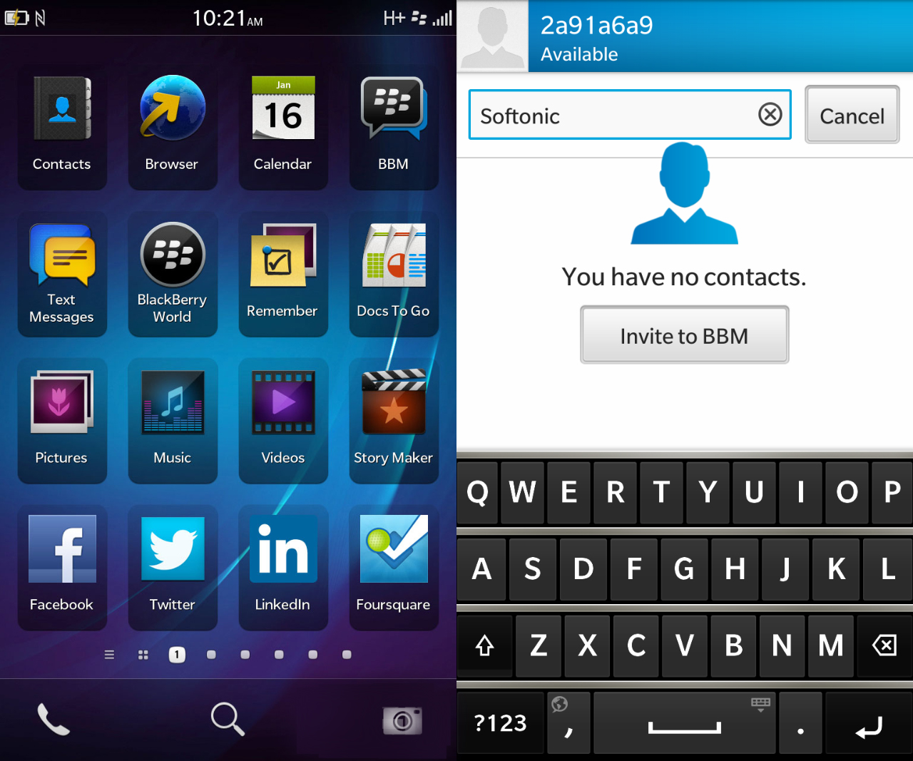
You might say what you want about BlackBerry and it’s OS in the recent years, but pretty will probably not be among them. With the recently launched Blackberry 10 OS it appears that there is finally some good design involved that doesn’t (at least not completely) rip-off from other platforms. The interface is clean, modern and kinda sexy actually. That’s not really BB style, but it’s a nice and refreshing choice.

I really like the typography, spacings and icons. Even the semi-skeumorphic keyboard looks quite nice. Sure, there are some odd things about it and the UI is a bit different from what we’re used to, but that’s not necessarily a bad thing. It’s going to be an interesting battle (especially for the Enterprise market) between Microsoft and Blackberry this year. Being number 3 is always better than being number 4, right?

Blackberry 10 OS design

Too bad that right now the most outdated looking OS is the one coming from Apple…

Update:
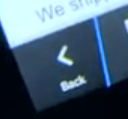
This is an interesting idea for a back button, with the skewed line showing which way the user will go. It’s a similar concept to what we have tried to do for an iOS app a few weeks ago, that I’ll try and showcase here soon.
Google redesigned their apps to improve overall quality of the Play Store?

Google Great Design

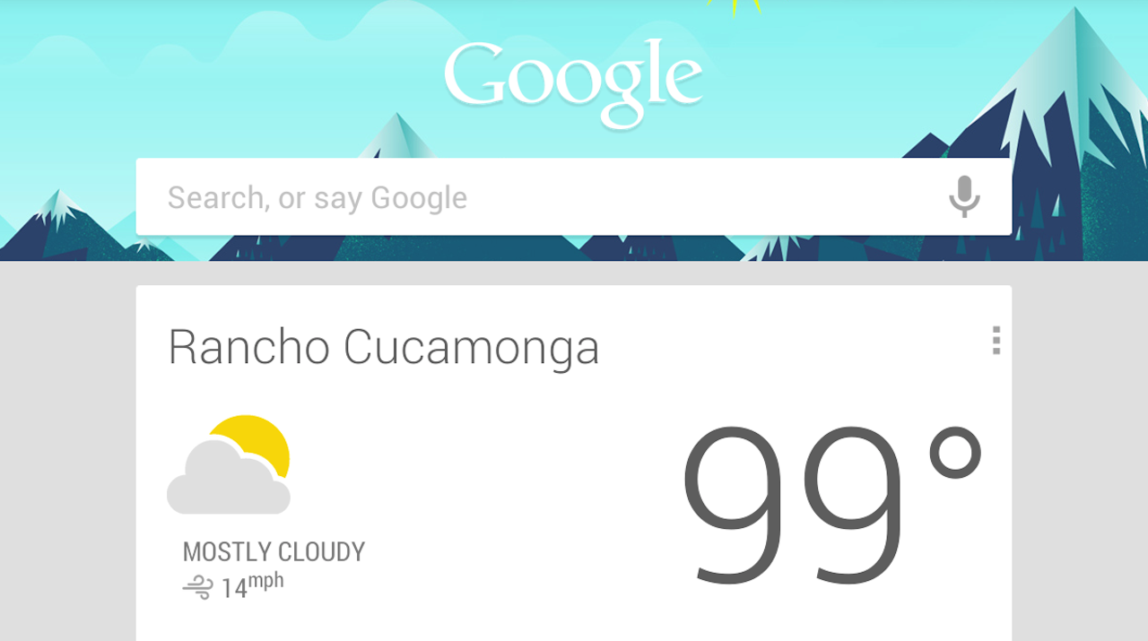
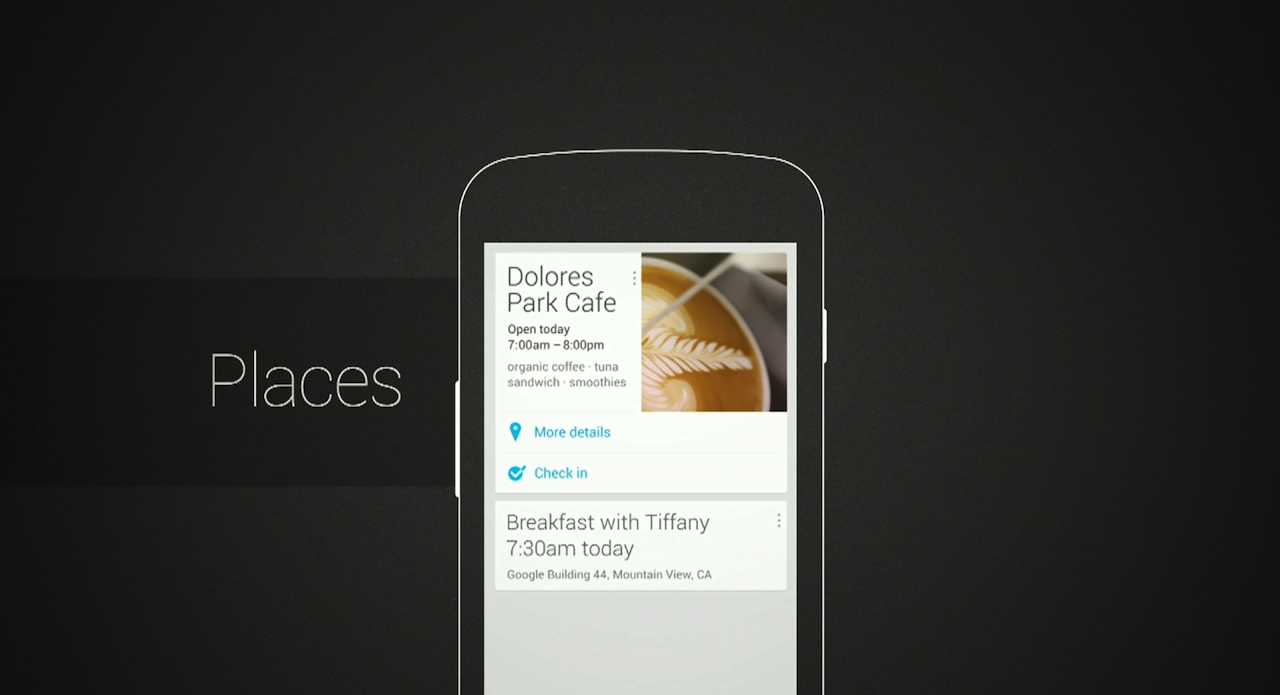
“The Verge” did a great article about how Google finally invested time and effort into design – with a stunningly beautiful result. I couldn’t agree more – the new designs for Maps, YouTube and Gmail apps are very good and in most cases prettier than Apple’s offerings.

There was also this life-long problem of Android being associated with bad quality apps, made just with developers and without any designers. Sounds familiar? Because apparently that’s how Google was operating (sort of) until that change a few years ago. It is true that most Android apps were never touched by a designer, and they are mocked for that by iOS and Windows Phone Users.

Great Google Design

Maybe this is all a clever ploy to improve overall designs for the Android Platform? Because if Google defines how to nicely put text data on a white background, many developers will copy the style. That might help boost Android a little bit design-wise which is something the platform really needs for it not to feel like that limpy cousin who always gets his presents a week later.

I personally think that Google has done an amazing job in design. Outpacing Apple and getting real-close to Microsoft. Now it’s Apple’s turn to show us something remarkable with iOS7.

Did Microsoft break Skype for iOS on purpose? Will Google break maps and youtube too?

skype color

The battle of the giants is on. With three main competing platforms (iOS, Android and Windows Phone) each company tries as much as possible to have an upper hand. Apple doesn’t really do cross platform apps for mobile, but MS and Google have some on nearly every platform and they are popular.

It started with Apple removing Google Maps and YouTube from iOS in the 6th version of the OS. Soon after that Google has published their own apps to replace the stock ones on iOS, and they are great. At the same time Google refuses to make their maps app for Windows Phone and even tried blocking web versions from mobile IE.

Continue reading

The 4 best designed Android Apps (Top list)

I’ll be honest, etsy shook my world a little bit because it looked far better than any Android app I’ve seen so far. And if there’s one there might be more, right? So I went out and searched for best designed Android Apps and while the list is not long (yet) at least there’s more than one non-stock beautifully designed App for the green robot. So let’s start, shall we?

best android app design

1. Spotify
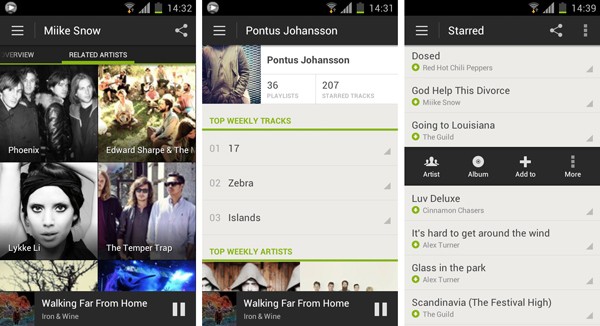
Spotify takes the first place and leaves the competition far away (have you seen that terrible Android Last.fm app? Exactly!). Here we have Android style UI with a lot of attention to detail, great font alignments, spacings and an overall refined look & feel. Too bad that’s just one app and not the entire Google Play offering…

etsy app for android

2. Etsy
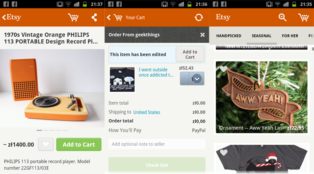
We covered Etsy last week and we believe it still deserves a place among the best designed Android apps, so here it is.

Best Android app design

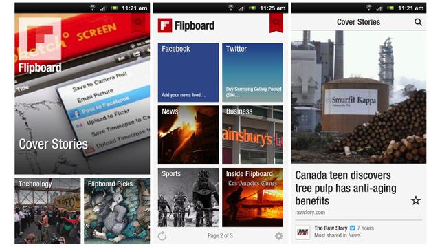
3. FlipBoard is another example that has been transferred from iOS with high precision. It looks almost exactly the same and it’s a good thing because it didn’t use the standard iOS guidelines anyway, so it translates well for any touch platform.

TuneIn-Radio-Pro-for-Android

4. TuneIn Radio
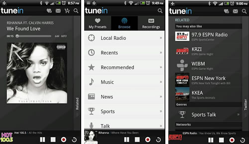
A simple and clean app can be free of annoying design flaws like fonts touching the edge of the screen with no padding. Whoa! That is actually something on Android!

Do you know any other beautiful Android Apps?

Etsy – One of the not many good looking Android apps

Good design Android app - Etsy

Etsy has released an Android app recently and I was pretty shocked, because it actually looks nice. Most of the Android apps I’ve seen are terribly ugly. That’s not really because of the UI difference from other platforms, but rather because developers for Android don’t really care about quality. They want to release many apps as fast as possible and cash the checks. Plus Google Play store is not as strict as iOS App Store when it comes to quality.

A lot of apps have fonts that are mis-aligned, weird spacings or lack of spacing, pixelated graphics or banding on gradients (that is a problem but can be fixed). So the main reason for Android apps looking relatively worse than iOS and Windows Apps is that the developers are lazy or they do the designs themselves without hiring an experienced designer.

That is a problem for the platform, even if people got used to apps looking ugly. By the way, I’m not saying that iOS has better UI than Android. Don’t really like gradients and gloss in iOS as well. That’s not the point. The point is that within those guidelines (or sometimes outside of them – completely unique apps like Flipboard) most iOS apps tend to look more refined than Android apps. You don’t see many apps on iOS that have their fonts glued to the left side of the screen without any padding. Or fonts that are not vertically/horizontally centred when they should be.

Good that Etsy (among some other apps that I’m hoping to find soon) is showing the world how Android apps should be done. Nearly everything here is perfect. Good fonts, good whitespace, right size icons and the right relativity of elements make it a very well designed and very refined Android experience. Hope to see more of that on the platform!

Do you know any good looking Android apps? Let us know!

You can download the app for free at: https://play.google.com/store/apps/details?id=com.etsy.android

iPad mini review – we simply love the new 7.9 inch Apple Tablet!

iPad Mini review

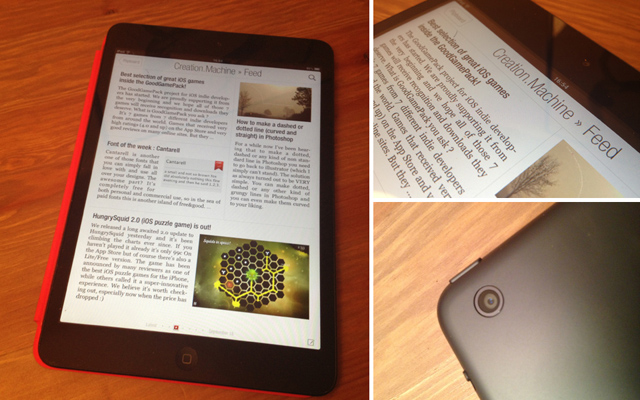
When Apple announced the iPad mini many thought that it’s their response to the cheap, 7 inch tablets taking the market by storm. In a way it might’ve been true, but iPad mini is neither cheap nor 7 inch. It is the best small tablet on the market though and here’s why:

Form factor

4:3 form factor is WAY better for a tablet than 16:9. Nexus 7 browser looks silly compared to the iPad. All pages seem small and hard to read. Same with books and magazines. It’s odd that most companies are making those 16:9 tablets. We have covered the aspect ratio battle before and apparently not much have changed since then. And I can’t believe Apple patented the 4:3 ratio. That would just be plain silly ;)

iPad Mini Screen

Screen

The screen is not retina, and probably will not get the bump in the next version because that would affect portability (weight and size) a little bit and right now it’s just perfect. The density is higher than on the iPads 1 & 2, and it doesn’t look bad. It is lower resolution that some of the Android tablets, but that doesn’t matter much when most Tablet apps are in Apple’s basket anyway. And they generally look much better anyway. After a while (and that’s from someone who used a retina iPad since March 2012) the screen doesn’t appear as low res as many would like it to be. It works and looks good (enough).

Apps

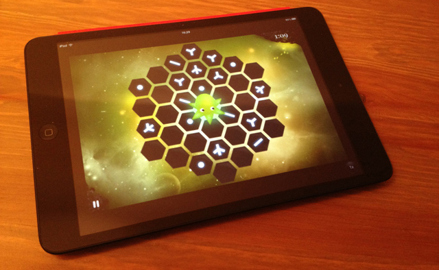
All tablet apps work just as well on the mini which makes it the best all around tablet in the world right now. It is portable and has the biggest tablet app selection out there. Everything is a little bit smaller but I didn’t encounter any problems with misplaced touches. It works and it works well.

iPad Mini review and test

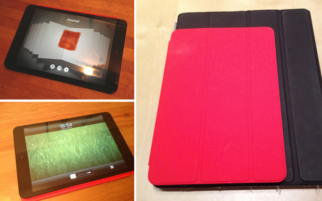
All in all that is the best iPad yet and will replace my 3rd generation Retina iPad as my main travel tablet. It’s also much better as a nightstand Flipboard reader due to the smaller weight – much easier to hold for longer periods of time. We got over 11 hours of continuus video playback from this device, so battery life is also outstanding. The small tablet market has a new leader. All the megapixels and megahertz don’t really matter. The device still works better than most tablets and it’s build quality is far ahead of ANY tablet out there, even including the big iPads.

Usability guru Jakob Nielsen simply hates Windows 8

Jakob Nielsen hates Windows 8 tiles

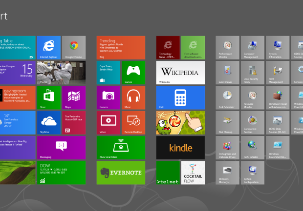
CNET reported today that usability guru Jakob Nielsen is very displeased with the new Windows8 on both PC’s and tablets. He claims that the system has important features hidden, and criticises the start screen.

Let’s think about that for a while. Sure a lot of features (like restart the computer) are more clicks away than ever, but in the era of always on SSD equipped computers is that really a flaw on MS’s part?

The “two desktops” approach may be confusing, but unless Windows 8 fails miserably we won’t see the standard desktop anymore in Windows 9. The biggest flaw at least for me is the fact that you can’t really use more than one window at the time. Sure you can pin a small second window to either the left or right, but that’s not really multitasking. I think Microsoft will address that at some point, because full screen apps are cool and all, but people need to have a choice. Right now it’s as Nielsen stated – the system looks more like a Window than Windows.

But the fact that it’s harder to use for consumers is not a bad thing necessarily. Everything that’s new needs some time to adjust to. Some people used Norton Commander equivalents in Windows for years because they preferred it to the windowed folders approach. Some even still do. But a lot of the users adjusted to the new (and now obsolete) ways of seeing windows.

We can see that by the numbers of people who are downloading the Start8 mod that brings back the start menu. Old habits die hard but without killing them from time to time there won’t be any innovation. And I for one don’t really want to look back in 2050 and still see a start button.

Nielsen may have had some strong points during the years but what would you expect from a person that actually loved the Ribbons in MS office? He also hated Photoshop, which I admit has some flaws, but judging pro software as if it’s made for consumers is a rather big mistake.

Office 2007 is a good improvement over the old, crusty Office UI. Interestingly, Snagit is one of the several other applications to adopt the “ribbon” style UI, which makes that more pleasant to use as well. On the other hand, I continue to find Photoshop unintuitive, though it has made me more productive to downgrade from the full edition to the more limited Elements edition.
J. Nielsen in 2007

Android Apps can look good too! Community redesigns popular apps.

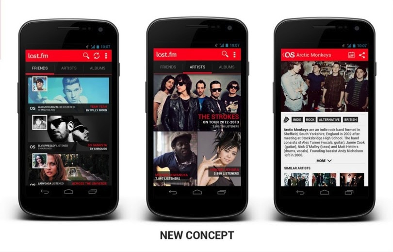
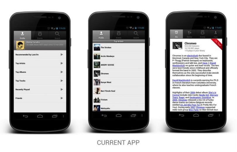
Android is not really famous for good designs of their Apps. In fact Apple mocks them all the time in their keynotes (especially the tablet scaled-up phone apps). There were some good ideas introduced to Android design with Holo, but still it feels as if most apps don’t really take it into account and are made by programmers without designers. WindowsPhone and iOS are way ahead of Android in terms of app design and that’s a fact. But that can still change! A google plus Android design community has put together some nice user redesigns of popular Android apps and the results are WAY better than the original apps. That means that there are skilled designers who understand the Android UI guidelines and can use them to create something that’s not appalling at first glance. Some of those apps look REALLY good. Let’s hope it spawns even more Android redesigns and the platform will finally get quality apps and not only cheaper, plastic phones from millions of manufacturers. Last.fm app redesign is up top, and here’s the original version below:

The new one looks much better doesn’t it?
You can see all the other works at
https://plus.google.com/u/0/s/%23ADiA%20%23Androiddesign

Microsoft gets it right (even skeumorphism) with Office for iOS announcements

Microsoft Office iOS iPad iPhone

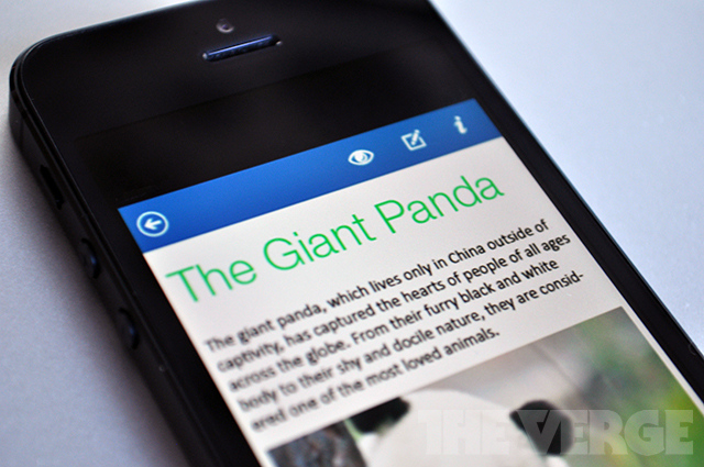
Microsoft was supposedly working on an iOS version of Office for a while now, but right now it appears to be near completion, because some screenshots of the iPhone version surfaced. What do they look like? To me it’s a mix of Apple skeumorphic app guidelines with Microsoft new design aesthetic and it works great! They look very well made and refined visually. IMHO they look better than Apple’s own iWork mobile suite that has those overblown hard gradients and shadows everywhere.

Modern UI (ex. Metro) aside Microsoft is slowly becoming the best company design-wise in any style. Let’s wait for the final product and see if they can beat Apple in Skeumorphic game as well.

Microsoft Office for iOS
Image source: The Verge

Will skeumorphism really be gone in iOS? Or will it just be simplified?

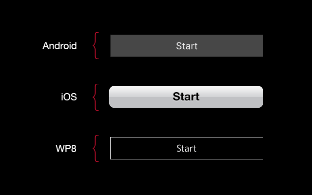
ios Windows android buttons

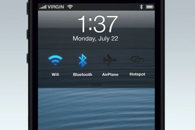
Jony Ive is famous for sleek, minimalistic designs of Apple products. But will he be able to transform the Human Interface (as Apple now calls it’s UI) after so many years of stitched leather and paper? And should he? Right now iOS is the only mobile OS that didn’t simplify their UI. Android went from gradients and odd looking fonts to solid buttons and Roboto font. Windows 8 introduced outlines and Segoe, while Apple is still stuck on gradients, overlays, inner and outer shadows and large and bulky helvetica neue bold. Right now because of that exact Skeumorphism Apple stands out from the rest a bit more. If we simplify it by removing the gradients and making the buttons less “button’y” it’ll start looking either like Win8, or Android.

Apple chose a very bad time to make those changes after so many years of life-like UI’s. Why? Because if they do it now, after everyone else went purely digital, they’d be accused of stealing ideas and being “behind”.

My bet is that it won’t go as far as Android or Windows Phone in simplicity, but we might see the gradients removed (while keeping the shadows, and maybe a little noise). Also I think mr. Ive might go for a better consistency across all the apps, because right now iOS is a mess – every app has a slightly different looking UI, not really fitting together with the rest of the OS. If it gets a little bit simpler visually and more unified, the experience will be better without copying Android or Windows Phone.
I seriously hope that we’ll see a change, because as a designer I’m a bit upset with Apple’s current direction. Taking the button metaphor as an example – I think iOS buttons are less refined than Android’s and WP8’s.

But of course we just have to wait and see what comes next with iOS7.

We’ve got a little more to show you – Apple will unveil the iPad mini on October 23rd?

We've got a little more to show you

Apparently Apple will unveil the new iPad mini (to compete with Kindle fires and Nexus 7’s on low prices) on October 23rd. The invitations are sent, and apparently they decided that a smaller tablet is actually worth their while. Steve Jobs famously said that a smaller form factor is plain stupid. Tim Cook seems to differ ;)

Too be honest we’d rather see the infamous 13″ retina macbook pro, than a smaller and cheaper (and probably non-retina) iPad. Apple going after mass market only looks good on paper.

Besides, if the iPad mini is smaller, why are they calling it a little more? A smaller, non-retina iPad would actually be something “less” ;P

What if iOS design matched the iPhone design? (and it’s colours!)

iOS redesign

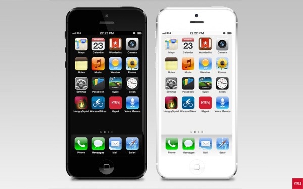
A few days ago Yves Behar had said, that Apple products don’t really fit the software, as if they were made by two completely different teams. The industrial design is clean, simple and futuristic, while the OS has skeumorphism with stitched leather and all that ‘fun’ stuff. He inspired me to see what would happen, if the software design matched the industrial design, with color-coded OS for each device. Apple has been under a lot of critique lately, due to keeping it safe and not introducing many visual innovations to their software. I’m not saying my design is better. I just wanted to see how it’d look like if the design matched the phone quite literally. So I created the Black and Grey + White and Silver versions of the OS for the iPhone 5.

You can see the whole project at: http://hype4.com/whatif