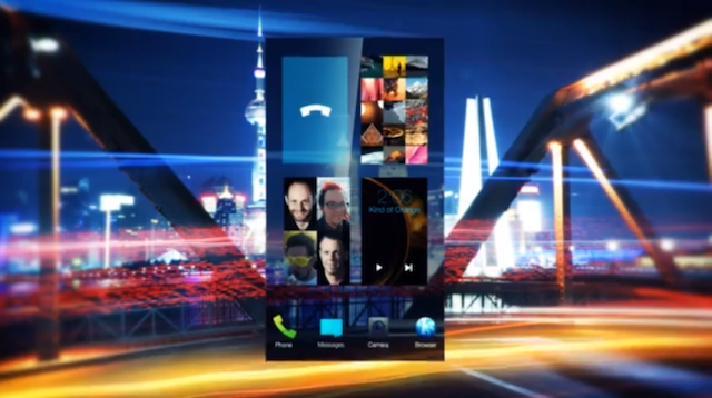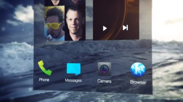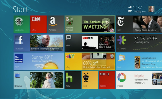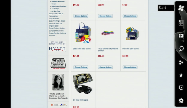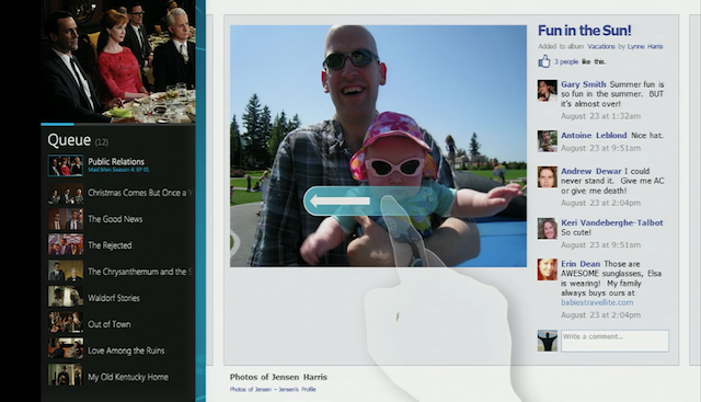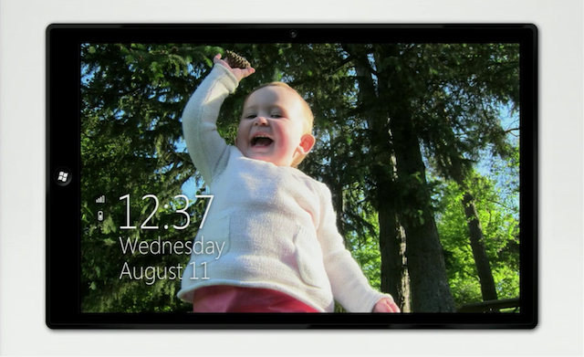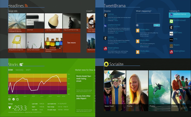
Even though the revolutionary UI of Windows8 wasn’t publicly seen untill 2011, apparently it has been in the works for over a year before. In Fact they started working on it in 2009, even before the first iPad came out. Of course iOS was available back then, as was Android. As you can see from the screenshots the live tiles weren’t as minimal and looked a lot messier in general. There was some more info (wifi, time and battery) on the top right and the charms bar (which I think is the biggest flaw of current windows) had more items and what looks like a start menu (?) on the top.


Since designs like that are always iterative, it’s possible that it simply was a start menu incorporated into that design. All in all I believe that it does look better and cleaner now, than it looked back then. It almost seemed as if MS was trying to make something in between it’s minimal approach and Apple’s skeumorphism. But in the video below Jensen Harris (Windows design team) makes fun of stitched leather quite a bit. He also points out that there’s always sunny and 23 degrees Celsius on the iPhone, but on the Calendar you see the current date. So not only there’s inconsistency, but also false information. And that brings me to another realisation – should icons go towards a tile-like style on iOS and Android? The Calendar on iOS sort-of already does that, but weather and clock are pretty obvious examples. The Photos app could have the latest photo there. I’m gonna try and create a mockup of how it could look like soon.
The also made really nice templates for the first and third party apps to be consistent which may crush creativity sometimes but is actually really cool in use.

Too bad we don’t see many videos like that from Jony Ive, but still worth a watch!
You can see the full video after the break:
Continue reading →
