Photoshop CS6 type tool bugs and Adobe’s Creative Cloud future

photoshop cs6 type tool bug

Photoshop CS6 has brought a couple of great and not so great additions to the world’s most popular pro graphics app that we already covered. But now after over two months with it the little annoyances don’t seem to be going away in an update anytime soon.

Especially since Adobe has decided that we won’t get a CS7 and should all use Creative Cloud instead. On one hand the deal is great (and pays for itself usually with a portion of a project) but abandoning CS5 and CS6 users and leaving them with not-fixed bugs is kinda not-cool Adobe!

The Font bugs are the most common and most annoying – some fonts take a VERY long time (seconds) to load even on a Retina Macbook Pro with 8GB’s of RAM. Some fonts are smaller in size visually than others, but Photoshop proclaims them bigger for some reason. Setting a consistent font-size among lots of text-fields can be a pain.

I’m keeping the CS6 license, but will probably upgrade to Creative Cloud quite soon. Does anyone know if the CC version of Photoshop (yes it’s apparently a different version with a different update cycle) has those type tool bugs fixed?
Usability guru Jakob Nielsen simply hates Windows 8

Jakob Nielsen hates Windows 8 tiles

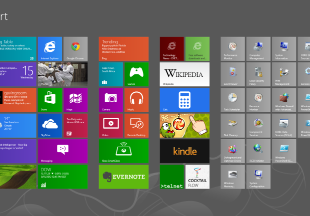
CNET reported today that usability guru Jakob Nielsen is very displeased with the new Windows8 on both PC’s and tablets. He claims that the system has important features hidden, and criticises the start screen.

Let’s think about that for a while. Sure a lot of features (like restart the computer) are more clicks away than ever, but in the era of always on SSD equipped computers is that really a flaw on MS’s part?

The “two desktops” approach may be confusing, but unless Windows 8 fails miserably we won’t see the standard desktop anymore in Windows 9. The biggest flaw at least for me is the fact that you can’t really use more than one window at the time. Sure you can pin a small second window to either the left or right, but that’s not really multitasking. I think Microsoft will address that at some point, because full screen apps are cool and all, but people need to have a choice. Right now it’s as Nielsen stated – the system looks more like a Window than Windows.

But the fact that it’s harder to use for consumers is not a bad thing necessarily. Everything that’s new needs some time to adjust to. Some people used Norton Commander equivalents in Windows for years because they preferred it to the windowed folders approach. Some even still do. But a lot of the users adjusted to the new (and now obsolete) ways of seeing windows.

We can see that by the numbers of people who are downloading the Start8 mod that brings back the start menu. Old habits die hard but without killing them from time to time there won’t be any innovation. And I for one don’t really want to look back in 2050 and still see a start button.

Nielsen may have had some strong points during the years but what would you expect from a person that actually loved the Ribbons in MS office? He also hated Photoshop, which I admit has some flaws, but judging pro software as if it’s made for consumers is a rather big mistake.

Office 2007 is a good improvement over the old, crusty Office UI. Interestingly, Snagit is one of the several other applications to adopt the “ribbon” style UI, which makes that more pleasant to use as well. On the other hand, I continue to find Photoshop unintuitive, though it has made me more productive to downgrade from the full edition to the more limited Elements edition.
J. Nielsen in 2007

Should we do more boxy-CMS-like projects, or go nuts and let them update it through HTML?

Image credit: I Love Design.com

It’s 2011, so saying that someone should update their website through editing HTML files (or as some people say “programming” ;)) sounds quite insane doesn’t it? Maybe so, but is the ease of updating worth the compromises on quality? Sure, some CMS driven sites can be pretty interesting, but it’s hard for them to have a distinct style, that doesn’t look like it’s a set of boxy templates. Apple’s website seems boxy at first, but it breaks most template rules by having each page look completely differently – as if it was designed for a fine printed book, and not through a set of CMS templates. Sure the main page is just a big banner with some smaller ones below,  and that can be easily customizable through some backend, but once you get to any page it will look almost like it’s taken from a full-colour manual, rather than one-design-fits-all-template.

The point here is – should smaller websites (like a small hostel, a pet shop, a cafe) really use CMS, or go for something unique, creative and new. What I mean is that they should have each page designed as a separate website, using a set of overall rules, but even breaking the text in just the right place. Sure CMS is necessary for news sites, blogs and e-stores, but the internet itself is actually going into stagnation.

We had that Flash-explosion a few years ago where websites were made into all-flash-all-singing-all-dancing animated multimedia presentations, and that was fun … for a while. Then Flash started to recede towards HTML5 animation and simplicity. But the CMS underneath it all is I think what keeps the real creativity still in the box.

Maybe we should think about it – maybe the web after a few years of finding it’s way, is actually going back to imitating fine-printed books, magazines and brochures? Maybe the attention to every detail, every word and every image would lead us away from square thumbnails with “float: left;”, a small margin and justified text on their right side?

I sure hope so…

iOS 5 GUI for iPhone (PSD) – a free download from TeehanLax.com!

The guys that brought us all the previous iPhone OS GUI’s are at it again. What stands out in their work is both attention to detail and a very nice organization of the content. Everything is sorted in groups (including nested groups for smaller elements). This is priceless for UX people, who can now design the interfaces for their own apps with the right elements. It’s more of a drag&drop of lego bricks into place, than anything and we like it here.

Go to teehanlax.com/blog to download your free PSD of the iPhone GUI!

Simple vs overblown designs – how the focus shift from content to form-factor

When the web first started, all websites were just about presenting content. Or to be more precise – information. It was a simple, high contrast design, with white background, black text and blue, underlined links. It’s been many years since then, although I remember using a lot of these principles when building websites back in 1998. They were easy to read, and the lack of multimedia due to slower connections at the time, was in fact a blessing that let us fully appreciate content.

Now all of that has shifted towards shocking the user with jQuery animations, smooth scrolling, effects and gimmicks. I’ve been browsing through a lot of award winning websites – mostly portfolios for online companies – and I noticed that the amount of content they communicate now can be summarized in a few bullet-points. Surely if it’s purely about the design, it’s not a bad thing, but sometimes we really want to read more and don’t want to be treaded like idiots who can only comprehend ordered lists.

What do you think? Should we simplify the websites, relying more on bullets and eye-candy, or should we balance it better with longer pieces of text, that actually say something?

Microsoft pushes it’s creativity with Windows Phone 7 ads

But isn’t this a little bit too far? I mean advertising a phone that you’ll use less than your current phone? Who are they trying to catch with that idea? Besides their current competition (iphone and android phones) are also very easy to use and have streamlined interfaces that allow people to just “glance” at the phone quickly instead of the old-time “stop-and-stare”. They might be a couple of years late to the party, just like with Windows. Oh and the interface of the main screen is pretty U-GLY… It gets a bit better when you’re in the phone functions but still somewhat “modern for the sake of being cool”. And we all know how it ends when someone tries to be cool so hard…

when redesigns kill the project / how people get used to things

We’ve seen it a couple of times already. Facebook made some changes and groups started popping up that were hoping to get the new design back. Some even issued threats that they’ll stop using the service if it’s not reverted tom the beloved original.

That clearly defines how people hate a change. Why blame them? It’s confusing when you come back to a familiar site to see it changed. As with music – you like what you already know- if you’ve used a site for a long time and see it many, many times you get used to the design of it as well. And it doesn’t really matter if the design was good or bad. It was “home sweet home” and people don’t like others redecorating their home. Now do they?

The whole subject came up because just recently some statistic were revealed about the popular site Digg. They had a steady 40mil uu daily and they drastically redesign the site. The result? a 26% decline in a few weeks in the US. That’s a lot of users.

So what’s the solution if you don’t want to stay behind with your design but you don’t want your viewers to go away? The simplest solution would be to keep changing small stuff constantly so people don’t have the time to get used. And if you keep the changes small the evolution will be easier to grasp than a revolution.

Examples? Think Google.

Facebook is the end of IE6 ?

facebookie6
At a point in time, when facebook is the internet inside the internet, and when many people think of it as THE internet, rarely using anything else, an interesting thing has happened. Many had pleaded, many had wished for it (especially web developers), and even Microsoft urged for it. No success. Nobody was able to kill Internet Explorer 6, mainly because it’s preinstalled with windows XP and this is still what the majority uses. So all of the office computers, and all the home computers of casual users remained the silent majority of web browsing.

ie6compatThis of course led to websites being done ESPECIALLY for IE6 and for the rest of the world. Twice as much work. Or actually more, since IE6 had it’s humors and wasn’t really following standards, so it was all a hit or miss scenario constantly. And as years have gone by, the usage of IE6 was shrinking, but not fast enough so it’d be convincing for a client to skip IE6 version of the site. Even at 25% of the market (and it still has more than that, significantly more) nobody would decide to skip IE6 version while building a site.

Well until now. A while ago youtube stopped supporting IE6, but most of it worked just fine in IE6 anyway.
Now facebook comes into play, and since it has all those apps and all those quizes the casual user really loves, they’ll see a big difference. And that alone – a decision of a website they spend half their awake time on – can lead them to upgrade. Sure firefox, chrome, safari and opera are better than any IE iteration, but for god’s sake! Make them upgrade to at least IE7 and that, as terrible a browser as it is – is still a huge step for the web world.

IE6 Rest in peace.

Fold ’em when you need ’em

What is the mysterious “fold” ?

There’s this very big issue among many designers of making all the necessary information above the fold (that being a standard of about 600 / 700 pixels high). So they try and they try to fit everything that’s “important” in there. In a typical layout that gives us 960 x 660 pixels of space that the most users will instantly see. Which is about this much of this website :
cm-960x660

Continue reading

Think before you design

creativity_usability
I recently give a lot of thought to two things: usability of a project (be it a website) and creative communication so the ideas are easy to grasp/read for a majority of readers. The time of “pweety weebsites” is over. It’s time for thinking at least as much as the design process itself. Think what you want to say in a claim, before you type it and add a dropshadow. Analyze other successful projects and copy only what you think is important. And by that I dont mean the 30 layer header background. If it’s a business don’t add people in business suits, unless it’s the suits you’re selling. This is so overused now that for a business to stand out it just takes to come up with something different.

Think about mobile use, it’s growing at an unbelievable rate, you don’t want to be the last on the wagon do you?

And remember that form and function should be equal without one praying on the other!

Usability killed the cat

usab
Sure we do have a bunch of internet cliches – how to make a registration form, how to place ads, how to build websites that are easy to navigate. The list goes on.
It had to be redefined a bit in terms of usability after web 2.0 came into play, but the main point is that studying the usability of web apps (and not only, the usability of daily objects is also studied and put to many tests all the time) has never been more important than now. With the overflow of information a site that’s not well prepared in terms of usability will flunk, even with the best promotion and visual flare. Examples : Google ? A simplistic, pretty ugly site, but it works well and it’s so easy that people using it for the first time know what’s going on. Well the ads might be a bit confusing, but the rest is very thought out. So are we seeing the fall of the dark ages in which we were supposed to do “pweety weebsites” ? Or will the web be divided between “pweety” and “functional” ?
Usability specialists sure know their worth nowadays. It’s time for the rest of the web world to pick up.