Our own “Natural environment” device library

mockup-iphone5c-yellow mockup-android-phone-1
mockup-tablet-1
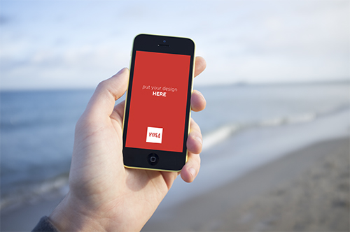
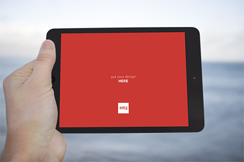
We are starting our own little photo library (avoiding the term stock on purpose, as our photos will be natural, human and real, instead of “plastic”). We are creating mockup-ready, natural environment device photos (in PSD format) that you’ll be able to paste your design into (a PSD smart object) so it’ll appear natural on the screen. The decision came to us because we always like to show our designs in the context of the device it was made for, but most stock photos of “iPhones in hand” are plain terrible. The photos will be taken in all possible settings (beach, mountains, cafe, home etc) and added over time. We will be selling them, but the prices will be VERY low.

iOS 7 visual errors, mistakes and bugs

ios7 background app refresh visual bug

I was very skeptical about Apple’s new mobile OS a while ago, but it actually grew on me. I still think the home screen icons are ugly, but more and more of the OS is actually quite cool. There are glitches though and small visual errors that look very weird coming from Apple. Steve Jobs had famously called some designers at 4am to change an orange hue on the Google Maps icon, and now things like that end up in the final OS? Odd. Let’s hope they fix it soon. I’ll be adding more images as I’m finding them.

ios7 calendar iPad portrait visual bug

The calendar bug is pretty weird. It says it’s September of 201, and I’m pretty sure that if it was I wouldn’t be writing this blog ;)
Yes, we know that the “3” is under the segmented control, but that is just a plain bad solution. Especially in portrait on the iPad, when we have so much vertical space, we can make the actual days smaller vertically and add another line with just the date. It would be clean and precise + visible too.

Apple’s website is starting to match iOS 7 style and with even better result!

Apple modern website design iphone 5c

Apple did not only announce some new hardware today, but it also revamped some of it’s web presence, that was considerably lacking the (controversial) flair of iOS 7. Apparently it’s slowly progressing towards unification and we can see the start of it on the iPhone 5C page. First of all it hides the glossy, gradient’y Apple menu background right after you scroll down and the translucent (hello iOS 7) menu bar slides down and stays on the top of the site.

The website also uses nice scroll-animations that are becoming a new web design trend, but fit the mobile OS as well. After all there’s plenty of things moving in iOS 7. It’s becoming more and more consistent and we might as well see a totally revamped Apple website on the day iOS 7 ships.

Let’s just hope they won’t go too minimal with the next desktop OS (the one after mavericks as this one has the classic MAC OS look left intact) because that will be a lot harder to get used to.

Get Things Done vs Make It Cheap

websites under construction forever

There’s a saying in the design industry, that price alone is far less important than the ability to deliver. That is especially true if price is the only factor by which a design is chosen, and we all got our fair share of “we think the CEO’s nephew will make a great website. Why he did two already!” which almost always results in projects that are not done. Ever. Or at least in any near future. Having a web presence is important just as it always was, but now with responsive web it’s even more important that people can find you via mobile devices. In that case GTD or Get Things Done usually beats the “Make it Cheap” motto, because the latter cases rarely become anything at all. The infamous nephew or that “close friend who has web-something company” usually end up either not doing the job well, or not doing it at all.

When you have a mix of quality and the ability to actually deliver something at the end of the day, you have a successful company that’s hard to beat. If all you look at is price or “personal relation” you might end up with that cute “under construction” graphic BEING your website for a year or two. That’s why it’s always important to price your projects right, so you have the motivation to deliver. After all big companies pay big agencies hundreds times more for the exact same things small design studios do.

Why?

Because those big clients are SURE that the job will be delivered and having that peace of mind is important.

Yahoo’s interesting way to rebrand

Most companies considering rebranding (especially the larger ones) try to keep it as much of a secret as possible. Yahoo has decided to go in an opposite direction and will show us 30 of the logo designs they worked on, with a final unveiling of the “real” one on September 5th. That’s a pretty cool idea, to see all the iterations and concepts. The logo itself will still be consistent with the current one as the “!” and the colors will most likely stay exactly the same. The first logo can be seen above, the rest will be shown here

What happened to famous Apple design?

what happened to apple design

I installed iOS 7 with high hopes that ugly homescreen icons were the only thing bad about it and I will see a familiar, high-quality experience I have associated with Apple. What I saw was inconsistencies (yet they claimed consistency), ugliness and a couple of nice ideas poorly executed. But what strikes me even more is this years Apple Design Award winners.

The left side of the image above is an app called “Finish” which is a student-done To-Do list that won this year in the student category.

Now I don’t doubt the app’s usefulness, UX or navigation ideas. But seriously it’s BUTT-UGLY. It’s actually uglier than iOS 7 and that says something on it’s own. I know the rules by which Apps are chosen for the award, but it’s still called Apple DESIGN award, right? And the design here cries for help. And let’s not sugar-coat it with “they’re only students” and crap like that – I know students who design amazing things – they’re all around dribbble and behance. Seriously. WTF is that?

apple ugly icons

I think that to deserve the design award an app should excel in EVERY aspect. Having a nicely thought out, but ugly app as a design award winner might set bad standards for the future. Or maybe design just doesn’t matter anymore at Apple?

It’s never cool or easy to mock a company that defined me as a designer, a smartphone user and a Mac addict for years. I was a total Apple fanboy, buying most of their products right at launch, and praising them for the best design on the planet. And why it still stands for their physical products (although I love the design of recent Nokia Phones just as much), it went seriously downhill when it comes to their taste in software…

I still remember Design award winners that really contributed to great design – Pixelmator, Flipboard or that Al Gore’s book (Our Choice) that defined a great eBook paradigms that even Apple later copied in their iBooks author. Those were groundbreaking apps with amazing design. This year has proven that design apparently doesn’t matter in Apple Design Awards.

Maybe they should just be called “Apple Awards” ?

Windows Phone Navigation idea mockup (UI + UX)

windows phone tabbed ui idea ux

I am currently a happy user of a Lumia Phone. The idea for the switch from my trusty old iPhone 4S was simple – I wanted to learn & feel the platform since I need to design for it as well. After a few days of playing with the OS I can honestly say I like A LOT. The lack of quality third-party apps is the biggest drawback, but all-in-all it’s a very well designed OS both visually and in the UX (those animations are just lovely)

But while playing with the OS an idea formed in my head about a tabbed-not-really-tabbed interface that would both fit the platform and be unique to it. Putting thoughts into pixels was the easy part after that and hence my tabbed-UI for Windows phone mockup was born.

Continue reading

How iOS 7 icons SHOULD look like

iOS 7 icons redesign

The biggest controversy with iOS 7 is probably the super-ugly set of homescreen icons (especially safari, but also the fact that most icons simply are too big within the rounded-square boundaries). One designer decided to take a stab at it and redesigned the icons (on the left) vs their original ones. We think this looks MUCH better! What do you think?

Check out the full size image and give props to the designer (Leo Drapeau) at His dribbble profile

iOS 7 screenshots and design review

ios7 screenshots iPhone 4S 5

We installed the new iOS 7 right away and we wanted to share both our thoughts and a nice set of screenshots from the release with our readers along with some commentary where we think it’s necessary to say something. Overall we have mixed feelings about the new OS design. Some elements are simply stunning (blurred navbars and tabbars), while some look like they’ve been done in a rush (the safari icon, the Control Center arrows are way too thick and so forth). On a side-note Apple also now allows developers to transfer their apps to another developer account. That can be handy – I hope Rovio transfers Angry Birds to me based on a typo ;)

What we like
The blurred, semi-transparent backgrounds of some elements are just plain stunning. We also like the general white tone of the OS that differentiates it from all the competition (both Windows Phone and Android are much darker). Siri looks simply stunning. The new UX features in Safari (pulling down for an unified search / address bar rocks!). The new keyboard is also pretty sweet looking. The lockscreen and weather (the do share a common aesthetic) are also beautiful. So is the new search bar and folder view. An oh the music icon finally has a white note one it! Just as we hoped it will!

What we don’t like
There’s still A LOT of inconsistency between all the apps. They have different font sizes and spacings, different color schemes (the keyboard sometimes changes the color too) and some of the new icons are plain ugly. There’s also a big inconsistency within the icons – some have very soft gradients while others – like mail, have hard and long gradients on them. Instead of unifying the look it makes it actually just as distracting as before. Apple showed some pretty advanced font alignments (with rulers and measurements and stuff) but all in all in some places the fonts really look out of place. Sometimes it’s better to judge things by the eye than with the numbers apparently. Some elements in the presentations were also pretty off (like the headline above the AirDrop bubbles – it’s not in the center of the screen but more to the left and it shows!). The control center arrow is WAAAAAY too thick and it looks out of place there visually. Also the messages are bulky and too close to each other. The whole messaging app doesn’t have enough breathing room (white space) and they don’t really look refined at all. More like a quick mockup as the internal paddings of the messages are way too big, while the external margins are way too small… Also some tab-bar icons are only blue when active (app store and contacts) while others are all blue (safari and maps).

What we’ve noticed
The icons are more rounded now which also changes the perception of the homescreen a bit. Also the contacts have now been put inside circles. This is actually a bit odd as there are not many circles anywhere inside iOS (the icons, even when more rounded are still rounded squares). But the circles do look nice. Some icons have thicker edges than others, some are very narrow and some are very wide. That all creates a bit of inconsistency.

Our judgement
We think it’s a step in an interesting direction but this is not what we’d expect from Apple. There’s too many little mistakes or weird, mismatched elements and inconsistency for my taste. But since it’s the first version of a developer beta we think a lot of the stuff will be refined in the final version and maybe that’s the idea Apple has – to get some good feedback now and refine iOS 7 for the fall release.

Screenshots
And here are some screenshots we took today:

iOS 7 homescreen screenshot

More after the break.

Continue reading

iOS 7 redesign and white icons

iOS music app icon redesign needed

We have discussed earlier that Apple has had some poor color choices for it’s icons – namely the desktop iTunes icon and the iOS music app icon. The iOS music icon especially should have the notes in white like it was before, and apparently with all the upcoming iOS 7 visual changes it finally will. We’ll keep you posted on the design updates as soon as they appear.

Fingers crossed for some visual goodness and cool new UX ideas because we don’t want another Android or Windows phone with just going minimal. If it indeed goes minimal we want it to be unique :)

The 4 best designed Android Apps (Top list)

I’ll be honest, etsy shook my world a little bit because it looked far better than any Android app I’ve seen so far. And if there’s one there might be more, right? So I went out and searched for best designed Android Apps and while the list is not long (yet) at least there’s more than one non-stock beautifully designed App for the green robot. So let’s start, shall we?

best android app design

1. Spotify
Spotify takes the first place and leaves the competition far away (have you seen that terrible Android Last.fm app? Exactly!). Here we have Android style UI with a lot of attention to detail, great font alignments, spacings and an overall refined look & feel. Too bad that’s just one app and not the entire Google Play offering…

etsy app for android

2. Etsy
We covered Etsy last week and we believe it still deserves a place among the best designed Android apps, so here it is.

Best Android app design

3. FlipBoard is another example that has been transferred from iOS with high precision. It looks almost exactly the same and it’s a good thing because it didn’t use the standard iOS guidelines anyway, so it translates well for any touch platform.

TuneIn-Radio-Pro-for-Android

4. TuneIn Radio
A simple and clean app can be free of annoying design flaws like fonts touching the edge of the screen with no padding. Whoa! That is actually something on Android!

Do you know any other beautiful Android Apps?

Etsy – One of the not many good looking Android apps

Good design Android app - Etsy

Etsy has released an Android app recently and I was pretty shocked, because it actually looks nice. Most of the Android apps I’ve seen are terribly ugly. That’s not really because of the UI difference from other platforms, but rather because developers for Android don’t really care about quality. They want to release many apps as fast as possible and cash the checks. Plus Google Play store is not as strict as iOS App Store when it comes to quality.

A lot of apps have fonts that are mis-aligned, weird spacings or lack of spacing, pixelated graphics or banding on gradients (that is a problem but can be fixed). So the main reason for Android apps looking relatively worse than iOS and Windows Apps is that the developers are lazy or they do the designs themselves without hiring an experienced designer.

That is a problem for the platform, even if people got used to apps looking ugly. By the way, I’m not saying that iOS has better UI than Android. Don’t really like gradients and gloss in iOS as well. That’s not the point. The point is that within those guidelines (or sometimes outside of them – completely unique apps like Flipboard) most iOS apps tend to look more refined than Android apps. You don’t see many apps on iOS that have their fonts glued to the left side of the screen without any padding. Or fonts that are not vertically/horizontally centred when they should be.

Good that Etsy (among some other apps that I’m hoping to find soon) is showing the world how Android apps should be done. Nearly everything here is perfect. Good fonts, good whitespace, right size icons and the right relativity of elements make it a very well designed and very refined Android experience. Hope to see more of that on the platform!

Do you know any good looking Android apps? Let us know!

You can download the app for free at: https://play.google.com/store/apps/details?id=com.etsy.android