Is the new iTunes 11 icon a sign that Apple finally saw it’s mistakes?

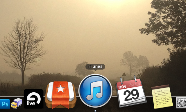
iTunes 11 icon is finally white!

For a long time now Apple has made those ugly music apps icons – the iTunes icon (mac) and iPod / Music (iOS). What was wrong with them? Well for starters they used dark “note” element on a bright gradient background. That of course is not the case with most other iOS apps (namely Phone and Messages). The first iPod icon was also white and it was a bit less “obtrusive” to my taste. The current “dark” icon simply doesn’t fit the rest of the “simple gradient background icons” out there like the App Store, iTunes Store, Phone and Messages.

A while ago the same thing happened to the Mac version of iTunes, but  now, with iTunes 11 the white icon is back. Hopefully that will inspire Apple to have the white icon on the iPhone as well. Seriously guys, that thing was SOOO much better in iOS 3.1.3, than it is now…

Not saying that that glossy, gradient filled new white icon is great, but it is an improvement.

Microsoft gets it right (even skeumorphism) with Office for iOS announcements

Microsoft Office iOS iPad iPhone

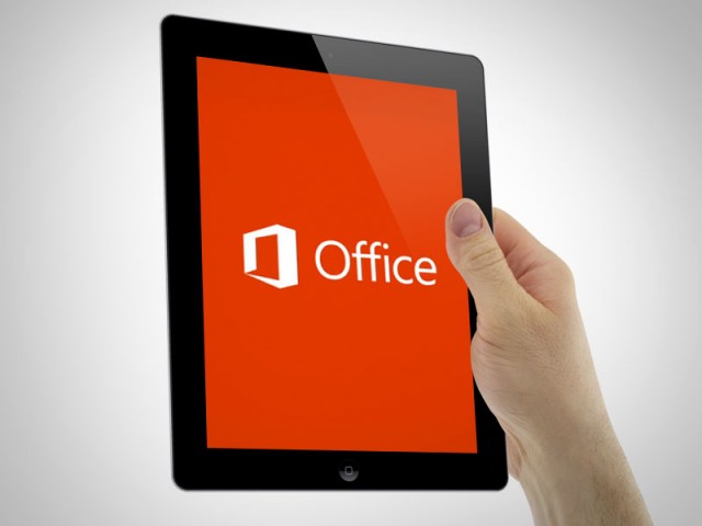
Microsoft was supposedly working on an iOS version of Office for a while now, but right now it appears to be near completion, because some screenshots of the iPhone version surfaced. What do they look like? To me it’s a mix of Apple skeumorphic app guidelines with Microsoft new design aesthetic and it works great! They look very well made and refined visually. IMHO they look better than Apple’s own iWork mobile suite that has those overblown hard gradients and shadows everywhere.

Modern UI (ex. Metro) aside Microsoft is slowly becoming the best company design-wise in any style. Let’s wait for the final product and see if they can beat Apple in Skeumorphic game as well.

Microsoft Office for iOS
Image source: The Verge

Will skeumorphism really be gone in iOS? Or will it just be simplified?

ios Windows android buttons

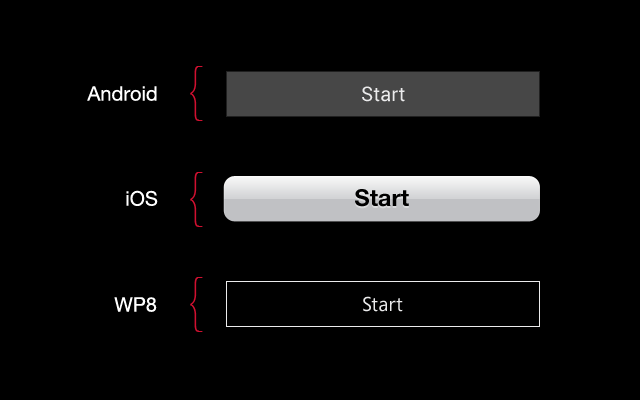
Jony Ive is famous for sleek, minimalistic designs of Apple products. But will he be able to transform the Human Interface (as Apple now calls it’s UI) after so many years of stitched leather and paper? And should he? Right now iOS is the only mobile OS that didn’t simplify their UI. Android went from gradients and odd looking fonts to solid buttons and Roboto font. Windows 8 introduced outlines and Segoe, while Apple is still stuck on gradients, overlays, inner and outer shadows and large and bulky helvetica neue bold. Right now because of that exact Skeumorphism Apple stands out from the rest a bit more. If we simplify it by removing the gradients and making the buttons less “button’y” it’ll start looking either like Win8, or Android.

Apple chose a very bad time to make those changes after so many years of life-like UI’s. Why? Because if they do it now, after everyone else went purely digital, they’d be accused of stealing ideas and being “behind”.

My bet is that it won’t go as far as Android or Windows Phone in simplicity, but we might see the gradients removed (while keeping the shadows, and maybe a little noise). Also I think mr. Ive might go for a better consistency across all the apps, because right now iOS is a mess – every app has a slightly different looking UI, not really fitting together with the rest of the OS. If it gets a little bit simpler visually and more unified, the experience will be better without copying Android or Windows Phone.
I seriously hope that we’ll see a change, because as a designer I’m a bit upset with Apple’s current direction. Taking the button metaphor as an example – I think iOS buttons are less refined than Android’s and WP8’s.

But of course we just have to wait and see what comes next with iOS7.

What if iOS design matched the iPhone design? (and it’s colours!)

iOS redesign

A few days ago Yves Behar had said, that Apple products don’t really fit the software, as if they were made by two completely different teams. The industrial design is clean, simple and futuristic, while the OS has skeumorphism with stitched leather and all that ‘fun’ stuff. He inspired me to see what would happen, if the software design matched the industrial design, with color-coded OS for each device. Apple has been under a lot of critique lately, due to keeping it safe and not introducing many visual innovations to their software. I’m not saying my design is better. I just wanted to see how it’d look like if the design matched the phone quite literally. So I created the Black and Grey + White and Silver versions of the OS for the iPhone 5.

You can see the whole project at: http://hype4.com/whatif

New Myspace Redesign is amazing!

New myspace

Remember MySpace? No? Well before Facebook (and yes there was a BEFORE Facebook) the most popular social network in the world was MySpace. It allowed people to customize their profiles with images and CSS, so each and every one was different. It was many things (music player, social media, bands promotion platform) but clean it wasn’t.

I still remember the horrible glitter backgrounds and green type on pink backgrounds. Yuck! Since Facebook came to life with it’s “clean&boring” design, MySpace was slowly dying, even with one of the biggest indie music collections in the world onboard. Well now they’re redesigning it (again) to be a mix of a music service, pinterest-que type photo viewer and in general a social network for the creatives – photographers, musicians, designers. And of course “fans”. Take a look at the screenshots after the break – it looks impressive and really clean + modern. Good job MySpace!

Continue reading

9/11 WTC Conspiracy photos would look very different now, 11 years after the tragic event

WTC 9/11 conspiracy theory photo

Today’s the 11th anniversary of the terrorist attack on New York. Our hearts are with the victims and their families, but the reason for this post is slightly different.

The photo above depicts one of the planes, and was a base for many conspiracy theories. The problem with those conspiracy theories (the same as with UFO sightings) is that literally ALL of the pictures that are supposed to prove something are blurry and fuzzy. The picture above was taken (obviously) 11 years ago. Now the camera technology has gone so far, that a better camera sits in every other persons pocket. Smartphone cameras also use cloud services to quickly upload photos.

That means the end of conspiracy theories is near. I’m not saying some of them aren’t true. But maybe now, with better technology they’ll simply stop being theories and become facts (conspiracy facts?). Pictures that actually show something substantial instead of a few blurry lines that are open to interpretation. That sort of thing. Let’s hope we won’t see another terrorist attack (seriously people should just get along), but as far as UFO sightings go I seriously would like to see a decent, sharp picture. Especially since smartphones are starting to be better at nighttime photography.

Microsoft goes for a (semi) radical logo redesign

Microsoft logo evolution 25 years
We might've been expecting that to happen, so meh...

It’s been long since MS redesigned their brand, but we’ve all seen it coming. Introducing the metro windows 8 interface with colorful tiles and nice typography, MS went ahead to further afirm the choice by changing it’s main brand logo to reflect that. Now it’s just 4 colorful tiles with Microsoft written in Segoe font next to them. While it might not be the most creative thing out there, it fits with the brand and the future chosen by the Redmond company. They kept the F and T connection in this one, which probably is supposed to suggest the evolution. Redesigns of big brands do happen quite often, as seen below.

And here’s a 4-step revolution from Apple:
Apple Logo Evolution

And one by Google:
Google logo evolution

#000000 black doesn’t exist in nature, so it shouldn’t exist in design

Pure black is only pure when you close your eyes. In the dark

We have covered minimal design before, and every time we did the idea was to have black text on white background. Well, that minimalist approach was of course oversimplified, but a couple readers asked me about that, so here we go:

I stumbled upon a couple of blog posts recently about the issue and that made me think about it as well. The fact is that pure (#000000) black doesn’t exist anywhere in nature. Even if a surface is black, light hitting it makes it dark-grayish with a warm or cool tone. So it’s never really black, but we call it that.

Same with text. Black text on a white background creates A LOT of contrast (as high as it gets really) and that’s not very good on the eyes. The idea is to modify the extremes a little bit (both black and white) into some nice looking dark/light greys. If the general website palette is warm, we should have our “blacks” warm with a bit more red, than blue in them. If it’s rather cool, we’d add more blue to our black and have a black and blue design. Yay.

Pure black is also not good with other colours because it immediately catches the eye and distracts us from the rest of the content. I personally prefer even brighter blacks, than most designers, ranging from #2x2x2x up to #4x4x4x, with my “white” backgrounds being somewhere around #fdfdfd with a slight addition of either blue or red.

All in all toned down text is both readable and beautiful and it’s the first step to better typography. Let’s leave pure blacks to print, because after it’s printed it’s not pure black anymore (light is hitting the black making it grey too)

New Outlook.com email is stunning!

Finally a worthy competitor to Gmail!

Microsoft is really pushing the metro interface (it’s not supposed to be called metro anymore – they’re thinking of a new name) with tiles, colors and beautiful typography. That purely digital, modern approach is finding it’s way in other places, and right now it came to the fully redesigned hotmail little brother – Outlook.com.

The site features skype video calling, facebook integration and a super-clean email experience with no ugly MS ribbons and cluttered menus. This looks so good, that it’s possibly the very best design in web email clients anywhere.

That clean, uncluttered interface IS the future and I seriously hope that Apple will tune down those skeumorphic designs at least a little bit. Since it’s all digital anyway, maybe it’d be best to accept it and become digital design-wise.

Besides it works well from the usability standpoint since it’s all clear, visible and easily accessible. The only thing I don’t quite like is the choice of colors. Maybe MS could tune down those hard colors a bit, or give the users a choice to just type in a hex color themselves. That’d be awesome. Well anyway – since it’s just launched maybe it’s a good time to go and “reserve” your name on there? www.outlook.com

CM & HYPE4 present first super CHEAP design elements template!

We have teamed with Hype4 to bring you an awesome PSD design template with buttons, icons, popovers, polls, graphs and more! Only 5$ and it's good for commercial use!

The creative guys at Hype4 are starting an awesome initiative to make web and apps look better, by offering super cheap template elements that anyone can use for any project. The set includes icons, textboxes, buttons, popovers, calendars, polls and graphs. Each element can by modified (colour etc.) by layer styles, which gives you total flexibility and ease to fit them into your projects. And all this for $5. Get yours now on FIVERR by clicking: HERE

More images after the break.

Continue reading

The Verge sums up iOS UI updates!

The Verge has posted a very detailed view on how the iOS UI has changed and improved (along with the list of added features) over the years.

It’s an impressive post, full of images, and it makes you think about revised UI in your own projects too. The image on the left shows how little really changed in fundamental elements, and yet how fine it still works today, with more modern features on top of those designs. Do you think that changing the design completely every few years is THAT important? Because the original iPod design came from the 60’s and didn’t change much after that. Some good designs are here to stay. The only thing dreadful on the image on the left is that terrible “Music” logo on the icon. Why is it dark? Why doesn’t it match the phone icon, the voice recorder icon or the SMS icon? OR for that matter the previous iPod icon. A white icon on an orange background would look MUCH MUCH better.

You can read the full Verge post here

Should we do more boxy-CMS-like projects, or go nuts and let them update it through HTML?

Image credit: I Love Design.com

It’s 2011, so saying that someone should update their website through editing HTML files (or as some people say “programming” ;)) sounds quite insane doesn’t it? Maybe so, but is the ease of updating worth the compromises on quality? Sure, some CMS driven sites can be pretty interesting, but it’s hard for them to have a distinct style, that doesn’t look like it’s a set of boxy templates. Apple’s website seems boxy at first, but it breaks most template rules by having each page look completely differently – as if it was designed for a fine printed book, and not through a set of CMS templates. Sure the main page is just a big banner with some smaller ones below,  and that can be easily customizable through some backend, but once you get to any page it will look almost like it’s taken from a full-colour manual, rather than one-design-fits-all-template.

The point here is – should smaller websites (like a small hostel, a pet shop, a cafe) really use CMS, or go for something unique, creative and new. What I mean is that they should have each page designed as a separate website, using a set of overall rules, but even breaking the text in just the right place. Sure CMS is necessary for news sites, blogs and e-stores, but the internet itself is actually going into stagnation.

We had that Flash-explosion a few years ago where websites were made into all-flash-all-singing-all-dancing animated multimedia presentations, and that was fun … for a while. Then Flash started to recede towards HTML5 animation and simplicity. But the CMS underneath it all is I think what keeps the real creativity still in the box.

Maybe we should think about it – maybe the web after a few years of finding it’s way, is actually going back to imitating fine-printed books, magazines and brochures? Maybe the attention to every detail, every word and every image would lead us away from square thumbnails with “float: left;”, a small margin and justified text on their right side?

I sure hope so…
iOS 5 GUI for iPhone (PSD) – a free download from TeehanLax.com!

The guys that brought us all the previous iPhone OS GUI’s are at it again. What stands out in their work is both attention to detail and a very nice organization of the content. Everything is sorted in groups (including nested groups for smaller elements). This is priceless for UX people, who can now design the interfaces for their own apps with the right elements. It’s more of a drag&drop of lego bricks into place, than anything and we like it here.

Go to teehanlax.com/blog to download your free PSD of the iPhone GUI!