ex-Nokia employees present Jolla – the new meego that runs Android apps

Meego redesigned

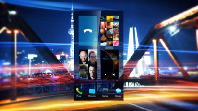
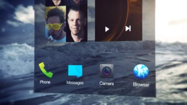
Ex-Nokia employees posted the first video of what appears to be a completely revamped Meego mobile OS. It looks a little bit like a mix of Android and Windows Phone, taking good elements from both. I think the fact that it will run Android apps (emulated) out of the box may help the system gain a userbase. Exciting.

Meego redesigned

Video:

Print design – bleeds, safe areas, margins, a0 / a1 / a2 / a3 / a4 / a5

Sure it sounds kinda easy, but when we design for print it’s important to keep some basic rules in mind. If you never did any print designs read on to find out what to do, to avoid instant failure. The most important thing is – modern printers are pretty precise, but still not as precise as your screen. That means that if you make an A4 sized paper and print it on a bigger one, the cutting and printing process together can result in your design being actually less than a4. And most clients don’t really want that.

Continue reading

20 creative business card ideas!

When people use the term “business card” we usually associate it with the boring rectangle in 2 or 3 standard sizes and forget about it. Well ok, sometimes someone uses a crazy color. But that’s not enough nowadays to catch the eye now is it? Here are 20 business card ideas that I’ve found that experiment. And surely having one of these given to you, you’d remember the company. Some are even edible!

See them after the break:

Continue reading

My thoughts on tablet vs mouse designing

It struck me a while back when I saw some designers using ONLY their tablets for all of the work. I mean even moving around the OS and launching apps. Right now desktops are basically having three input metods for designing. One is the graphic tablet, then we have the mouse which is still holding strong, and a new addition – a touchpad. Since the touchpads are pretty new and currently kinda low-res you won’t really have that much control over what you do, but soon that might change too.

I design using both the mouse and a Wacom tablet. The mouse is essential for most designs (well, for me) because simple shapes –> rectangles and ovals are easier to adjust with the mouse. I was trying to recreate the same level of precision on my tablet, and maybe it’s due to it’s relatively low-resolution but it was much harder. Still tablets are good for drawing things, for adding texture with various brushes or masking. For me the best way is to simply use both devices.

Also, the main difference between the mouse and the tablet is – if you’re using a tablet to design something for a couple hours you’ll actually feel more accomplished than if you’d just use the mouse all along. That’s probably due to the fact that using a “pen” makes it seem more like a real creation – our analogue memories kick in and bring us some positive feedback from kindergarten.

What do you prefer?

Creative destruction

Here’s a cool idea – let’s buy those overpriced apple products and then destroy them for the sake of art. If it won’t catch on we’ll be a couple thousand dollars behind budget, but if it does we might actually sell the prints and get the money for even more gadgets to destroy. Some we can even spare and use perhaps? Naaah. Michael Tompert is an artist that specializes in destroying apple products and photographing the results. He uses sledgehammers, blowtorches and other tools not necessarily associated with electronics-care. And for some odd reason that twisted, colorful metal looks really, really good. But kids don’t do it at home! More pictures after the break.

Continue reading

Make your own font.

Well not exactly “make” but it’s more of an exercise to better understand the relations between letters and it also helps a bit in future logo creation. I made this one by taking the letter “o” from Arial Black and then cutting into it, modifying the edges and such, to create a whole typeface. This is not a finished piece as some of the letters need a little tweaking, but it’s surely getting there. Go on, try and make a font yourself!

when redesigns kill the project / how people get used to things

We’ve seen it a couple of times already. Facebook made some changes and groups started popping up that were hoping to get the new design back. Some even issued threats that they’ll stop using the service if it’s not reverted tom the beloved original.

That clearly defines how people hate a change. Why blame them? It’s confusing when you come back to a familiar site to see it changed. As with music – you like what you already know- if you’ve used a site for a long time and see it many, many times you get used to the design of it as well. And it doesn’t really matter if the design was good or bad. It was “home sweet home” and people don’t like others redecorating their home. Now do they?

The whole subject came up because just recently some statistic were revealed about the popular site Digg. They had a steady 40mil uu daily and they drastically redesign the site. The result? a 26% decline in a few weeks in the US. That’s a lot of users.

So what’s the solution if you don’t want to stay behind with your design but you don’t want your viewers to go away? The simplest solution would be to keep changing small stuff constantly so people don’t have the time to get used. And if you keep the changes small the evolution will be easier to grasp than a revolution.

Examples? Think Google.

Photoshop and Illustrator on a budget

If you own a mac you’ve probably already spent a lot of cash on it. So digging deep in your pockets you might not find another hundreds of dollars for photoshop and illustrator right off the bat. But fear not as there are alternatives that are getting closer to the moment in which they can become substitutes. Sure they lack a lot of functions of the big brothers, but for most tasks they do just fine and are both around 60 dollars. So you can get a whole package for a little over a hundred. Which wouldn’t get you even the cardboard box for photoshop CS5.

Limited functionality is being worked on constantly so if something’s missing that you need in these apps it’ll probably come up pretty soon in the next version anyway. Of course if you need Adobe you’ll have to go with adobe. But it’s good to know that there are alternatives, maybe not for all tasks but still alternatives.

For raster graphics you have the beautifully designed Pixelmator and for vectors there’s Vector Designer . Both cheap but pretty capable. Abduzeedo promotes pixelmator and have quite a lot of tutorials for it, but there’s also a “Learn” section on their website that you can check out to see for yourself if the app is good enough for you.

Simplicity is pretty complicated

In graphic design the hardest things are actually the simple ones. Sure it sounds a bit stupid, but when you think about the rule of “Less is more” and then look at the big letter “a”, written in helvetica on a white background you can see that it’s not actually all peaches and cream.

Simplicity in webdesign is often refferred to as “minimalism”, which basically says it all. Something “minimalist” (-ic) is something simple, an expression of content/function with very little form.

This form can of course has it’s saturation levels – we can have a nicely designed website with just the text. Various typefaces, paddings and margins working together to create something that’s nice to the eye.
But that would probably be considered ultra-minimalism, so let’s move on.

Another step is adding a couple of elements like a background here, a divider line there, but still keeping it simple with as little colors, gradients, photography as possible. And this is where the hard part starts.
We all know that graphically rich and intense websites can hide their content flaws in a lot of flashes and eyecandy. With minimalism we don’t have that comfort, so everything has to be in place. Considering typefaces, font-sizes for different elements is crucial for the whole thing to look good while still being minimalist. If you want to make minimal websites it’s best to look around first and get some inspiration (that doesn’t mean copy+paste! ;))

I think every designer should have at least a couple of those minimal sites in his/hers portfolio among all those beloved graphically intense sites that we’re all so proud of.

Pixelmator 1.6 released

pixelmator16

It’s been a long time since the last version of pixelmator hit the internets, and now the long awaited 1.6 is out. Was it worth it? Is it super-cool? Is it a photoshop killer?

Well sort of

What we get in 1.6 is the long awaited layer groups (FINALLY!) which are done much nicer and user-friendly than in Photoshop. So yeah, this is a big plus.

We also get performance improvements and 64 bit / Grand Central Dispatch and all that other technical mambo jumbo. Bottom line? It’s 40% faster. This is of course always a good “feature”.
Precision transform tools are now more precise, rulers are now more ruler’y and there are supposed to be little tweaks here and there.

Still no real text tool though which is a buzz kill because that is the only major feature setting the app a bit behind but hopefully we’ll see text tools in 1.7. I’d just hate to wait for it for a year ;)
Overall performance is much better, and I love the new layer groups.

There’s also importing from devices such as cameras, iphones, ipads, and exporting to popular social sites. Might come in handy, although I don’t think it’s as important as the text tool ;)

So yeah, it got better, and closer to beating photoshop’s price-to-quality ratio. A good app and you should at least give it a try at pixelmator.com
Overlapping interests

smart-monkey Expansion in the creative field is a must nowadays, since everything seems to be running faster than us. The technology, other designers, recession of the currency. And so on. So we either try to outdo ourselves in one area – focusing on being great at one specific tasks – and hoping that we will be chosen because of the amount of skill we have. Or we try many different things like adding flash animations, video editing, sound editing, and not being too good in any of them.

But is it really that bad? I mean come on! It’s our ideas that matter. And in fact the myth of doing stuff to the point, and working long hours on every single project is bullshit. Some people work faster. And I’ve never seen a flawless project either. So is someone bullshitting us into thinking that we should be sticking to one thing, because they fear for the competition? I can make a pretty good video if I have the right material, choosing the right trimmings, effects and music. Does it mean that I shouldn’t do it because I’m not a pro at it? And I’m not talking about birthday party videos for my sister here. I’m talking about something I take the money for and I can put in my portfolio. That kind of video.

I think that creativity is not limited to a medium. It’s limited only as far as our own limits go. And if we truly commit , we simply don’t have any. Allright? Allright. So go out there, be creative. Accept criticism and turn your back on the hate because when they put their time into hate towards you and your work, you’re already on another project.
Good luck!