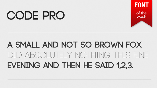
Here’s a very nice bold+thin free font called Code Pro. It looks very good on all kinds of modern-style web-designs and posters and for the $0 price is well worth grabbing right now!

Here’s a very nice bold+thin free font called Code Pro. It looks very good on all kinds of modern-style web-designs and posters and for the $0 price is well worth grabbing right now!
Adobe has made it’s CS2 apps (from 2005) available for free for anyone who has an Adobe ID (which you can get easily). That’s good news because some apps are less useful than others and not really worth paying big bucks for a now-and-then use. Since the servers are currently down you can download the MAC illustrator and inDesign versions here:
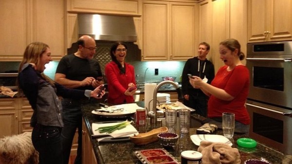
Not using my real name and info there anyway. But the whole story of public feeds and twitter controversy is funny. Especially since the picture is nothing special at all, just a bunch of people. Nobody’s even naked. The funny thing is how facebook lackluster privacy issues can even affect the people who are supposedly in charge. Well… who cares? The future belongs to vertical social networks anyway. And here’s the picture.
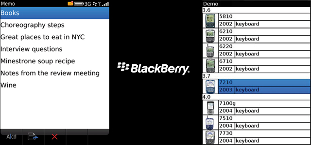
With the quickly coming BlackBerry 10 (the final stand) I looked back at what their apps and OS looks like to designers and actually went through the design guidelines. Most of it is typical gibberish, but the screen above speaks volumes – how could ANYONE create text that’s basically touching the screen border? I know the screens are low res, but having just 5 pixels from the side would create an EXTREMELY big difference. 10/15 would be perfect. The sad truth is that they lost on both functionality (modern touch phones can do a lot more) AND design. And by the looks of the BlackBerry 10 OS some things are fixed, but I think that without a complete overhaul it’s going to be one ugly OS with ugly apps (if any). And that’s a pity because the more OS’es the more different designs I can do. Well, let’s hope Windows 8 catches on…
I’ll be honest, etsy shook my world a little bit because it looked far better than any Android app I’ve seen so far. And if there’s one there might be more, right? So I went out and searched for best designed Android Apps and while the list is not long (yet) at least there’s more than one non-stock beautifully designed App for the green robot. So let’s start, shall we?
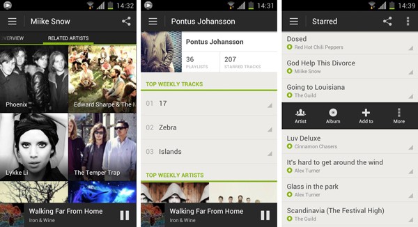
1. Spotify
Spotify takes the first place and leaves the competition far away (have you seen that terrible Android Last.fm app? Exactly!). Here we have Android style UI with a lot of attention to detail, great font alignments, spacings and an overall refined look & feel. Too bad that’s just one app and not the entire Google Play offering…

2. Etsy
We covered Etsy last week and we believe it still deserves a place among the best designed Android apps, so here it is.
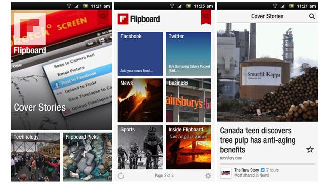
3. FlipBoard is another example that has been transferred from iOS with high precision. It looks almost exactly the same and it’s a good thing because it didn’t use the standard iOS guidelines anyway, so it translates well for any touch platform.
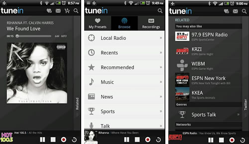
4. TuneIn Radio
A simple and clean app can be free of annoying design flaws like fonts touching the edge of the screen with no padding. Whoa! That is actually something on Android!
Do you know any other beautiful Android Apps?
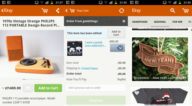
Etsy has released an Android app recently and I was pretty shocked, because it actually looks nice. Most of the Android apps I’ve seen are terribly ugly. That’s not really because of the UI difference from other platforms, but rather because developers for Android don’t really care about quality. They want to release many apps as fast as possible and cash the checks. Plus Google Play store is not as strict as iOS App Store when it comes to quality.
A lot of apps have fonts that are mis-aligned, weird spacings or lack of spacing, pixelated graphics or banding on gradients (that is a problem but can be fixed). So the main reason for Android apps looking relatively worse than iOS and Windows Apps is that the developers are lazy or they do the designs themselves without hiring an experienced designer.
That is a problem for the platform, even if people got used to apps looking ugly. By the way, I’m not saying that iOS has better UI than Android. Don’t really like gradients and gloss in iOS as well. That’s not the point. The point is that within those guidelines (or sometimes outside of them – completely unique apps like Flipboard) most iOS apps tend to look more refined than Android apps. You don’t see many apps on iOS that have their fonts glued to the left side of the screen without any padding. Or fonts that are not vertically/horizontally centred when they should be.
Good that Etsy (among some other apps that I’m hoping to find soon) is showing the world how Android apps should be done. Nearly everything here is perfect. Good fonts, good whitespace, right size icons and the right relativity of elements make it a very well designed and very refined Android experience. Hope to see more of that on the platform!
Do you know any good looking Android apps? Let us know!
You can download the app for free at: https://play.google.com/store/apps/details?id=com.etsy.android

Here’s a quick video of how HungrySquid looks on the new iPad mini. Both are simply beautiful! We love how the game plays on the 7.9 inch screen though, it’s perfect for puzzle gameplay. Far better than either the iPhone or the big ipad.
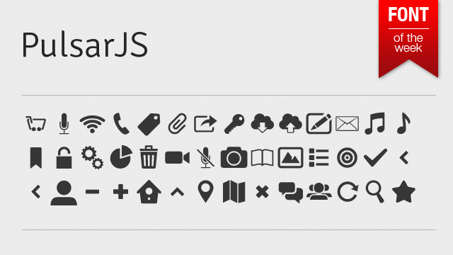
PulsarJS is a very nice icon typeface that comes in really handy, and in most cases can fully replace vector icon packs. Sure not all of the icons are awesome, but most of them are very neatly done and work well in all resolutions. This is a no-brainer.
And yes, it’s free. You can get it here
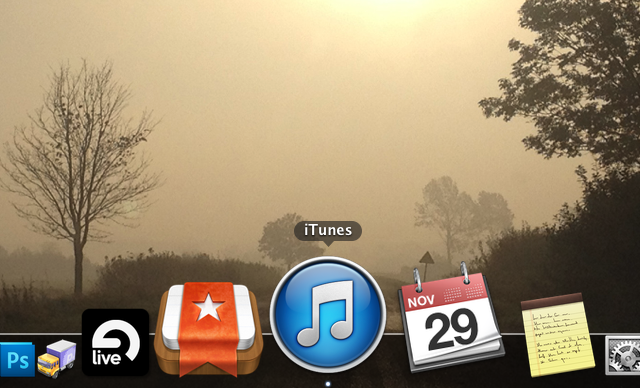
For a long time now Apple has made those ugly music apps icons – the iTunes icon (mac) and iPod / Music (iOS). What was wrong with them? Well for starters they used dark “note” element on a bright gradient background. That of course is not the case with most other iOS apps (namely Phone and Messages). The first iPod icon was also white and it was a bit less “obtrusive” to my taste. The current “dark” icon simply doesn’t fit the rest of the “simple gradient background icons” out there like the App Store, iTunes Store, Phone and Messages.
A while ago the same thing happened to the Mac version of iTunes, but now, with iTunes 11 the white icon is back. Hopefully that will inspire Apple to have the white icon on the iPhone as well. Seriously guys, that thing was SOOO much better in iOS 3.1.3, than it is now…
Not saying that that glossy, gradient filled new white icon is great, but it is an improvement.
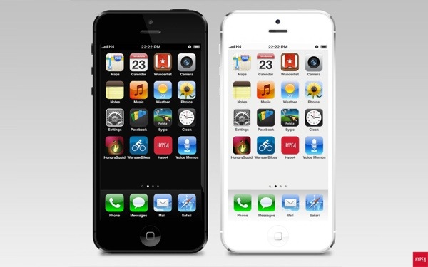
A while ago we created an iOS redesign project, to see what would the OS look like if the colours matched the iphone chassis colour. The results can now be viewed on Behance. Dont forget to Appreciate it ;)
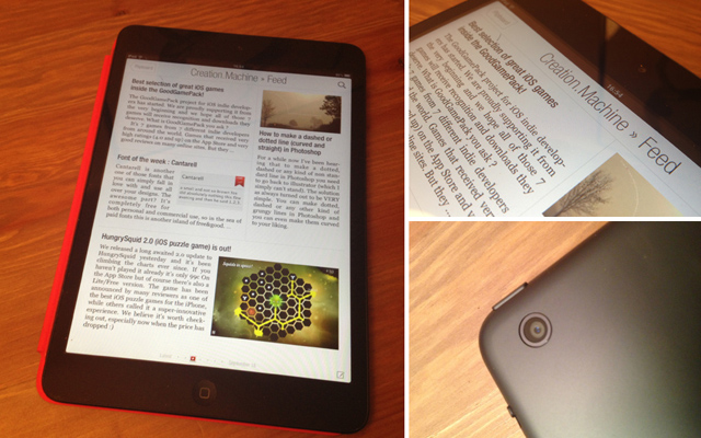
When Apple announced the iPad mini many thought that it’s their response to the cheap, 7 inch tablets taking the market by storm. In a way it might’ve been true, but iPad mini is neither cheap nor 7 inch. It is the best small tablet on the market though and here’s why:
4:3 form factor is WAY better for a tablet than 16:9. Nexus 7 browser looks silly compared to the iPad. All pages seem small and hard to read. Same with books and magazines. It’s odd that most companies are making those 16:9 tablets. We have covered the aspect ratio battle before and apparently not much have changed since then. And I can’t believe Apple patented the 4:3 ratio. That would just be plain silly ;)
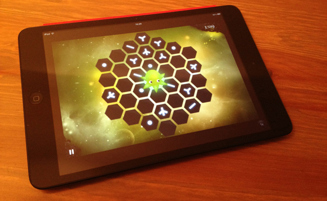
The screen is not retina, and probably will not get the bump in the next version because that would affect portability (weight and size) a little bit and right now it’s just perfect. The density is higher than on the iPads 1 & 2, and it doesn’t look bad. It is lower resolution that some of the Android tablets, but that doesn’t matter much when most Tablet apps are in Apple’s basket anyway. And they generally look much better anyway. After a while (and that’s from someone who used a retina iPad since March 2012) the screen doesn’t appear as low res as many would like it to be. It works and looks good (enough).
All tablet apps work just as well on the mini which makes it the best all around tablet in the world right now. It is portable and has the biggest tablet app selection out there. Everything is a little bit smaller but I didn’t encounter any problems with misplaced touches. It works and it works well.
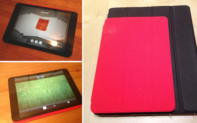
All in all that is the best iPad yet and will replace my 3rd generation Retina iPad as my main travel tablet. It’s also much better as a nightstand Flipboard reader due to the smaller weight – much easier to hold for longer periods of time. We got over 11 hours of continuus video playback from this device, so battery life is also outstanding. The small tablet market has a new leader. All the megapixels and megahertz don’t really matter. The device still works better than most tablets and it’s build quality is far ahead of ANY tablet out there, even including the big iPads.
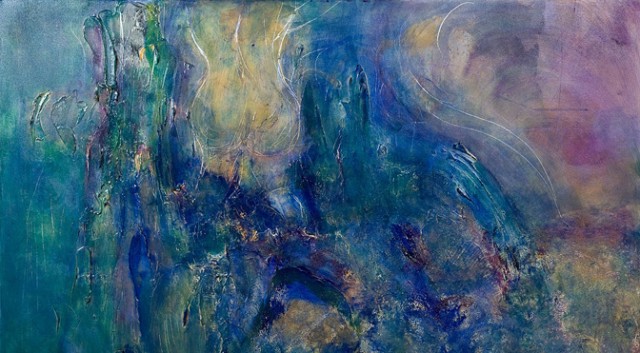
This is a little bit scary, a little bit sci-fi and a little bit not exactly true. But scientists have found a way for computers to understand the patterns of abstract art, and when supplied with data on how people react to certain paintings they can in turn analyse and create a painting that would evoke desired emotion in most humans. Still, true art is about error, about little mistakes and about the human touch. Computers can reproduce art, but they won’t be able to create something with a soul, if they don’t have one.
It made me think though – what if computers could analyze social networks, online blogs etc. and create collages automatically that would be always about the most recent, most popular thing out there.
That could transform the whole tv industry and a lot of people would loose their jobs. But well anyway, we still have time. SkyNet hasn’t been invented yet ;)
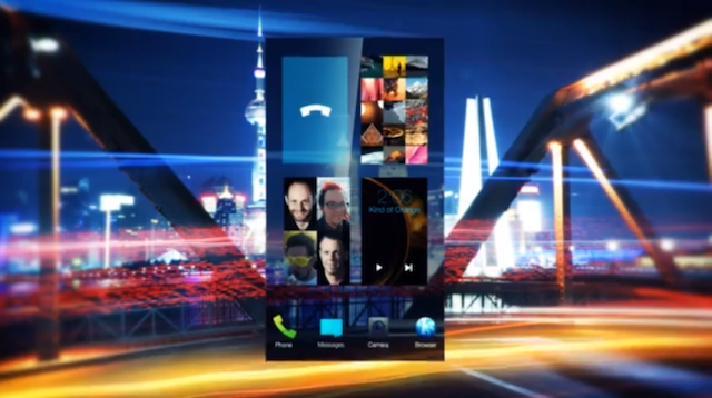
Ex-Nokia employees posted the first video of what appears to be a completely revamped Meego mobile OS. It looks a little bit like a mix of Android and Windows Phone, taking good elements from both. I think the fact that it will run Android apps (emulated) out of the box may help the system gain a userbase. Exciting.
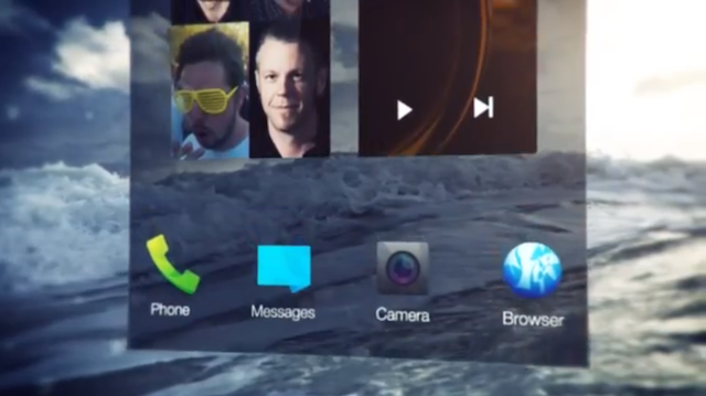
Video:
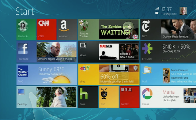
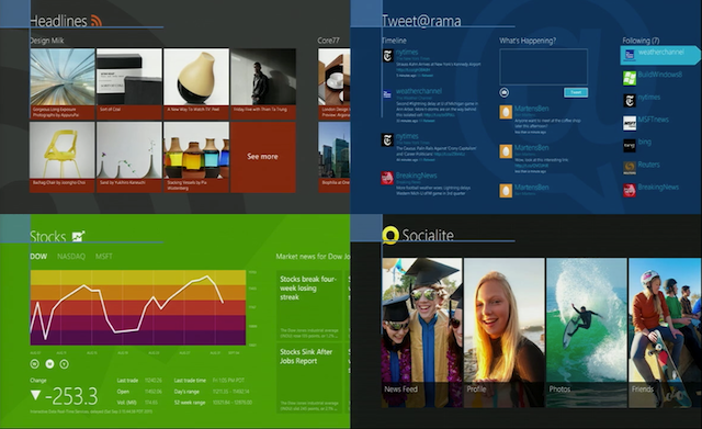
Even though the revolutionary UI of Windows8 wasn’t publicly seen untill 2011, apparently it has been in the works for over a year before. In Fact they started working on it in 2009, even before the first iPad came out. Of course iOS was available back then, as was Android. As you can see from the screenshots the live tiles weren’t as minimal and looked a lot messier in general. There was some more info (wifi, time and battery) on the top right and the charms bar (which I think is the biggest flaw of current windows) had more items and what looks like a start menu (?) on the top.
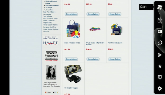
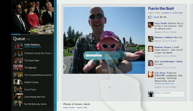
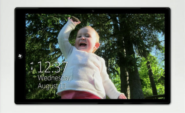
Since designs like that are always iterative, it’s possible that it simply was a start menu incorporated into that design. All in all I believe that it does look better and cleaner now, than it looked back then. It almost seemed as if MS was trying to make something in between it’s minimal approach and Apple’s skeumorphism. But in the video below Jensen Harris (Windows design team) makes fun of stitched leather quite a bit. He also points out that there’s always sunny and 23 degrees Celsius on the iPhone, but on the Calendar you see the current date. So not only there’s inconsistency, but also false information. And that brings me to another realisation – should icons go towards a tile-like style on iOS and Android? The Calendar on iOS sort-of already does that, but weather and clock are pretty obvious examples. The Photos app could have the latest photo there. I’m gonna try and create a mockup of how it could look like soon.
The also made really nice templates for the first and third party apps to be consistent which may crush creativity sometimes but is actually really cool in use.
Too bad we don’t see many videos like that from Jony Ive, but still worth a watch!
You can see the full video after the break:
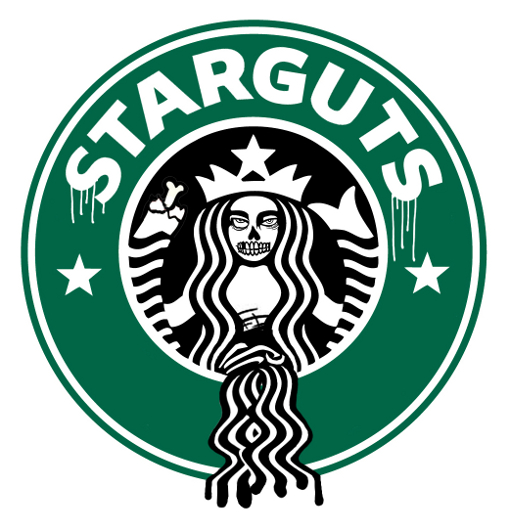
Designer Ben Fellowes created zombie versions of popular brands. Starguts and Fed On are my favourites. Here they are:
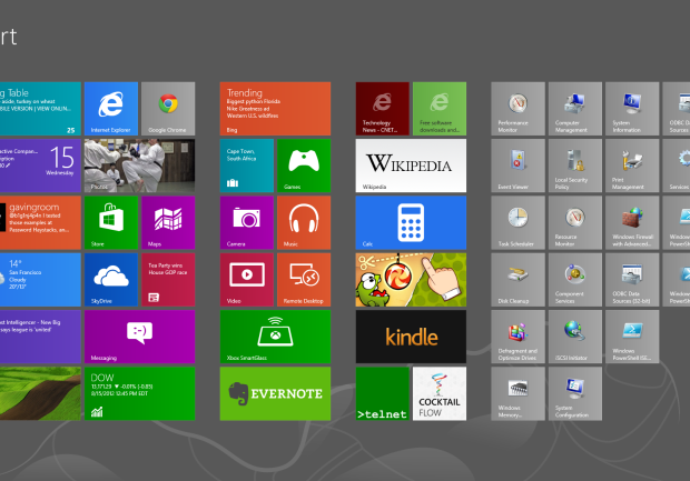
CNET reported today that usability guru Jakob Nielsen is very displeased with the new Windows8 on both PC’s and tablets. He claims that the system has important features hidden, and criticises the start screen.
Let’s think about that for a while. Sure a lot of features (like restart the computer) are more clicks away than ever, but in the era of always on SSD equipped computers is that really a flaw on MS’s part?
The “two desktops” approach may be confusing, but unless Windows 8 fails miserably we won’t see the standard desktop anymore in Windows 9. The biggest flaw at least for me is the fact that you can’t really use more than one window at the time. Sure you can pin a small second window to either the left or right, but that’s not really multitasking. I think Microsoft will address that at some point, because full screen apps are cool and all, but people need to have a choice. Right now it’s as Nielsen stated – the system looks more like a Window than Windows.
But the fact that it’s harder to use for consumers is not a bad thing necessarily. Everything that’s new needs some time to adjust to. Some people used Norton Commander equivalents in Windows for years because they preferred it to the windowed folders approach. Some even still do. But a lot of the users adjusted to the new (and now obsolete) ways of seeing windows.
We can see that by the numbers of people who are downloading the Start8 mod that brings back the start menu. Old habits die hard but without killing them from time to time there won’t be any innovation. And I for one don’t really want to look back in 2050 and still see a start button.
Nielsen may have had some strong points during the years but what would you expect from a person that actually loved the Ribbons in MS office? He also hated Photoshop, which I admit has some flaws, but judging pro software as if it’s made for consumers is a rather big mistake.
Office 2007 is a good improvement over the old, crusty Office UI. Interestingly, Snagit is one of the several other applications to adopt the “ribbon” style UI, which makes that more pleasant to use as well. On the other hand, I continue to find Photoshop unintuitive, though it has made me more productive to downgrade from the full edition to the more limited Elements edition.
J. Nielsen in 2007