About IdeaMonster

Krop, Square Extension, Dust|box artist. Illusion of sense art group founder, creative director, open mind.

Android Apps can look good too! Community redesigns popular apps.

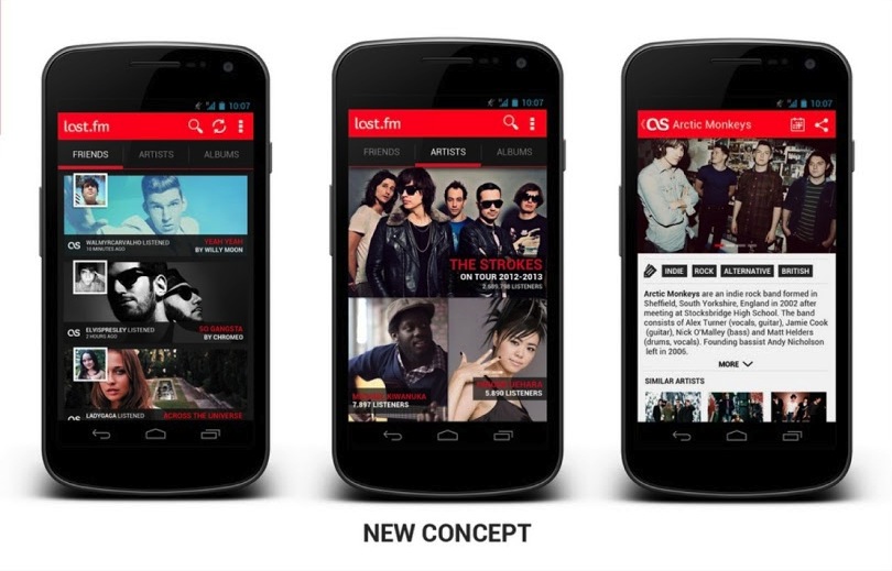
Android is not really famous for good designs of their Apps. In fact Apple mocks them all the time in their keynotes (especially the tablet scaled-up phone apps). There were some good ideas introduced to Android design with Holo, but still it feels as if most apps don’t really take it into account and are made by programmers without designers. WindowsPhone and iOS are way ahead of Android in terms of app design and that’s a fact. But that can still change! A google plus Android design community has put together some nice user redesigns of popular Android apps and the results are WAY better than the original apps. That means that there are skilled designers who understand the Android UI guidelines and can use them to create something that’s not appalling at first glance. Some of those apps look REALLY good. Let’s hope it spawns even more Android redesigns and the platform will finally get quality apps and not only cheaper, plastic phones from millions of manufacturers. Last.fm app redesign is up top, and here’s the original version below:
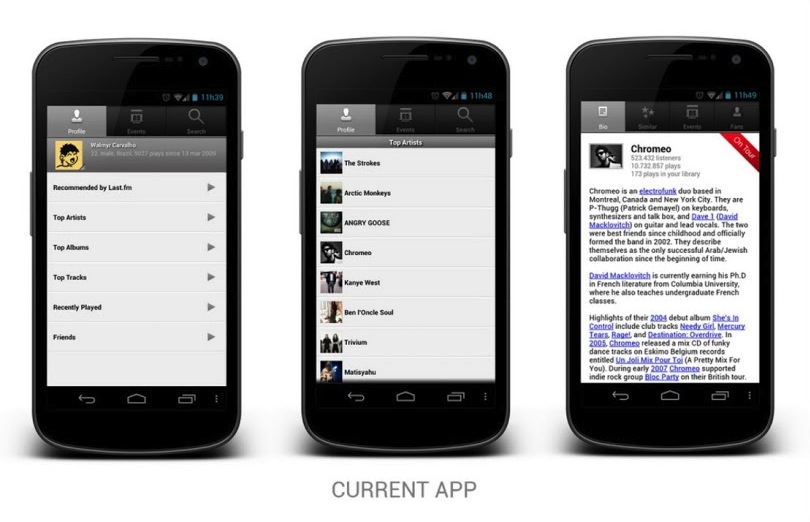
The new one looks much better doesn’t it?
You can see all the other works at
https://plus.google.com/u/0/s/%23ADiA%20%23Androiddesign
Best selection of great iOS games inside the GoodGamePack!

Good iPhone games

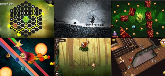
The GoodGamePack project for iOS indie developers has started. We are proudly supporting it from the very beginning and we hope all of those 7 games will receive recognition and downloads they deserve. What is GoodGamePack you ask ?

It’s 7 games from 7 different indie developers from around the world. Games that received very high ratings (4.0 and up) on the App Store and very good reviews on many online sites. But they didn’t get featured by Apple and didn’t reach critical mass. In many cases they didn’t pay for themselves either. Instead of giving up, the developers decided to take action and created a pack. If you want to help out share the info about www.GoodGamePack.com on your social circles and buy the games:

HungrySquid , NihilumbraMonstaaa!KometenWebbiesZONR and Brainsss


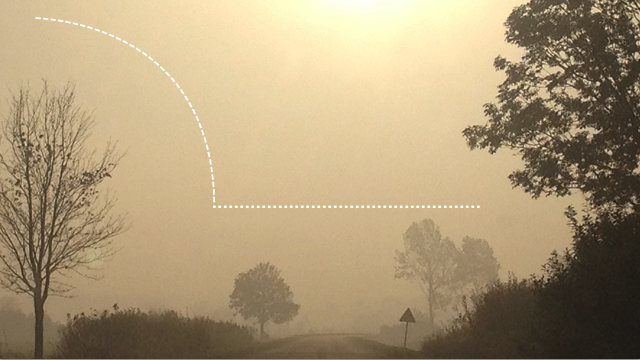
How to make a dashed or dotted line (curved and straight) in Photoshop

How to make a dashed or dotted straight or curved line in Photoshop

For a while now I’ve been hearing that to make a dotted, dashed or any kind of non standard line in Photoshop you need to go back to illustrator (which I simply can’t stand). The solution as always turned out to be VERY simple. You can make dotted, dashed or any other kind of grungy lines in Photoshop and you can even make them curved to your liking.

That can apply to both making a nice looking separator, or creating a whole character outline that way. So here’s how to do it:

Continue reading

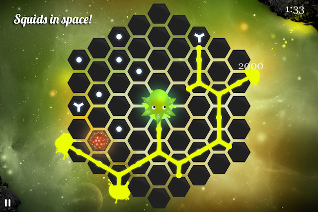
HungrySquid 2.0 (iOS puzzle game) is out!

The Best iPhone puzzle game

We released a long awaited 2.0 update to HungrySquid yesterday and it’s been climbing the charts ever since. If you haven’t played it already it’s only 99c On the App Store but of course there’s also a Lite/Free version. The game has been announced by many reviewers as one of the best iOS puzzle games for the iPhone, while others called it a super-innovative experience. We believe it’s worth checking out, especially now when the price has dropped :)

A lot of work went into the development and the game has almost 50,000 players from around the world, with an average App Store rating of 4.5 (after about 150 total ratings in all stores). That’s good, but the current update makes it even better!

  • We changed the graphics (new backgrounds, updated squids and planets)
  • Added 30 new levels (including earth!)
  • Updated the gameplay and fixed some bugs
  • Updated the French translation thanks to Claire Servolle
Go get it now On the App Store!

Continue reading

Microsoft gets it right (even skeumorphism) with Office for iOS announcements

Microsoft Office iOS iPad iPhone

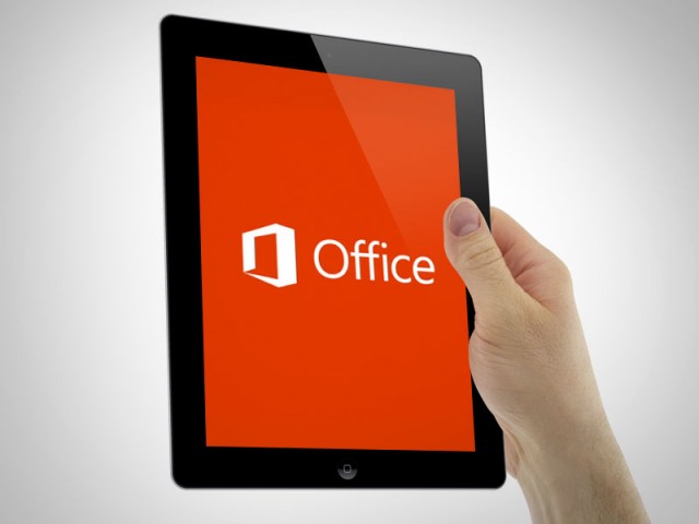
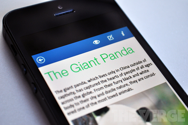
Microsoft was supposedly working on an iOS version of Office for a while now, but right now it appears to be near completion, because some screenshots of the iPhone version surfaced. What do they look like? To me it’s a mix of Apple skeumorphic app guidelines with Microsoft new design aesthetic and it works great! They look very well made and refined visually. IMHO they look better than Apple’s own iWork mobile suite that has those overblown hard gradients and shadows everywhere.

Modern UI (ex. Metro) aside Microsoft is slowly becoming the best company design-wise in any style. Let’s wait for the final product and see if they can beat Apple in Skeumorphic game as well.

Microsoft Office for iOS
Image source: The Verge

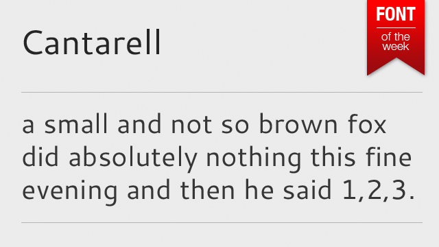
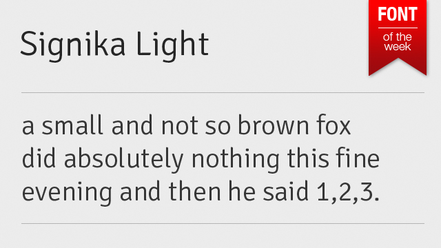
Font of the week – Signika Light / Signika font family

Font of the week signika

The Signika family is a beautiful set of typefaces made by Anna Giedryś. Signika is a sans-serif, gentle gentle font, developed for wayfinding, signage, and other media where clarity of information is required. And it sure does deliver, looking great especially on white backgrounds. It has a low contrast and tall x-height to improve readability of texts in small sizes as well as in large distances from the reader. It can also be used via Google Web Fonts and looks great online. In fact we’re using it for the body copy at Hype4 websites (blogs not included). Get it now at Google Web Fonts

Will skeumorphism really be gone in iOS? Or will it just be simplified?

ios Windows android buttons

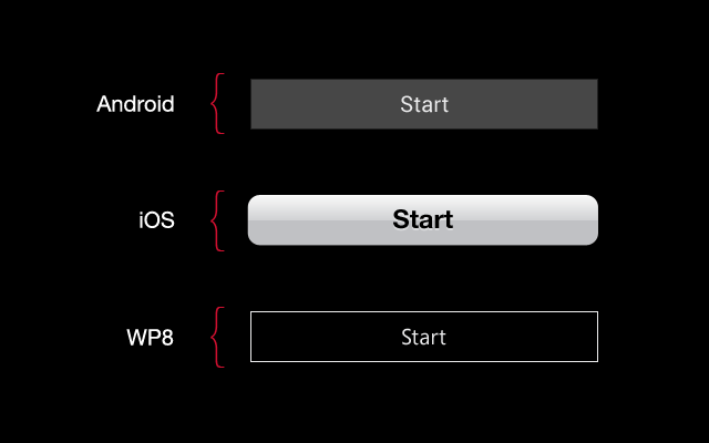
Jony Ive is famous for sleek, minimalistic designs of Apple products. But will he be able to transform the Human Interface (as Apple now calls it’s UI) after so many years of stitched leather and paper? And should he? Right now iOS is the only mobile OS that didn’t simplify their UI. Android went from gradients and odd looking fonts to solid buttons and Roboto font. Windows 8 introduced outlines and Segoe, while Apple is still stuck on gradients, overlays, inner and outer shadows and large and bulky helvetica neue bold. Right now because of that exact Skeumorphism Apple stands out from the rest a bit more. If we simplify it by removing the gradients and making the buttons less “button’y” it’ll start looking either like Win8, or Android.

Apple chose a very bad time to make those changes after so many years of life-like UI’s. Why? Because if they do it now, after everyone else went purely digital, they’d be accused of stealing ideas and being “behind”.

My bet is that it won’t go as far as Android or Windows Phone in simplicity, but we might see the gradients removed (while keeping the shadows, and maybe a little noise). Also I think mr. Ive might go for a better consistency across all the apps, because right now iOS is a mess – every app has a slightly different looking UI, not really fitting together with the rest of the OS. If it gets a little bit simpler visually and more unified, the experience will be better without copying Android or Windows Phone.
I seriously hope that we’ll see a change, because as a designer I’m a bit upset with Apple’s current direction. Taking the button metaphor as an example – I think iOS buttons are less refined than Android’s and WP8’s.

But of course we just have to wait and see what comes next with iOS7.

We’ve got a little more to show you – Apple will unveil the iPad mini on October 23rd?

We've got a little more to show you

Apparently Apple will unveil the new iPad mini (to compete with Kindle fires and Nexus 7’s on low prices) on October 23rd. The invitations are sent, and apparently they decided that a smaller tablet is actually worth their while. Steve Jobs famously said that a smaller form factor is plain stupid. Tim Cook seems to differ ;)

Too be honest we’d rather see the infamous 13″ retina macbook pro, than a smaller and cheaper (and probably non-retina) iPad. Apple going after mass market only looks good on paper.

Besides, if the iPad mini is smaller, why are they calling it a little more? A smaller, non-retina iPad would actually be something “less” ;P

GoodGamePack started! Great iOS games database

iOS game pack

Good Game Pack (or GamePack) is a web app that we just started (with Hype4) to gather and cross-promote great but undiscovered iOS games. We have reached out to 10 developers to have their games added and we will continue looking. If your game fits the bill, let us know. It’s completely free! It’s all about cross-promotion of selected game developers because well … United we stand!

You can visit the GamePack on your iPhone at GoodGamePack.com!

What if iOS design matched the iPhone design? (and it’s colours!)

iOS redesign

A few days ago Yves Behar had said, that Apple products don’t really fit the software, as if they were made by two completely different teams. The industrial design is clean, simple and futuristic, while the OS has skeumorphism with stitched leather and all that ‘fun’ stuff. He inspired me to see what would happen, if the software design matched the industrial design, with color-coded OS for each device. Apple has been under a lot of critique lately, due to keeping it safe and not introducing many visual innovations to their software. I’m not saying my design is better. I just wanted to see how it’d look like if the design matched the phone quite literally. So I created the Black and Grey + White and Silver versions of the OS for the iPhone 5.

You can see the whole project at: http://hype4.com/whatif

New Myspace Redesign is amazing!

New myspace

Remember MySpace? No? Well before Facebook (and yes there was a BEFORE Facebook) the most popular social network in the world was MySpace. It allowed people to customize their profiles with images and CSS, so each and every one was different. It was many things (music player, social media, bands promotion platform) but clean it wasn’t.

I still remember the horrible glitter backgrounds and green type on pink backgrounds. Yuck! Since Facebook came to life with it’s “clean&boring” design, MySpace was slowly dying, even with one of the biggest indie music collections in the world onboard. Well now they’re redesigning it (again) to be a mix of a music service, pinterest-que type photo viewer and in general a social network for the creatives – photographers, musicians, designers. And of course “fans”. Take a look at the screenshots after the break – it looks impressive and really clean + modern. Good job MySpace!

Continue reading