Apple iPhone screen fragmentation and the missing 3 pixels

iphone screen size fragmentation

When apple switched from the 4:3 aspect ratio on the iPhone 4S, to the 16:9 ratio of the iPhone 5, the world accepted it as a fact.
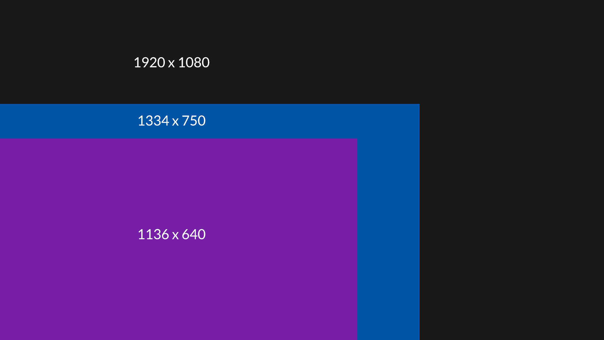
Now, when we have two new resolutions we can start thinking about iOS fragmentation. Apparently both the iPhone 5, 6 and 6 plus have a 16:9 aspect ratio. With the respective resolutions of 1136 x 640, 1334 x 750 and 1080 x 1920, we would expect we can scale the top resolution down and get the middle and lowest one. No suck luck.

iphone screen size fragmentation 3px

When we scale 1080p down to 750 pixels, we get 750 x 1333. We are missing one pixel.
It get’s even weirder when we scale it down from 750 x 1334 to 640, because the height appears to be 1138. Now we are gaining two pixels.
Scaling up from 640 to 750 yields 750 x 1331 pixels – so loosing two.

Of course it’s all roughly 16:9 every time, but the problem is that even when you created your app fully on vectors, you can’t simply resize the canvas because you’re missing pixels on every resolution.

Bad move apple :(

Apple posts design tips for developers

apple design tips

We recently raised the subject of how most apps don’t really look like the design when they are developed, and here comes Apple to the rescue! ;) The developers are generally lazy when it comes to implementation and believe that if it displays (in any way) then their job is done. They don’t care about margins, spacing, platform rules and ui paradigms. No, they are the mighty app developers, a rather small elite among other devs, so they don’t lower themselves down to implement things perfectly or to worry about how the information is presented.

Apple has published a set of rules and guidelines (a short one still, but always something) to educate developers about some basic mistakes they do. Let’s just hope they’ll start rejecting crap-design apps from now on, because a warning is only meaningful when it’s a threat.

Forget Flappy Bird clones! Dotpocalypse is out!

Dotpocalypse iOS arcade game

We are happy to announce our second, free iOS game called Dotpocalypse (press release image attached). It’s a simple, minimal arcade game that’s all about how fast and accurate you are with your fingers. The only thing that matters is skill and dexterity. Oh and technique too. The game adjusts to your speed, so the faster you are, the higher you score – some players can do insane, inhuman combos because of that. Check it out at:

https://itunes.apple.com/us/app/dotpocalypse/id737504884?ls=1&mt=8

Thanks,

HYPE4 + ManBat team!

Our next iOS arcade game – “Dotpocalypse” is coming very soon

dotpocalypse

We are happy to announce our second iOS game – Dotpocalypse. It’s coming VERY soon and will be free with in-app purchases. The second game is very flat and minimal for a difference, while the most important part of it to be as fast and accurate as possible. Without spoiling any more details, we’ll post a link to the game when it’s released this February.

We played around with quite a lot of ideas and concepts, and yes – we are working on a moody, atmospheric and story driven game. We wanted to release something simple and minimal first and now it’s almost there.

iOS 7 visual errors, mistakes and bugs

ios7 background app refresh visual bug

I was very skeptical about Apple’s new mobile OS a while ago, but it actually grew on me. I still think the home screen icons are ugly, but more and more of the OS is actually quite cool. There are glitches though and small visual errors that look very weird coming from Apple. Steve Jobs had famously called some designers at 4am to change an orange hue on the Google Maps icon, and now things like that end up in the final OS? Odd. Let’s hope they fix it soon. I’ll be adding more images as I’m finding them.

ios7 calendar iPad portrait visual bug

The calendar bug is pretty weird. It says it’s September of 201, and I’m pretty sure that if it was I wouldn’t be writing this blog ;)
Yes, we know that the “3” is under the segmented control, but that is just a plain bad solution. Especially in portrait on the iPad, when we have so much vertical space, we can make the actual days smaller vertically and add another line with just the date. It would be clean and precise + visible too.

Vectormator hidden inside Pixelmator 2.2 Blueberry

Vectormator hidden in Pixelmator

Pixelmator developers never cease to amaze us. They released a great update not too long ago, and now it turns out it’s packing a whole other app hidden inside of it. When you press Command + Shift + V the app switches it’s mode and becomes a vector editing tool. It might not yet be an Illustrator replacement, but I really like how the vector tools work and feel like. This is a great way to enhance the possibilities of the app and also some simple logos and shapes can be created from within the app, but in a more streamlined and specified UI. Great work!

You can download Pixelmator 2.2 on the App Store for $15. Blueberry is a free update for all the existing Pixelmator users. I hope to play a bit with the vector tools in Pixelmator / Vectormator and see how they work when there’s actual work to be done. Updates coming soon.

Pixelmator 2.2 Blueberry released with light leak filter and cool shape tools

pixelmator 2.2 blueberry shapes light leak

We expressed our love & admiration for Pixelmator a couple of times before, also noting a couple of small issues. (most of them are fixed by now :) But in general it’s one of the apps (and success stories) worth looking at with awe.

Now we can download the 2.2 version, codenamed Blueberry from the App Store and it’s absolutely worth it. At that price ($15) it’s probably the best price-to-features ratio on the planet. Sure – layer styles are nowhere to be found in this version (but they said they’re coming further down the road) but we have some more awesome photo effects (beautiful and very customizable light-leak effects) and vector shapes done in my oppinion better than in Photoshop. They’re both easier to manipulate, handle and edit than what the big brother has to offer.

Adobe moving to fully to the cloud with Pixelmator gaining features and staying at a low price point may in a year or two convince a lot of designers to just switch to a cheaper alternative with a much prettier UI and most of the really useful (at least for web / mobile design) functions are already there. Once we get layer styles a lot can change on the market.

Great job Pixelmator Team!

You can download the app on the mac app store and read more at www.pixelmator.com

Photoshop CS6 type tool bugs and Adobe’s Creative Cloud future

photoshop cs6 type tool bug

Photoshop CS6 has brought a couple of great and not so great additions to the world’s most popular pro graphics app that we already covered. But now after over two months with it the little annoyances don’t seem to be going away in an update anytime soon.

Especially since Adobe has decided that we won’t get a CS7 and should all use Creative Cloud instead. On one hand the deal is great (and pays for itself usually with a portion of a project) but abandoning CS5 and CS6 users and leaving them with not-fixed bugs is kinda not-cool Adobe!

The Font bugs are the most common and most annoying – some fonts take a VERY long time (seconds) to load even on a Retina Macbook Pro with 8GB’s of RAM. Some fonts are smaller in size visually than others, but Photoshop proclaims them bigger for some reason. Setting a consistent font-size among lots of text-fields can be a pain.

I’m keeping the CS6 license, but will probably upgrade to Creative Cloud quite soon. Does anyone know if the CC version of Photoshop (yes it’s apparently a different version with a different update cycle) has those type tool bugs fixed?

Photoshop CS6 first impressions, bugs and awesome new features

photoshop cs6 new features

Photoshop CS6 was released quite a while ago, but as usual, the first versions are ridden with bugs and generally slow, so I finally bought the update yesterday and wanted to share my impressions about it. There was one annoying (very annoying) bug with Middle-Eastern typography setting (instead of East Asian) that I resolved, but more on that later. Now let’s get to what’s cool:

Continue reading

Why sticking to what user already knows in UX design is a wrong approach

pull to refresh UX

If there’s a way to do things and it has been in use for a long time, the users are more likely to understand that way and have a better experience. Easier too. UX people are usually using this one a lot, almost as a bible-quote. Sure – if something’s not broken why fix it, but that’s only one part of the story. The truth in mobile apps is, that Apple created a certain set of rules in 2007 that hasn’t really changed. Android followed with their ripoff own version a while later and both platforms.

So should we really follow only what users know and expect? Because if we did, we wouldn’t have Twitter’s “Pull to refresh” which is now ubiquitous. We wouldn’t have the twitter / facebook style slide-from-the-left menu panel and many, many more small tidbits.

facebook pull the side menu

Within reason it’s those who try new things, that are pushing the experience forward. And the only was is to go against the user sometimes. Of course it’s all within reason, but don’t let anybody fool you. If an UX designer is saying your idea is bad, just go and prove him wrong :) Unless you want the world to stand still.

Did Microsoft break Skype for iOS on purpose? Will Google break maps and youtube too?

skype color

The battle of the giants is on. With three main competing platforms (iOS, Android and Windows Phone) each company tries as much as possible to have an upper hand. Apple doesn’t really do cross platform apps for mobile, but MS and Google have some on nearly every platform and they are popular.

It started with Apple removing Google Maps and YouTube from iOS in the 6th version of the OS. Soon after that Google has published their own apps to replace the stock ones on iOS, and they are great. At the same time Google refuses to make their maps app for Windows Phone and even tried blocking web versions from mobile IE.

Continue reading

Pixelmator is on it’s way to kill Photoshop with vectors and layer styles

pixelmator 2.2 will kill photoshop

Pixelmator, the cheap ($25) image editing app has been a big hit on the App store. First of all – it can read PSD files and save them. It also provides a lot of the basic editing tools and filters that most web/mobile designers use every day. Also it uses 99% of the same keyboard shortcuts as Photoshop, so it’s very easy and natural for a PS user. Sure it’s not as good as the newest PS for large print and photo editing, but for a web / app designer only a few things were missing. Mostly layer styles and vector shape support. Well guess what – they’re all coming to the app as a free update in the very near future.

I have tested Pixelmator for quite a while now and if it had layer styles and shapes I think it could replace Photoshop in my daily workflow completely. After those functions are added I will try and do my day-to-day work in Pixelmator for two weeks and will submit my views every other day. This is VERY good news for all designers out there.

Let’s just hope the company will expand and make a vector editing app as well, because frankly most cheap alternatives to illustrator are not really good.

You can read more about the app and it’s features at pixelmator.com

Adobe CS2 suite is NOT free after all

Adobe CS 2 suite available for FREE

Apparently the whole “Free download” has made quite a stir on the internet. People were happy to finally go “legal” in some cases, even with old software. Sure, the Mac version wouldn’t work on any new Mac (post 2006) anyway, but FREE is free right? Well, no. No it’s not.

You have heard wrong! Adobe is absolutely not providing free copies of CS2!

What is true is that Adobe is terminating the activation servers for CS2 and that for existing licensed users of CS2 who need to reinstall their software, copies of CS2 that don’t require activation but do require valid serial numbers are available.

So there you have it. I knew it was too good to be true, especially for a company like Adobe ;)