
Back in the days when we had to design for 800×600 screen sizes, “The Fold” was somewhat as much feared as IE6’s ability to destroy layouts. Now it’s 2012 and we have 800×600 pixels and more in some mobile phones, and the web has settled for 960 pixel width layouts. But the Fold is still pretty strong in a lot of the designs.
On most websites a nice body copy font is considered to be somewhere close to 10-12 pixels, with the default leading. And usually to cover the fact that most web copy is just plain horrible, there’s a lot of graphics around the text, almost as if the main function (information) is loosing with the form (the graphics). It’s not readable. And I’m not talking about pink fonts on yellow backgrounds. I’m talking about most of the web.
It’s almost as if designers are afraid of making the content look legible. Maybe they’re thinking that if there’s more text than anything else in a design, they’re not really needed anymore? Who knows. The fact is that most of the web is terribly unreadable and actually painful to use.
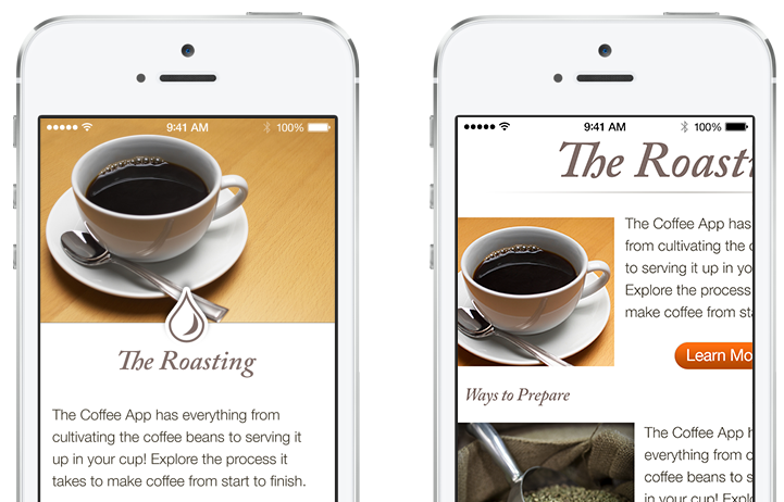
And then came Flipboard with it’s pre formatting and changed some perspectives. Bigger fonts (between 16 and 24 pixels) came into play, and a leading of 1.4 em. Content consumption has become pleasant again. Apple added the “Reader” feature to Safari, and suddenly most websites are just a click away from being enjoyable!
Maybe it’s time to switch some perspectives and bring the web to it’s basic function (except porn) – reading stuff on the screen. And yes it can be a nice experience!
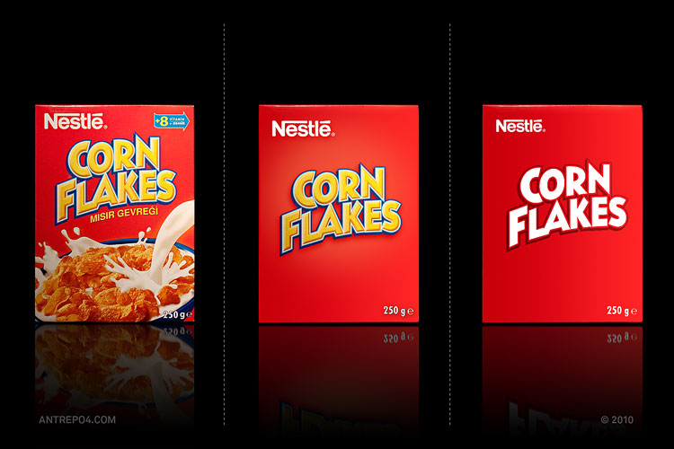






 The web sure has gone a long way from it’s humble beginnings of blue, underlined links, serif fonts, animated GIFs (they now exist as something completely different) and patterned backgrounds. Well now we are seeing a rapid increase of so-called ‘minimal design’. The idea is to have a simple, once color background (preferably white). Gradients and textures are generally frowned upon. The site’s palette should consist of only a couple colours, and using more than two (or three) fonts is prohibited.