HYPE4 was at the Web Summit this year – it was awesome!

The Web Summit in Dublin 2014

We were at the Web Summit in Dublin this year and took some pictures! It was a very cool show, with lots of interesting startups (some not-so-interesting and some utterly pointless too, but that balance was tipped well towards the former!) and inspiring keynotes from industry leaders of all shapes and sizes.

Web Summit Centre stage
The centre stage was a place of many interesting conversations, keynotes and showcases – including that adorable little robot :)

Continue reading

A Good user interface? You bet!

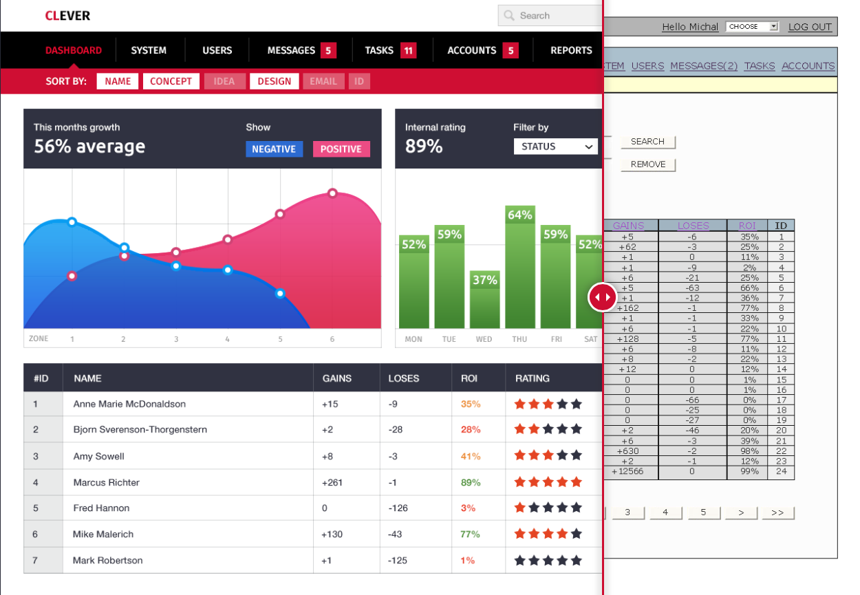
A good user interface - before & after

Most of the current web interfaces are still based on the visual and UX paradigms created in the early days of the internet. User Friendly is an empty term with a lot of those interfaces, loosing the battle against costs and deadlines. The end user is the one who suffers a poorly designed, hard to use and plain ugly interface on a daily basis. Be it a bank system, your webmail, or any other sligthly more complicated thing you spend hours with every day. It’s not the 90’s anymore, time to redesign!

Does it have to stay that way?

Go here to find out + see the before & after shots.

Bob Dylan comes back to the techno-reality with “Like a rolling stone” interactive music video

bob-dylan-like-a-rolling-stone

I never considered Bob Dylan to be Tech Savvy, aside from doing ads for Apple a while ago, but apparently the man has still some cool ideas. Sure it took quite a few years for Like a Rolling Stone to get a music video, but it was well worth the wait. The video is interactive and actually fun to use + no two people will get the same experience the creators claim. Check it out at:

http://video.bobdylan.com/desktop.html

Windows Phone Navigation idea mockup (UI + UX)

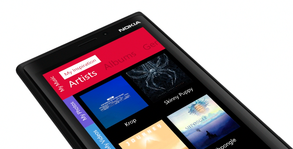
windows phone tabbed ui idea ux

I am currently a happy user of a Lumia Phone. The idea for the switch from my trusty old iPhone 4S was simple – I wanted to learn & feel the platform since I need to design for it as well. After a few days of playing with the OS I can honestly say I like A LOT. The lack of quality third-party apps is the biggest drawback, but all-in-all it’s a very well designed OS both visually and in the UX (those animations are just lovely)

But while playing with the OS an idea formed in my head about a tabbed-not-really-tabbed interface that would both fit the platform and be unique to it. Putting thoughts into pixels was the easy part after that and hence my tabbed-UI for Windows phone mockup was born.

Continue reading

iOS 6 vs iOS 7 banners comparison

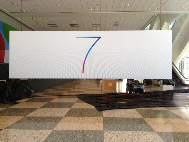
ios 7 banneer wwdc13 moscone west

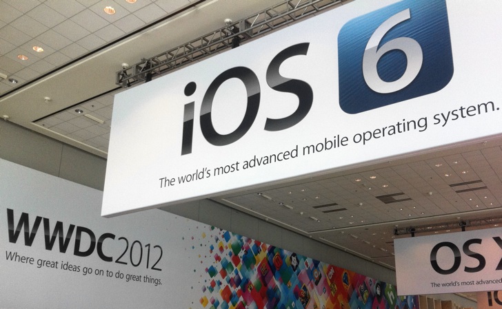
ios 6 banneer wwdc12 moscone west

The hype is building up before WWDC this year about major redesigns for both iOS and OS X (which is unlikely especially since Apple has pulled engineers from OS X to deliver iOS on schedule, and OS X is by far a more complex OS)

We think it’s a cool direction for both iOS 7 and OS X (what cat comes after Mountain Lion? Anybody knows?)
People say “modern, flat designs are all the rage” which is of course true, but looking back they actually always were. They’re just being refined as people understand the technology, hi-dpi screens and touch inputs more and more.

Computers can now be artists too and create works that evoke human emotion

Computers understand abstract art

This is a little bit scary, a little bit sci-fi and a little bit not exactly true. But scientists have found a way for computers to understand the patterns of abstract art, and when supplied with data on how people react to certain paintings they can in turn analyse and create a painting that would evoke desired emotion in most humans. Still, true art is about error, about little mistakes and about the human touch. Computers can reproduce art, but they won’t be able to create something with a soul, if they don’t have one.

It made me think though – what if computers could analyze social networks, online blogs etc. and create collages automatically that would be always about the most recent, most popular thing out there.
That could transform the whole tv industry and a lot of people would loose their jobs. But well anyway, we still have time. SkyNet hasn’t been invented yet ;)

Microsoft gets it right (even skeumorphism) with Office for iOS announcements

Microsoft Office iOS iPad iPhone

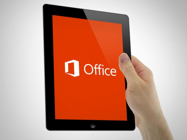
Microsoft was supposedly working on an iOS version of Office for a while now, but right now it appears to be near completion, because some screenshots of the iPhone version surfaced. What do they look like? To me it’s a mix of Apple skeumorphic app guidelines with Microsoft new design aesthetic and it works great! They look very well made and refined visually. IMHO they look better than Apple’s own iWork mobile suite that has those overblown hard gradients and shadows everywhere.

Modern UI (ex. Metro) aside Microsoft is slowly becoming the best company design-wise in any style. Let’s wait for the final product and see if they can beat Apple in Skeumorphic game as well.

Microsoft Office for iOS
Image source: The Verge

Adobe Illustrator sucks! We want FreeHand back! Well sort of.

A while ago a group of dedicated Macromedia Freehand users created a petition to bring back the beloved vector image editor from the dead (or Adobe’s closet if you wish). Of course there’s no way in hell Adobe will admit that illustrator is not good enough, so they didn’t really go well with the idea of bringing a streamlined, easier to use and more intuitive vector tool back to the world. But fret not. Apparently FreeHand’s fans are really a dedicated bunch, because they’re making a “clone” of FreeHand, with modern features that would probably be added anyway if the software was still alive. The project is in development and there’s not much info available yet, but you can give the guys 25EUR to keep them both motivated and moving forward.

We think it’s a very cool idea, because let’s face it – the interface for Ai is dreadful. And since the Pixelmator Team didn’t start a vector app (yet?) we have to stick to what we hope will be the next best thing.

Check them out at : www.stagestack.com

Trees are on the streets!

It's about time they took matters into their own hands

I stumbled upon (no pun intended) an awesome image of a tree holding an awareness sign against cutting down rain forests. It’s great because it catches attention way more than a normal billboard, and the fun factor makes it spread via word of mouth more. I think I’ve read somewhere that it’s a german action – well congratulations to the guys who came up with it – a really awesome and inspiring idea. And he has friends! ;)

New Outlook.com email is stunning!

Finally a worthy competitor to Gmail!

Microsoft is really pushing the metro interface (it’s not supposed to be called metro anymore – they’re thinking of a new name) with tiles, colors and beautiful typography. That purely digital, modern approach is finding it’s way in other places, and right now it came to the fully redesigned hotmail little brother – Outlook.com.

The site features skype video calling, facebook integration and a super-clean email experience with no ugly MS ribbons and cluttered menus. This looks so good, that it’s possibly the very best design in web email clients anywhere.

That clean, uncluttered interface IS the future and I seriously hope that Apple will tune down those skeumorphic designs at least a little bit. Since it’s all digital anyway, maybe it’d be best to accept it and become digital design-wise.

Besides it works well from the usability standpoint since it’s all clear, visible and easily accessible. The only thing I don’t quite like is the choice of colors. Maybe MS could tune down those hard colors a bit, or give the users a choice to just type in a hex color themselves. That’d be awesome. Well anyway – since it’s just launched maybe it’s a good time to go and “reserve” your name on there? www.outlook.com


Physynth – amazing user interface design

Every now and then in a sea of copycats we see something truly new and unique that catches our attention

Physynth stands out not only for it’s musical capabilities, but most notably for great and innovative design. It uses the iPad’s accelerometer to simulate light and shadows on it’s surface. That means if you turn your device to the left, the shadows of the knobs and dials will go to the right and so forth. It all looks so “real” and “artificial” at the same time, that it really catches attention.

The app is just 1$ and it’s available at:
http://itunes.apple.com/us/app/physynth/id469924626?mt=8

Browser version of Windows Phone interface for iOS and Android

Microsoft is generally considered a non-creative, "suit philosophy" company. Sometimes though, it takes a step away from that and creates something cool. Bing, xbox, some recent ads and most notably the Windows Phone interface. The latter you can now preview on your iPhone or Android device inside the browser. Sure it’s not a full experience, and reminds us a bit of the Web iPad demo, but it’s a clever way to show how the interface is innovative and cool to use. Good job microsoft. To test it open this url on your phone:
http://aka.ms/wpdemo