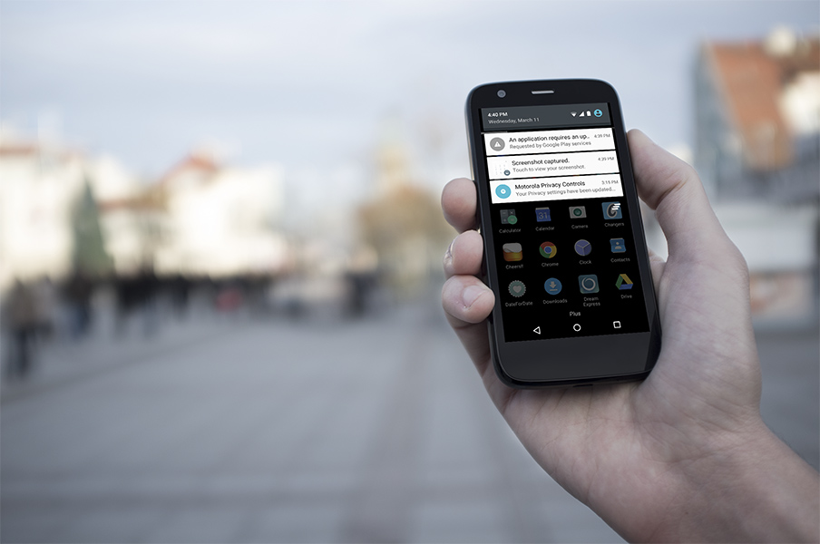
Finally Moto G First Gen users can play with the new Android release. So far it seems quite stable and visually better indeed. Material design was actually present on the Moto G even on 4.4.4 with most Google apps taking cues from it. Now we also have all the nice animations and transitions and the good thing is that they run smoothly even on a budget phone like the Moto G.
Author Archives: IdeaMonster
HYPE4 was at the Web Summit this year – it was awesome!
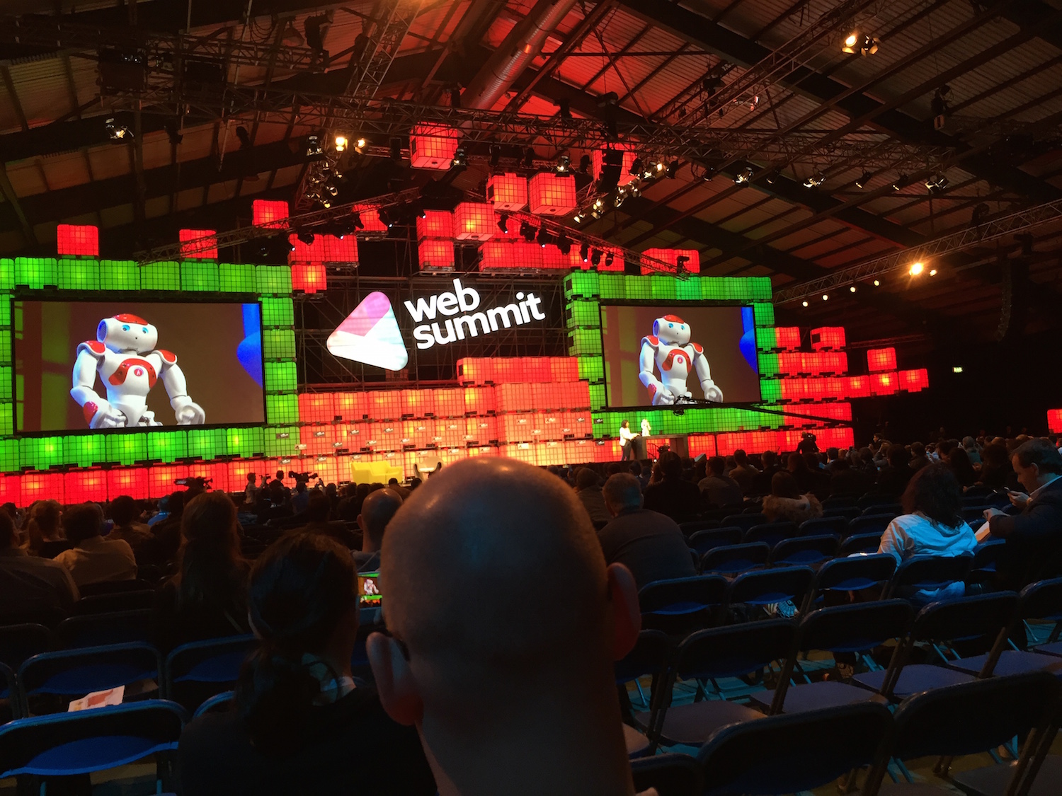
We were at the Web Summit in Dublin this year and took some pictures! It was a very cool show, with lots of interesting startups (some not-so-interesting and some utterly pointless too, but that balance was tipped well towards the former!) and inspiring keynotes from industry leaders of all shapes and sizes.
The centre stage was a place of many interesting conversations, keynotes and showcases – including that adorable little robot :)
Moov wearable first impressions and test / review
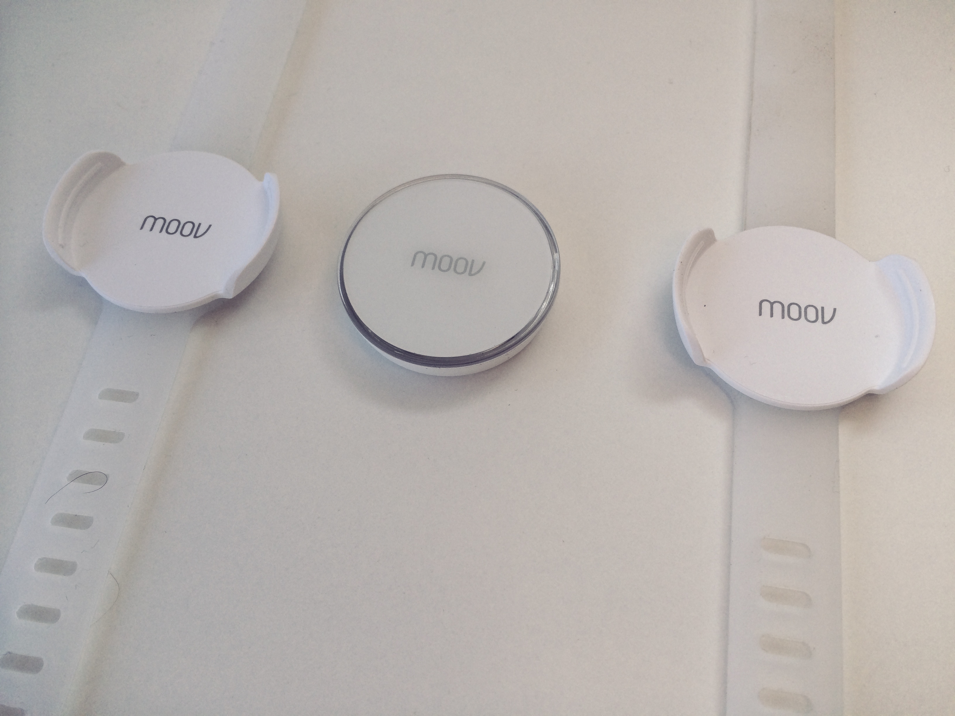
I just received the fitness-coach-wearable “moov” in the mail. Moov is a device made by an innovative US startup that crowdfunded itself on their own website instead of using kickstarter. Kudos!
The device promised to be way smarter than any other passive-fitness-wearable (like the Jawbone UP or the Fitbit Flex which I actually used myself) so did it deliver?
Apple iPhone screen fragmentation and the missing 3 pixels
When apple switched from the 4:3 aspect ratio on the iPhone 4S, to the 16:9 ratio of the iPhone 5, the world accepted it as a fact.
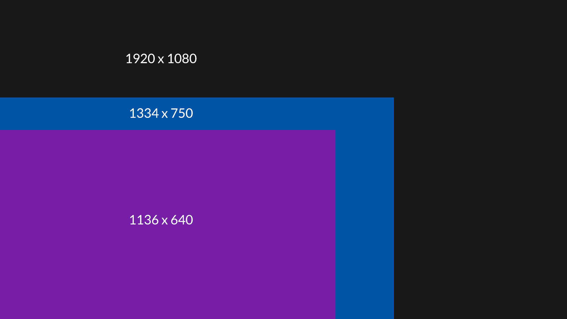
Now, when we have two new resolutions we can start thinking about iOS fragmentation. Apparently both the iPhone 5, 6 and 6 plus have a 16:9 aspect ratio. With the respective resolutions of 1136 x 640, 1334 x 750 and 1080 x 1920, we would expect we can scale the top resolution down and get the middle and lowest one. No suck luck.
When we scale 1080p down to 750 pixels, we get 750 x 1333. We are missing one pixel.
It get’s even weirder when we scale it down from 750 x 1334 to 640, because the height appears to be 1138. Now we are gaining two pixels.
Scaling up from 640 to 750 yields 750 x 1331 pixels – so loosing two.
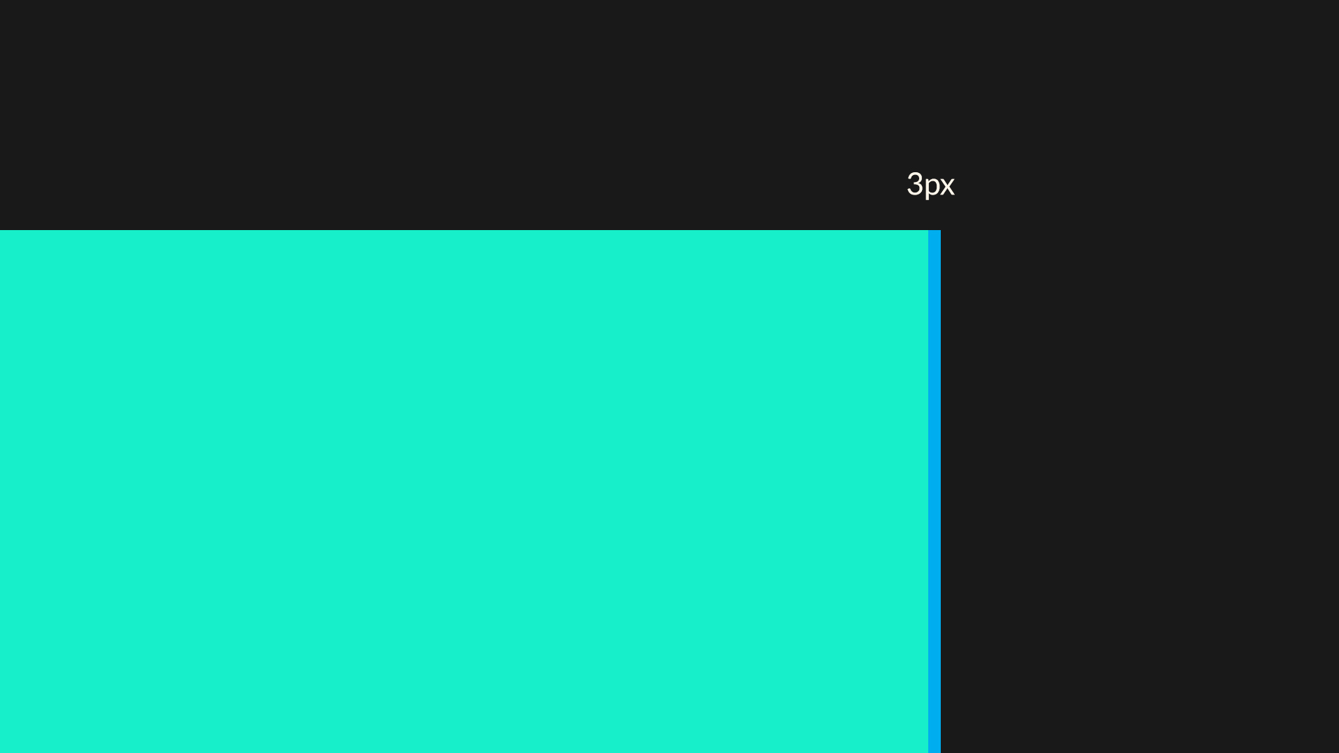
Of course it’s all roughly 16:9 every time, but the problem is that even when you created your app fully on vectors, you can’t simply resize the canvas because you’re missing pixels on every resolution.
Bad move apple :(
Material Design animations done in Apple Keynote
Here’s a nice, short video showing most of the Material Design animations done in Apple’s Keynote presentation app. It appears to be surprisingly powerful and definitely worth a watch!
Keynote does Material Design (Vertical Comparison) from Andrew Haskin on Vimeo.
Minimal design misconceptions
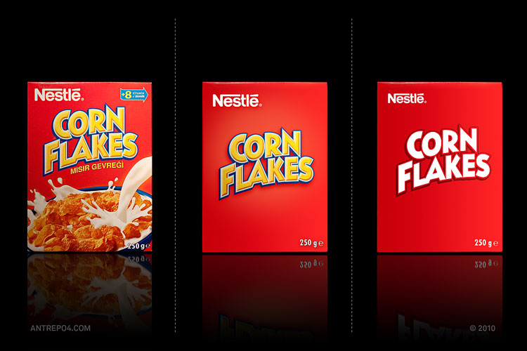
After 2010 we witnessed “minimal” or “flat” design becoming the cool and hip trend all around. We’ve seen flattened brands and products (like below), flat websites, flat apps and more. The world has suddenly stopped being round and became flat, just as some suspected it is a long time ago.
Minimal became the new hip. At first Microsoft pushed the idea with their redesigned Windows interface of flat, colourful tiles and clear typography. Google created their own “minimal” style with a small touch of shadows and transparencies here and there, and Apple followed suit with iOS 7 redesign. That way minimal and flat took over the world.
Watch this now: Font Men at SXSW 2014
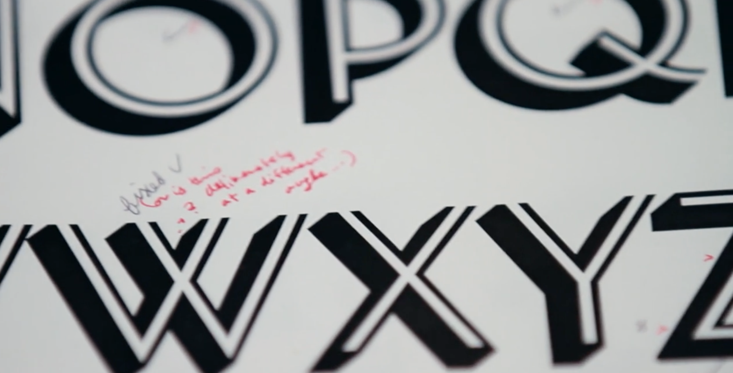
A short, 6 minute film about two guys – Jonathan Hoefler and Tobias Frere-Jones – who designed a lot of fonts that we know, love and use daily. It’s interesting to see bits and pieces of their process, with a nice, warm narrative to the whole thing. Definitely worth a watch if you’re into design or typography (or both).
Font Men – SXSW 2014 Official Selection from dress code on Vimeo.
Apple posts design tips for developers
We recently raised the subject of how most apps don’t really look like the design when they are developed, and here comes Apple to the rescue! ;) The developers are generally lazy when it comes to implementation and believe that if it displays (in any way) then their job is done. They don’t care about margins, spacing, platform rules and ui paradigms. No, they are the mighty app developers, a rather small elite among other devs, so they don’t lower themselves down to implement things perfectly or to worry about how the information is presented.
Apple has published a set of rules and guidelines (a short one still, but always something) to educate developers about some basic mistakes they do. Let’s just hope they’ll start rejecting crap-design apps from now on, because a warning is only meaningful when it’s a threat.
Forget Flappy Bird clones! Dotpocalypse is out!
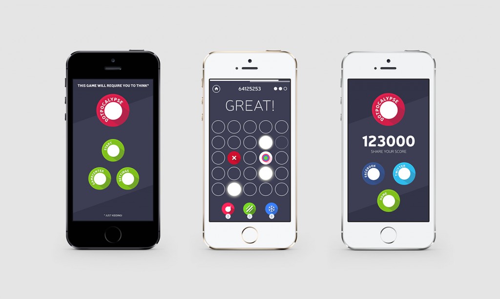
We are happy to announce our second, free iOS game called Dotpocalypse (press release image attached). It’s a simple, minimal arcade game that’s all about how fast and accurate you are with your fingers. The only thing that matters is skill and dexterity. Oh and technique too. The game adjusts to your speed, so the faster you are, the higher you score – some players can do insane, inhuman combos because of that. Check it out at:
https://itunes.apple.com/us/app/dotpocalypse/id737504884?ls=1&mt=8
Thanks,
HYPE4 + ManBat team!
This couldn’t be more true
In our industry there’s always the notion of finding someone cheaper to do the job. Be it a designer, a programmer or a copywriter, cheap is always best. Most companies with that attitude don’t take into account the fact, that usually cheap ends up being poor. We have done a lot of web and mobile projects over the last few years (design only), and while on the web about 50% is coded very close to the design, on mobile it was only five or six apps, one of which is the game we did internally. Why is this happening? The main reason is probably the fact that a lot of developers don’t really have any visual sense, to the extent of not recognising the differences between a nice design and a crappy one that’s falling apart. The other part is their laziness, coming from the fact that they did all that super-hard-to-learn coding and it sort of works, so it’s fine.
It’s not.
Startups especially should take an approach where crap-coding is eliminated as soon as possible. It’s possible by either educating the developers (some of them just need a little push), or doing very detailed audits by the designer, of the finished product. But that’s added cost so for most companies it’s not “worth” it. And those companies end up with a product like in the above image.
We are a design company and we try our best to do awesome designs, but unfortunately we can’t control the developers. It’s time to make our own devs then in our secret lair inside a volcano. Or educate the current ones with ebooks or lectures. Whichever is easiest ;)
We already helped some mobile developers achieve that, but new projects bring us in touch with new developers and we haven’t encountered new ones that already had visual quality of what they code in mind. Maybe someday…
A Good user interface? You bet!
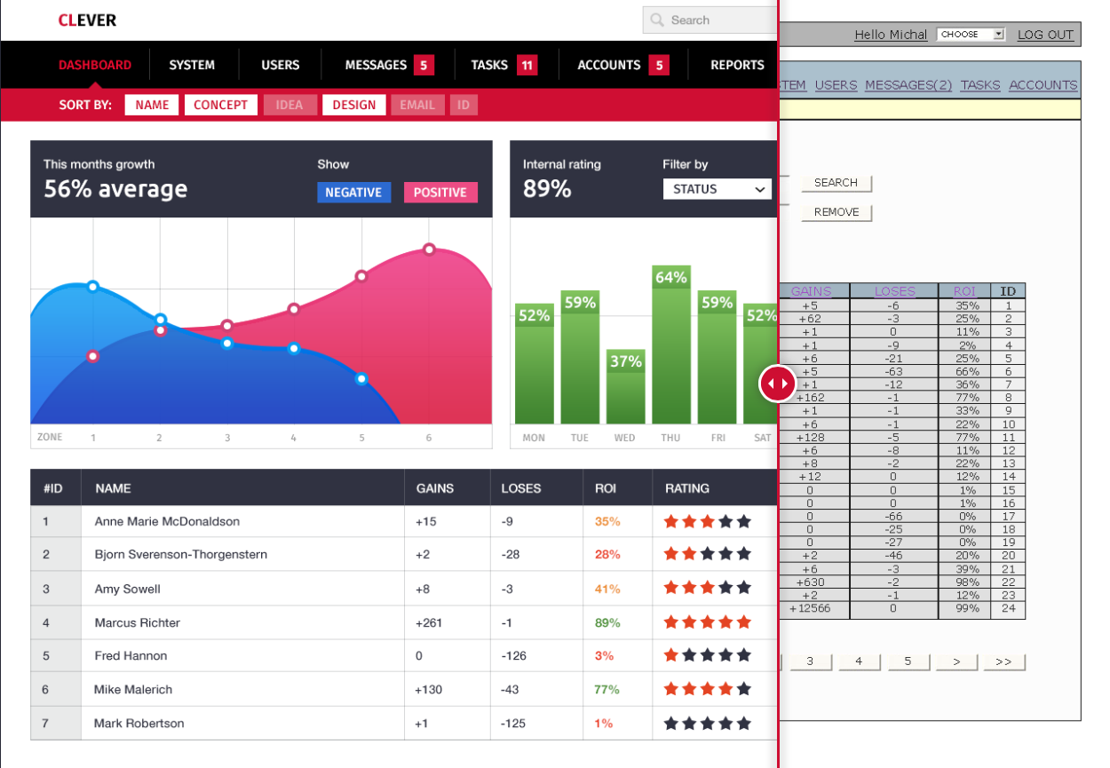
Most of the current web interfaces are still based on the visual and UX paradigms created in the early days of the internet. User Friendly is an empty term with a lot of those interfaces, loosing the battle against costs and deadlines. The end user is the one who suffers a poorly designed, hard to use and plain ugly interface on a daily basis. Be it a bank system, your webmail, or any other sligthly more complicated thing you spend hours with every day. It’s not the 90’s anymore, time to redesign!
Does it have to stay that way?
Best free fonts of 2014 (so far)
Here’s a selection of 15 awesome free fonts that we found out about in 2014 and are really worth taking a look. Enjoy!
Our next iOS arcade game – “Dotpocalypse” is coming very soon
We are happy to announce our second iOS game – Dotpocalypse. It’s coming VERY soon and will be free with in-app purchases. The second game is very flat and minimal for a difference, while the most important part of it to be as fast and accurate as possible. Without spoiling any more details, we’ll post a link to the game when it’s released this February.
We played around with quite a lot of ideas and concepts, and yes – we are working on a moody, atmospheric and story driven game. We wanted to release something simple and minimal first and now it’s almost there.
Our own “Natural environment” device library
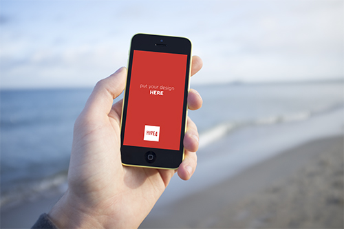
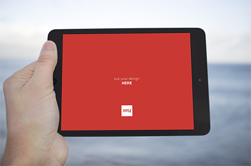
We are starting our own little photo library (avoiding the term stock on purpose, as our photos will be natural, human and real, instead of “plastic”). We are creating mockup-ready, natural environment device photos (in PSD format) that you’ll be able to paste your design into (a PSD smart object) so it’ll appear natural on the screen. The decision came to us because we always like to show our designs in the context of the device it was made for, but most stock photos of “iPhones in hand” are plain terrible. The photos will be taken in all possible settings (beach, mountains, cafe, home etc) and added over time. We will be selling them, but the prices will be VERY low.
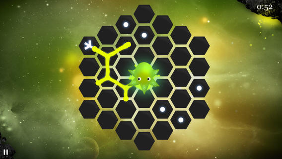
HungrySquid development screenshots
Before HungrySquid reached 400,000 downloads and became the little gem it is today, we went through a lot of iterations and versions before arriving at the current one. Let’s take a trip back in time and walk through some of them now.
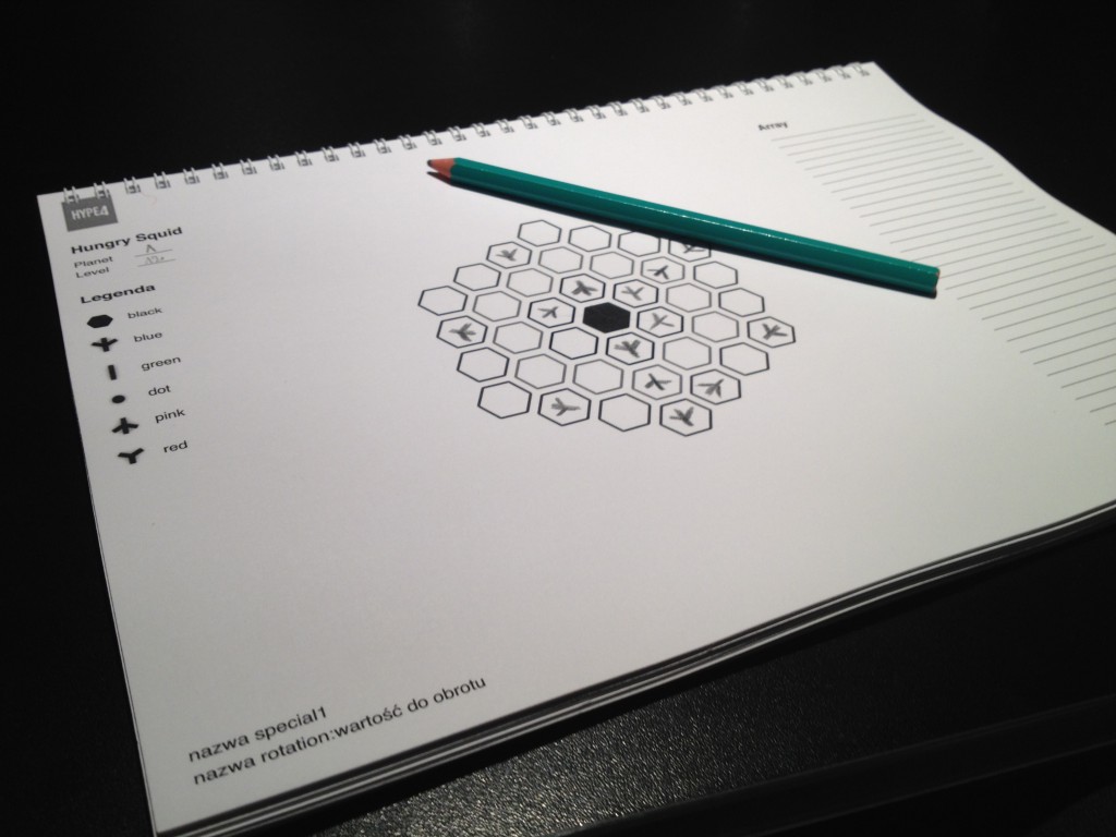
We started like all great things do – with a pencil and paper in a coffee shop ;)
Bob Dylan comes back to the techno-reality with “Like a rolling stone” interactive music video
I never considered Bob Dylan to be Tech Savvy, aside from doing ads for Apple a while ago, but apparently the man has still some cool ideas. Sure it took quite a few years for Like a Rolling Stone to get a music video, but it was well worth the wait. The video is interactive and actually fun to use + no two people will get the same experience the creators claim. Check it out at: